i mean nice, but also i feel like anyone with access to photoshop could’ve made this in 5 mins lol
The logo and colorway is perfect
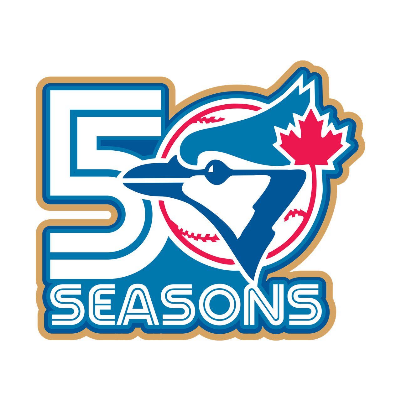
This is one of the better pro sports logos I’ve seen in a while. Love the old school blue jay!
Looks really cool! The Jays should bring back their original blue logo, it’s one of the best imo
On first glance I thought “5 seasons of what?”
They need to have Tom Henke throw out the first pitch in his old jersey, but with that as the “number” on the back

SEGA
Nice. But where are they gonna put it on the jersey?
They started the festivities early with a world series loss
Very 1970s. Not my favourite graphic design period – but apropos, here.
Will Brazil’s Nippon Blue Jays adopt this one as well?
Absolute best logo for the Jays

Clean. I always like the Blue Jays logo and color scheme. Aesthetically pleasing and the maple leaf was always a neat touch
This is cute. Is this the patch? Will look good on the cap if so.
Are the patches on a plane to Toronto?
Has that blue jay mascot come out of retirement? Seems like a while since they’ve used it
1977 gang
This is so good that it makes me want to buy something that has it.
Perfection
i’ve always loved the color palette of the blue jays logo
I like it, but I admit the 0 seems understated and thought it was some odd 5 year landmark i was forgetting.
It should be a logo of Dave stieb. The greatest blue jay ever. And the one who made the team possible
I like it. Remember when MLB clearly forgot about its 150th anniversary and they put together a logo at the last minute that was just the MLB logo with the number 150 next to it? Pepperidge Farm remembers.
What a satisfying shade of Blue
Gonna be a nice patch on the side of their hats.
Reaaally hoping they get a 50th anniversary alt this season… I’ll give you all my money Jays
Looks like they used chat gpt instead of Gemini 😭
It’s beautiful.
Jays needs to wear a jersey from every era this year please…

I love the whole thing, but my brain immediately snapped here
I remember when they joined the MLB. So old 🙁
That is sick
I suppose it’s inevitable that they’ll put it on the side of a hat and I’ll buy it
Can we have our World Series back Joe Carter? -Braves fan
Looks like the blue jay is getting domed by a sniper rifle and is in the crosshairs

38 comments
The original blue Jay logo is elite
i mean nice, but also i feel like anyone with access to photoshop could’ve made this in 5 mins lol
The logo and colorway is perfect
This is one of the better pro sports logos I’ve seen in a while. Love the old school blue jay!
Looks really cool! The Jays should bring back their original blue logo, it’s one of the best imo
On first glance I thought “5 seasons of what?”
They need to have Tom Henke throw out the first pitch in his old jersey, but with that as the “number” on the back

SEGA
Nice. But where are they gonna put it on the jersey?
They started the festivities early with a world series loss
Very 1970s. Not my favourite graphic design period – but apropos, here.
Will Brazil’s Nippon Blue Jays adopt this one as well?
Absolute best logo for the Jays

Clean. I always like the Blue Jays logo and color scheme. Aesthetically pleasing and the maple leaf was always a neat touch
This is cute. Is this the patch? Will look good on the cap if so.
Are the patches on a plane to Toronto?
Has that blue jay mascot come out of retirement? Seems like a while since they’ve used it
1977 gang
This is so good that it makes me want to buy something that has it.
Perfection
i’ve always loved the color palette of the blue jays logo
I like it, but I admit the 0 seems understated and thought it was some odd 5 year landmark i was forgetting.
It should be a logo of Dave stieb. The greatest blue jay ever. And the one who made the team possible
I like it. Remember when MLB clearly forgot about its 150th anniversary and they put together a logo at the last minute that was just the MLB logo with the number 150 next to it? Pepperidge Farm remembers.
What a satisfying shade of Blue
Gonna be a nice patch on the side of their hats.
Reaaally hoping they get a 50th anniversary alt this season… I’ll give you all my money Jays
Looks like they used chat gpt instead of Gemini 😭
It’s beautiful.
Jays needs to wear a jersey from every era this year please…

I love the whole thing, but my brain immediately snapped here
I remember when they joined the MLB. So old 🙁
That is sick
I suppose it’s inevitable that they’ll put it on the side of a hat and I’ll buy it
Can we have our World Series back Joe Carter? -Braves fan
Looks like the blue jay is getting domed by a sniper rifle and is in the crosshairs