
For the home and away I thought it would be cool to go for our famous iron fence work and incorporate it into a jersey using the stripes as the bars and the Fleur De Lis on the sides. I think it would give us a really unique look that speaks to the city. On the away Pelicans lettering I added a kind of church window painted glass type of pattern as an ode to our religious ties. I always thought the Warriors throwback with the Streetcar on the back was a cool jersey so i incorporated our own streetcar into what I call our Crawfish Red alternates. The NOLA is obviously from our past Hornets era and that logo is too good to not be used. I also added a Crawfish logo on the shorts. And the Gold jersey I used the street letter designs to spell out PELS and these would also be a Lake Pontchartrain type design. The artistic Pelican is inspired by the Bucks throwback with the real Buck drawn on it. In 2K25 they have this thing called eras where you can go back and start in any era of the NBA so I went back and even designed throwback versions as well. On NBA 2K25 you should be able to find them if you search JayDogon504
5 comments
The home and away hard and they match the city fs
First two are dope. The rest are too busy & distracting
I really like the artistic gold pelican jersey! These are dope!!!
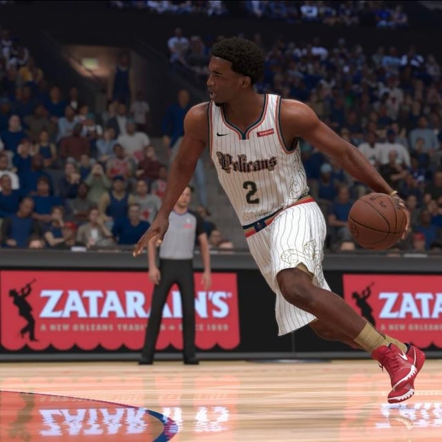
Love me some pinstripes
We should go back to hornets colors. Everybody loved the hornets brand. Charlotte doesn’t use the gold and we could do without any purple. They’ll also never make throwbacks that look like our hornets jerseys so there won’t be any conflict.
Our city editions over the years have made it clear that our current color scheme just sucks and nobody cares for them. We’re willing to do whatever possible to change our colors. People like the skelican but I honestly think it’s pretty goofy too. Just bring back hornets colors.