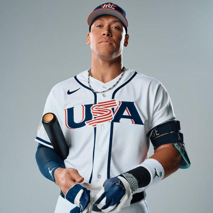
Aaron Judge posing in his Team USA jersey as a part of the MLB The Show 26 cover shoot
January 28, 2026
Aaron Judge posing in his Team USA jersey as a part of the MLB The Show 26 cover shoot
44 comments
TROUBLE IN THE BRONX
The blue piping is new, right? I like it
That line on the jersey looks it way cleaner. Kinda looks like braves jersey
Judge becomes instantly more likable without pin stripes
Looks really good on him.
I don’t have the issue with the hat that most of you have but I just cannot unsee the slice of bacon in the middle of the jersey
Glad the Bacon inspired S is still the main logo
Camera person actually took this at their eye level
So weird to see him in anything but a Yanks uniform
Does that mean The Show will have international teams??
He’s so hot
The piping is nice but the chest font/logo is too 90’s and the cap is too 2000’s. USA needs an overhaul.
Edits for ThirdPoliceman
Like this better than the “I just let out a Judgian blast…. from my butt” face from yesterday.
The jerseys look fantastic but those hats need some work. The logo is so bad.
USA Twizzlers
Everyone talking about piping…when I’m thinking I need a thorough piping by the Judge the way he’s looking at me😫
Should have been a split Judge USA / Ohtani Samurai Japan cover. Show both MVPs and the international reach.
You would think for something as big as this, especially for a photo shoot, that Nike could get the jersey logo to line up properly.
The red brim looks weird with these Jerseys. Should’ve gone all Navy hat with the home unis.
I might consider buying the show for the first time in a decade if the have a WBC mode
Does MLB The Show even have the WBC?

Ahhh the baconator jerseys.
They left ohtani off because they are saving him for 2027 when he wins batting title and triple crown

How are they still using that bootleg early 2000s Sixer cap logo?
I like the jersey – the hat logo needs help tho
Is the new game going to have a WBC mode? Or would that be too awesome? I know it’s highly unlikely to be included, but why go all in on the Team USA stuff?
The new headspoon is an upgrade but the candy bacon “S” must go. Looks dated and out of place
How are there no stars on the jersey ? Didn’t want to be too cool or something ?
sucks
We always get the fugliest uniforms imo. Would love to see a redesign next time. Mexico’s always mogs us
Why are all WBC unis wack
Does anyone know when the team USA jerseys go on sale?
We need a new logo. That just looks so uninspired and bland.
Ok, why in the Team USA jersey?
They should make the A on the jersey also red and white and add a couple stars on the U so it looks more like the flag
I’d love to have a Judge jersey, and a Team USA one is just about the only chance of that
But I can’t do the bacon slice.
He’s an absolute beast.
I don’t understand how we get a consistent stream of new city connects and alternate MLB jerseys, but the USA WBC jerseys have been basically unchanged.
They need to revamp the USA logo

I promise I will get you the money next week
Pretty not that good
U🥓A