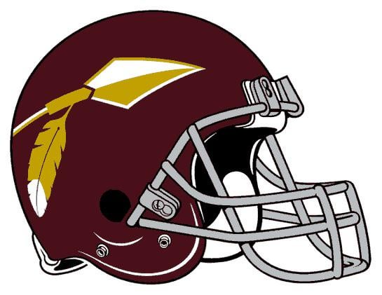
Just give us the old school arrow helmets! All the new stuff I’m seeing is too busy imo
February 5, 2026
Just give us the old school arrow helmets! All the new stuff I’m seeing is too busy imo
16 comments
I would kill for this logo over that god awful W. So simple yet so beautiful
And leave the feather.

no native imagery will be added
One of my Favorite designs. Sonny Jurgenson baby.
Im confused on what you’ve seen that is too busy? Because there’s been no proposed new helmet logo
This logo rules
Don’t you think that’s what the plan is? I have to imagine that’s why they keep introducing the spear imagery. Surely they’re not going to throw that whole super complicated logo on a helmet.
Tbh if you want to use the spear and W you can combine the two and make the spear go *through* the W.
Am I the only one who just sees the chiefs logo….
Absolutely no one (other than you apparently) thinks the new logo is intended to be a helmet logo. If anything it’s just a logo to use on graphics and merchandise. Many teams have actual logos that are different from what is on the helmet. Rams, Vikings, Bengals, for example.
If they go with the arrow, let’s lose that tone of Burgundy
Yeah I think it’s just the logical move, just remove the feather from the spear and you have a nice callback without upsetting anyone. I’m not even the biggest fan of the spear helmets tbh but I would welcome them with open arms given our current situation lol
Id LOVE this
Brother, is they’re doing this then they might as well change the name to the “Washington Warriors.” Pays an homage to the redskins. And I don’t mind it.
They should roll with the Roman army direction and be done with it. Right now the commander logo and theme is very generic.
The way people saw a designer having a bit of fun outside their style guide and latched on to it is wilddd.