Question I want to ask passionately: With the alternate jerseys leaked out, will we see a return of the classical Old English D on the home jersey eventually?

Question I want to ask passionately: With the alternate jerseys leaked out, will we see a return of the classical Old English D on the home jersey eventually?
30 comments
I like the current version. It matches the cap
Probably not until it has “throwback” status and they wear it a few times a year to sell extra merch lol
The old one is traditional but I think the jersey looks so much better with the cap logo.
It’s what people think of when they hear Detroit.
I hope not. The Ds not matching is so amateurish and honestly embarrassing. The spikey one is better.
I doubt it. Especially since the new orange one will have the current uni D
I miss the old one
I think the current one is better.
Bring back the old one. I am dying on that hill.
I don’t think it will ever happen, but I wish it would
I get the complaint that the classic D doesn’t match the hat D, but our uniforms have been like that for decades. Its cool seeing images of Hank Greenberg wearing the same uniform Miguel Cabrera wore.
The old one just looks right… New one is fine as a main logo but on the uniform it’s gotta be old
Nike has the MLB contract till 2029 and I doubt they’re going to abandon their own design.
Fucking hope so. Matches the JV OG.
No they’re not going to. Wish they’d kept the jersey D instead of the cap D
The team is abandoning their “tradition” of no alt uniforms. Not sure why people would see it as a sign they’d go back to an old “tradition”.
It never should have been changed in the first place. Looks like a bootleg with the “hat D”
So the Alt Uniforms would be in rotation with the City Connect? Or, would the be used for some away games?
Looks way better
New logo is way cleaner
I prefer the matching D’s. I think a Sunday alternate in cream with the rounded D on the jersey and hat would cool though.
Getting rid of that original jersey was a fucking travesty. Stick a few advertisements on these jerseys and it’s one more reason for me to stop giving a shit about sports.
I guess I am fine with either but prefer the new one. My only hope is the keep the hat and the jersey the same style. The new hat logo with the old jersey logo together was annoying.
For many years, I wondered why the two Ds didn’t match. I wanted the hat D on the uniform. I like hat D. And then, it happened and I hated it.
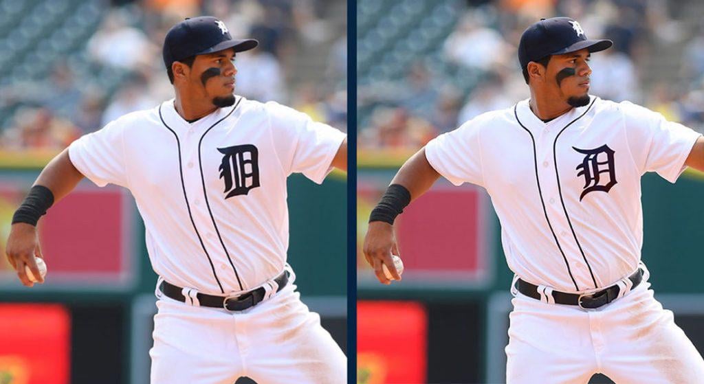
The one on the left is the correct logo we need to have
Hopefully not
New one that matches the hat is perfect and best. Clean, not thick and blocky
I really wish.
Fat D for life.
I like the current new D
No way