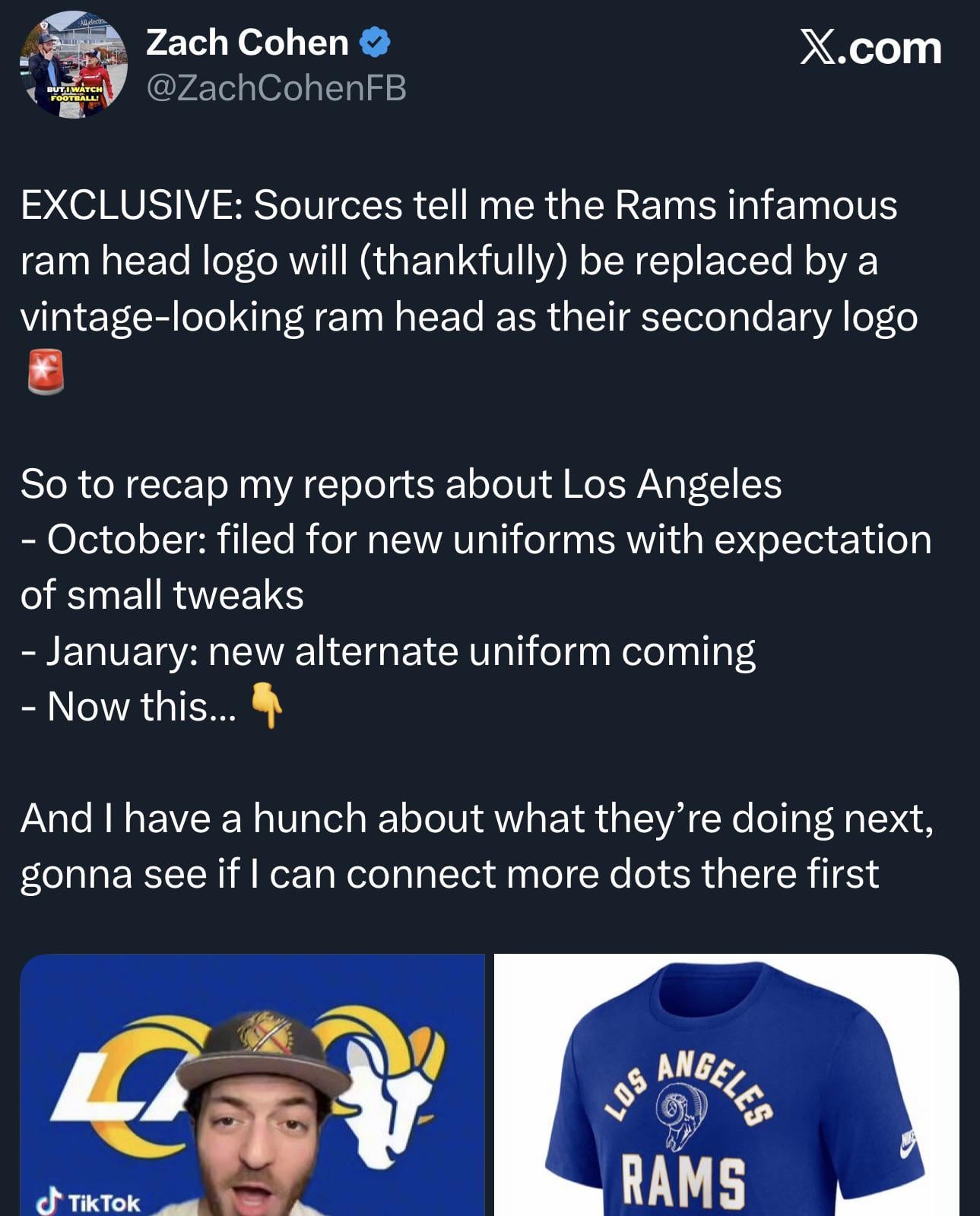
Sounds like we’re getting a vintage head logo to replace the 2020 head logo. Wonder how that’ll work, mixing modern and old logos.

Sounds like we’re getting a vintage head logo to replace the 2020 head logo. Wonder how that’ll work, mixing modern and old logos.
28 comments
Hell yeah!! Love the skull!
Get rid of the croissant 🥐 for fuck sakes
In his last post he said “another upcoming logo change.. one that almost everyone wants gone” and its the Ram head and not the croissant. Doesn’t make sense.
The head is fine except for the unintended peen. The LA surf croissant is an abomination. All of this could have been easily avoided from the beginning, but it gets the people going I guess.
It won’t be the same without the penis
I would hope for an updated version of the old Ram head because it may look outdated to nfl standards. As for the LA logo that needs to go. There are many talented artists I hope can create a great rebrand
It I like the Ram head. I never saw the peener until you filthy degenerates pointed it out.
Wish they could release it soon so I can get the loss out of my head.
nah it’s the croissant i hate, as long as it’s a ram head logo i’ll always love it. i didn’t know the new ram head logo was hated besides having a funny penis outline
Love the old school Ram Skull maybe modernize a little, slightly add gold close the mouth and turn it up a little, come up with a better LA with horns, get rid of the number fade! I didn’t like any of the new logos and don’t own anything with them on it.
If true, we are so fucking back
The Ram head logo is fine. Not great but fine. The LA logo is terrible.
I like both I didn’t want garbage st Luis crap and love that we rebranded
The Ram head is fine. Ditch the fucking LA bullshit
Getting rid of one of the only good elements of the rebrand. The L@ is terrible and it seems like they just feel obligated to have some sort of LA monogram.
The skull looks ok on the vintage merch, but it needs a lot of tweaks to work as a modern logo. Way too many thin lines. It looks like something from a biology textbook, not a professional sports logo.
I choose to believe it was decided in a closed room that our current logo was so hated that we couldn’t be allowed to win the superbowl until after the change.
Hopefully that means a blue and white throwback alternate
I love how people made fun of the head logo looking like a penis but I actually liked the design. The LA croissant was stupid.
Please be the skull!
While the vintage logo is cool, I really wanted the man logo to be the one that’s changed between the two. They’re so stubborn about the rebrand
Why don’t we go with Baphomet? Excellent local lore would win us some die hard fans. Food for thought
I’d rather keep the rams head over the banana logo, it’s atrocious
Bruh I actually like the Rams head. I just don’t like the LA horn
thank fuck the dick logo is gone 😭😭
They have sold merchandise with it in recent years. I’d rather update the Rams logo from 2000-2019 with today’s colors.
Damn I didn’t realize the LA logo was so hated and didn’t realize people call it the croissant lmao I actually like it.
we should have an occult ritual ram’s head symbol as our logo. really scare the hell out of the other teams. maybe do some shit with black smoke before each game.
Wtf no, that’s my favorite logo we’ve ever had. That one should be the primary logo and the LA one should be secondary or just redesigned. I swear if we keep the LA but get change the ram head I’m gonna be pissed.