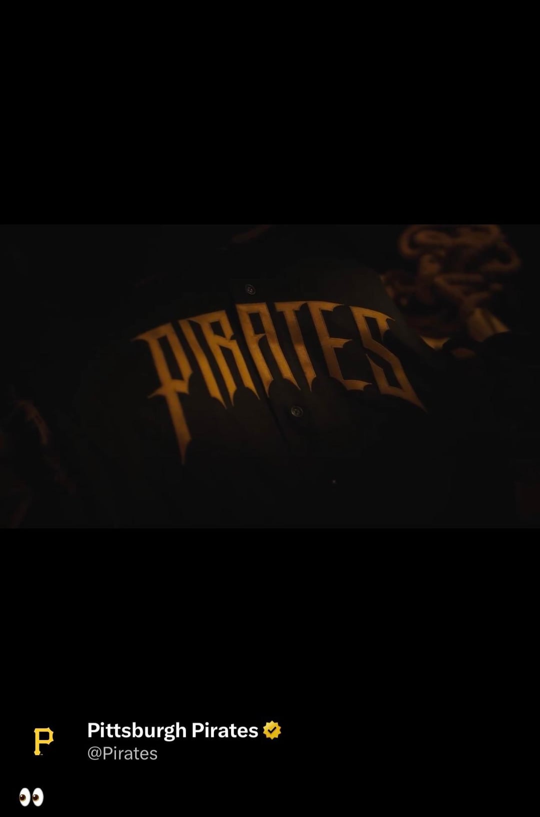
Pirates also just dropped a video with the new possible City Connect
March 25, 2026
Pirates also just dropped a video with the new possible City Connect
19 comments
Oh yeah it’s definitely been leaked
I think that removes the “possible”. I like it.

That final logo with the Jolly Roger with the crossed swords needs to be on the hat
Spectacular, now don’t go doing something dumb like gold pants.
Don’t really get the excitement over these. The sleeve patch is cool, but the front font is just pretty meh to me and looks cheap. Hope the hats are cool.
Where is it posted too I don’t see anything on YouTube recently.
If this is the cap logo and it has black pants… they cooked
I gotta be one of the only people who enjoyed the old city connects. The yellow was very striking to me and I love the color of our bridges. Made for a great hat. But these ones look cool too so I think I might just be a fan of variety.
AJ Burnett appearance got me so fired up you have no idea
They can’t be worse than the last ones.
One thing that I like about that font on the front of that jersey is that it’s slightly reminiscent of the font they had on the front of their black jerseys in the late 90s. ([Which they wore in the Cordova/Rincon no-hitter game.](https://www.youtube.com/watch?v=NT2Ds5Pzu4I))
Gotta be pretty rare for a player who played 16 seasons to claim the team he played 3 of his 4 final years as “his team”, but happy to have him lol
I just can’t grasp a city connection with these.
Moreso swashbuckling attire with a font reminiscent of the Tampa Bay Buccaneers newer logo.
The only criticism of these jerseys that makes some sense is that we already have multiple black jerseys. Do we really need another one?
We have the black Pittsburgh jerseys, and we also still have a black jersey with the P on the chest. Now, we have these black jerseys as well.
That’s a lot.
I like these jerseys personally, but my wife was less enthusiastic about them when I showed them to her. She doesn’t like the muted gold. I wonder if that’s a hint that they are going to have a mustard colored cap? Perhaps with that Pirates logo on the front?
I think the Pirates should always have a home white jersey, a road gray jersey, a black jersey, a gold jersey and a City Connect.
I think that’s plenty.
I think the answer and they just need to make one of the black jerseys, either the Pittsburgh jersey or the chest P jersey needs to become gold.
Also, I disagree that the Pittsburgh jerseys are their best jerseys. I think they’re OK, but I think the white jersey is the Pirates’ best look. It’s just so goddamn clean. It’s like the Dodgers. It’s just a beautiful home jersey that is criminally underrated amongst our fans.
city connect is just an unimaginative marketing ploy. so much potential and it’s all stopped by corporate regulatory and legal teams at MLB. cash grab shit.
Impossible. That guy on here confirmed that the jersey with red bubbles clearly made to promote sheetz is the city connect. It just makes too much sense.
Apparently these might not be the City Connects but they’re an alternate jersey of sorts. Kind of makes sense because the pirate theme doesn’t really have much to do with the city

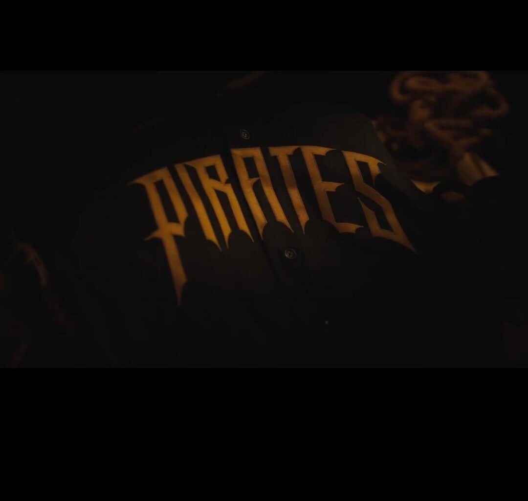
19 comments
Oh yeah it’s definitely been leaked
I think that removes the “possible”. I like it.

That final logo with the Jolly Roger with the crossed swords needs to be on the hat
Spectacular, now don’t go doing something dumb like gold pants.
Don’t really get the excitement over these. The sleeve patch is cool, but the front font is just pretty meh to me and looks cheap. Hope the hats are cool.
Where is it posted too I don’t see anything on YouTube recently.
https://preview.redd.it/r9x9exq9j3rg1.png?width=253&format=png&auto=webp&s=8eef499c106fcfe5267125a2f31f9375f4c7b226
If this is the cap logo and it has black pants… they cooked
I gotta be one of the only people who enjoyed the old city connects. The yellow was very striking to me and I love the color of our bridges. Made for a great hat. But these ones look cool too so I think I might just be a fan of variety.
AJ Burnett appearance got me so fired up you have no idea
They can’t be worse than the last ones.
One thing that I like about that font on the front of that jersey is that it’s slightly reminiscent of the font they had on the front of their black jerseys in the late 90s. ([Which they wore in the Cordova/Rincon no-hitter game.](https://www.youtube.com/watch?v=NT2Ds5Pzu4I))
Gotta be pretty rare for a player who played 16 seasons to claim the team he played 3 of his 4 final years as “his team”, but happy to have him lol
I just can’t grasp a city connection with these.
Moreso swashbuckling attire with a font reminiscent of the Tampa Bay Buccaneers newer logo.
The only criticism of these jerseys that makes some sense is that we already have multiple black jerseys. Do we really need another one?
We have the black Pittsburgh jerseys, and we also still have a black jersey with the P on the chest. Now, we have these black jerseys as well.
That’s a lot.
I like these jerseys personally, but my wife was less enthusiastic about them when I showed them to her. She doesn’t like the muted gold. I wonder if that’s a hint that they are going to have a mustard colored cap? Perhaps with that Pirates logo on the front?
I think the Pirates should always have a home white jersey, a road gray jersey, a black jersey, a gold jersey and a City Connect.
I think that’s plenty.
I think the answer and they just need to make one of the black jerseys, either the Pittsburgh jersey or the chest P jersey needs to become gold.
Also, I disagree that the Pittsburgh jerseys are their best jerseys. I think they’re OK, but I think the white jersey is the Pirates’ best look. It’s just so goddamn clean. It’s like the Dodgers. It’s just a beautiful home jersey that is criminally underrated amongst our fans.
city connect is just an unimaginative marketing ploy. so much potential and it’s all stopped by corporate regulatory and legal teams at MLB. cash grab shit.
Impossible. That guy on here confirmed that the jersey with red bubbles clearly made to promote sheetz is the city connect. It just makes too much sense.
Apparently these might not be the City Connects but they’re an alternate jersey of sorts. Kind of makes sense because the pirate theme doesn’t really have much to do with the city
When are these supposed to come out?