
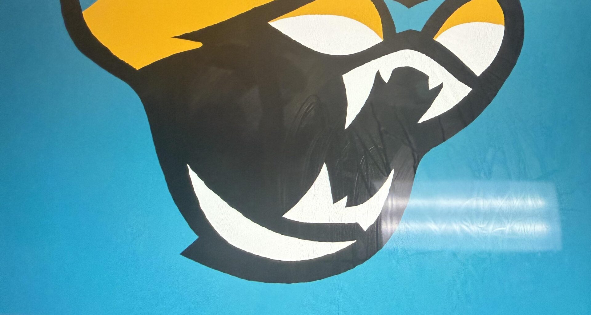
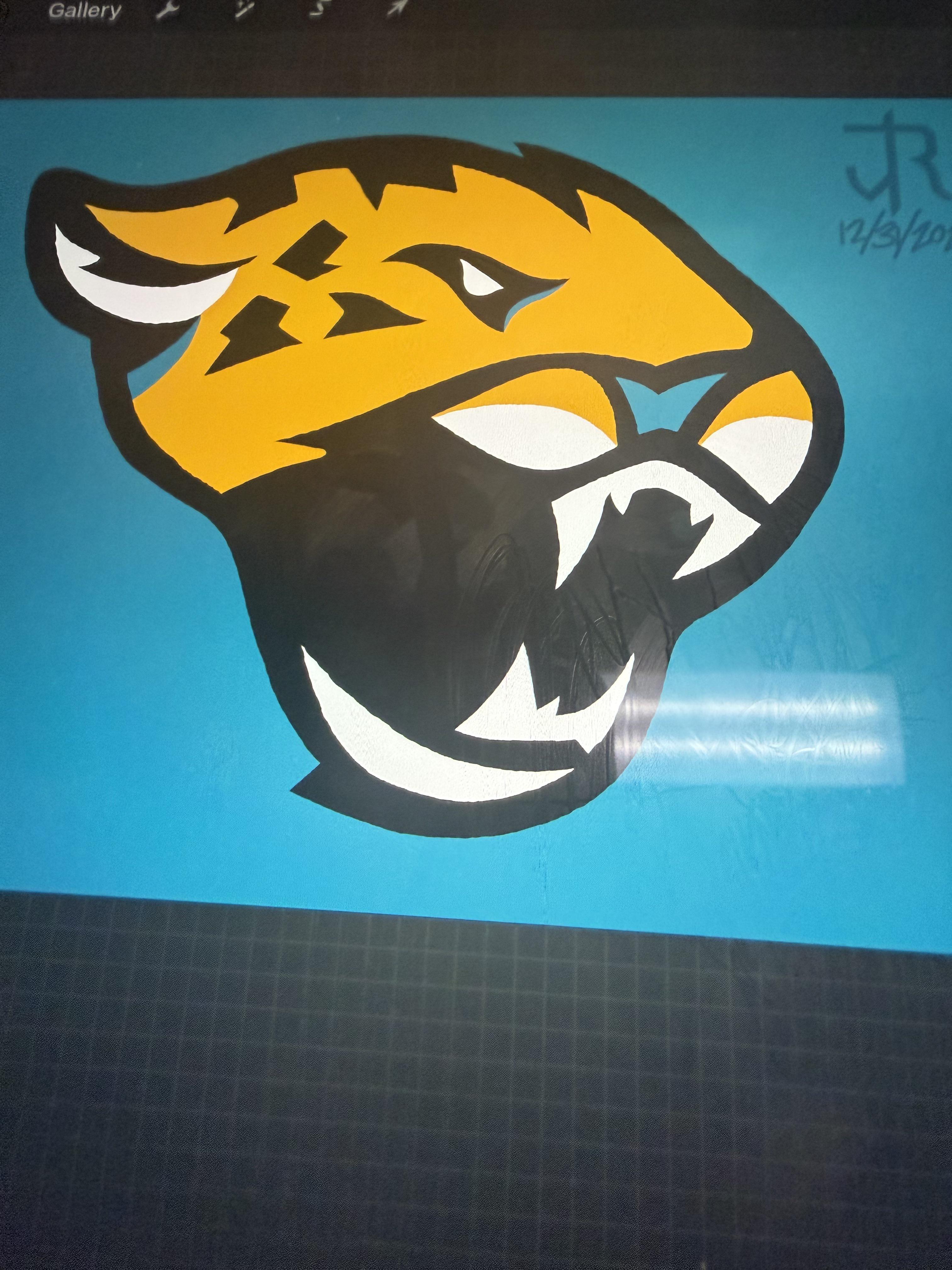
So I am trying to revise my logo from my rebrand concept a couple of weeks ago that I posted, and feel that it is missing one or two things here, any ideas as far as what I could add, leave it as is, because to me, it just feels a bit empty, and I’m stumped on my next move. Any ideas?
14 comments
I’m really not sure what you’re going for here

It just looks too blobby and discombobulated. Need to work on making it more symmetrical. You are also missing whiskers, but that bottom jaw needs to come up some and be made more angular.
Sorry for that but at first glance it looks like the current logo got stung by a wasp
I think it’s just a little too round and the perspective of the mouth and nose are not fitting the Rest of the head
nah

It’s ok, friend. Illustration really isn’t my thing, either.
I think that the nose and the teeth are off kilter, it’s hard to tell which angle it’s looking at
***IMPORTANT: THIS IS A WORK IN PROGRESS (I can’t stress this enough)***
This looks like the Jaguars logo drawn from memory during a concussion
It’s like the South Park Canadian version of an NFL logo.
The mouth & nose look weird. Push the right side of the nose back if that makes any sense. Where does the forehead and nose break? Everything is squished in. The eyes should be more defined with “eyebrows”. The bottom jaw is missing too, what’s the chin attached to? Where’s the tongue? I suggest making a front facing jaguar if you’re looking for something new. Oh yeah, don’t forget the whiskers. Gotta have whiskers bro.
The blue needs to be teal, it looks more like a powder blue to me here.
Arena League 3 vibes….