If the font was that large and the outline that thick it wouldn’t be as big an issue.
We’re here to do 2 things, see new jerseys and complain. Since we’ve seen the new jerseys, it’s time to complain.
Spoiler it wouldn’t have mattered all we do is talk shit and complain about this franchise
Exactly! Gotta wait to see it with helmets and pants
Stripes. On. Sleeves.
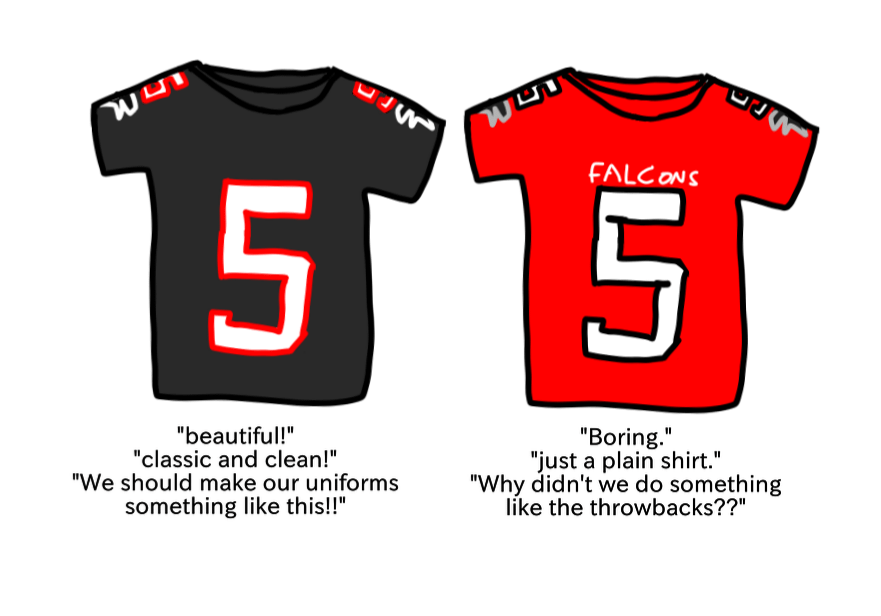
Black jerseys can be plain and look good. Red jerseys can’t. Also one is a throwback, the other isn’t
You’re spot on. Atlanta loves to complain. So there’s that. But I agree with the throwback being too plain. It’s clean because it’s plain. I wanted the new jerseys to be inspired by the past but forward thinking. These will be fine but not special. These shits cost too much now for me to own one any time soon anyway. I wanted an all black Falcons logo more than anything
The fans are so used to a losing franchise all they can do is complain
I bet if we win a SB people won’t be mad at the jerseys, but yeah…
Red jerseys are arguably our worst.
I don’t know why we can’t just go back to the black uniforms of the 90s and red throwbacks from the start of the franchise, then alternate between red/black helmets whenever we wear white jerseys.
Anything is better than whatever the fuck we have right now
All I’ve ever wanted uniform wise was to make the black jersey and red helmets with the old falcon logo on them our primaries. For our away jerseys, we should use the same setup except with a white jersey. It would look great. We could even have an alternate with a red jersey as a throwback to the 80s. I don’t know how we can literally have the best jerseys in football already exist and not use them more. They are taunting us by using them twice a year or whatever
The red is supposed to be the eye-catching part of the kit. With the recent throwbacks, the helmet was the statement piece, and the jersey complemented it well by being an understated backdrop. Now the would-be statement piece looks like the laughably bad fakes you find on eBay when you sort by lowest price 😭😭
Do something about the helmet and we’re good.

sigh. I see we are putting up with Optimus Falcon logo for another decade huh
The irony is, no matter what it is, the average fan buys it and wears it in public and at games.
We complain online but I’ve rarely seen someone wearing a jersey complaining.
I’ll admit, I’m one of those people. I hated the gradients but when I wear it as fashion, I never said a bad word on it lol.
Maybe because we don’t like talking bad about what we choose to wear.
Someone must have done the psychology research behind this.
The black works because of the red helmets and white pants. I didn’t really like them when we had black helmets. In other words I need to see the whole uni before I judge.
Cotten or polyester though?
Almost like colors are a relevant part of a uniform!!

20 comments
If the font was that large and the outline that thick it wouldn’t be as big an issue.
We’re here to do 2 things, see new jerseys and complain. Since we’ve seen the new jerseys, it’s time to complain.
Spoiler it wouldn’t have mattered all we do is talk shit and complain about this franchise
Exactly! Gotta wait to see it with helmets and pants
Stripes. On. Sleeves.
Black jerseys can be plain and look good. Red jerseys can’t. Also one is a throwback, the other isn’t
You’re spot on. Atlanta loves to complain. So there’s that. But I agree with the throwback being too plain. It’s clean because it’s plain. I wanted the new jerseys to be inspired by the past but forward thinking. These will be fine but not special. These shits cost too much now for me to own one any time soon anyway. I wanted an all black Falcons logo more than anything
The fans are so used to a losing franchise all they can do is complain
I bet if we win a SB people won’t be mad at the jerseys, but yeah…
Red jerseys are arguably our worst.
I don’t know why we can’t just go back to the black uniforms of the 90s and red throwbacks from the start of the franchise, then alternate between red/black helmets whenever we wear white jerseys.
Anything is better than whatever the fuck we have right now
All I’ve ever wanted uniform wise was to make the black jersey and red helmets with the old falcon logo on them our primaries. For our away jerseys, we should use the same setup except with a white jersey. It would look great. We could even have an alternate with a red jersey as a throwback to the 80s. I don’t know how we can literally have the best jerseys in football already exist and not use them more. They are taunting us by using them twice a year or whatever
The red is supposed to be the eye-catching part of the kit. With the recent throwbacks, the helmet was the statement piece, and the jersey complemented it well by being an understated backdrop. Now the would-be statement piece looks like the laughably bad fakes you find on eBay when you sort by lowest price 😭😭
Do something about the helmet and we’re good.

sigh. I see we are putting up with Optimus Falcon logo for another decade huh
The irony is, no matter what it is, the average fan buys it and wears it in public and at games.
We complain online but I’ve rarely seen someone wearing a jersey complaining.
I’ll admit, I’m one of those people. I hated the gradients but when I wear it as fashion, I never said a bad word on it lol.
Maybe because we don’t like talking bad about what we choose to wear.
Someone must have done the psychology research behind this.
The black works because of the red helmets and white pants. I didn’t really like them when we had black helmets. In other words I need to see the whole uni before I judge.
Cotten or polyester though?
Almost like colors are a relevant part of a uniform!!