
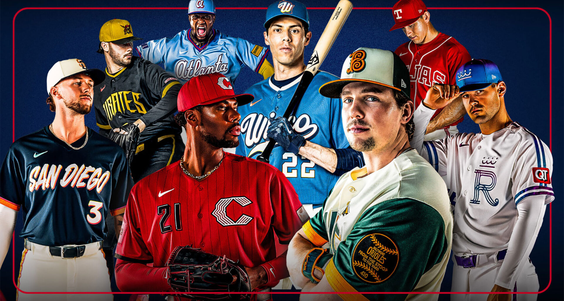
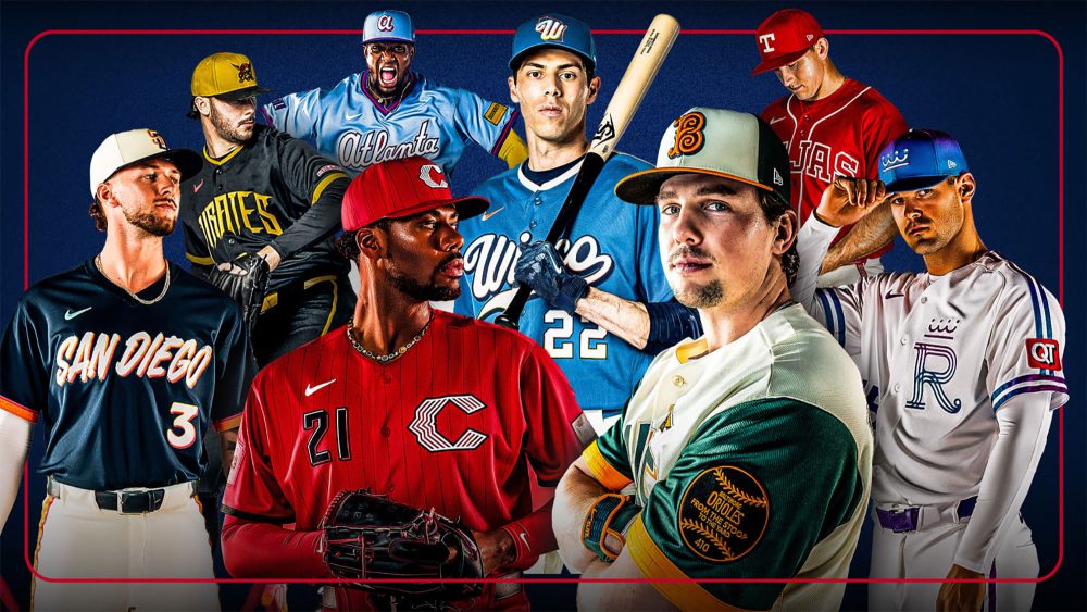
Eight Major League Baseball clubs officially unveiled new City Connect uniforms for the 2026 season on Thursday, including the Atlanta Braves, Baltimore Orioles, Cincinnati Reds, Kansas City Royals, Milwaukee Brewers, Pittsburgh Pirates, San Diego Padres and Texas Rangers.
This was the second installment of the City Connect program for each team, as the designs – which are typically inspired by cultural aspects of each team’s home city – remain in their uniform rotation for at least three seasons, with the Reds continuing to wear both designs this year.
Which team has your new favorite City Connect uniform? 🤩
– Padres
– Pirates
– Brewers
– Orioles
– Braves
– Reds
– Royals
– Rangers pic.twitter.com/GTf1CJ1MwF
— MLB (@MLB) April 9, 2026
Now that we’ve had some time to reflect, the staff at SportsLogos.Net – including contributors Paul Caputo, Glenn Cook and Andrew Lind – have decided to share our thoughts on the new designs, similar to how we reacted to the Atlanta Falcons and Tennessee Titans’ new threads.
This will be a regular story that follows any uniform or logo unveiling across the four major sports, though our initial coverage will continue to be as unbiased and informative as possible. We’d also love to hear your thoughts in the comments below!
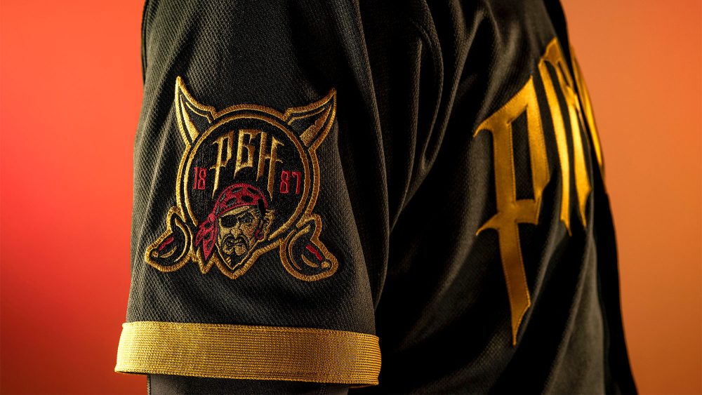 Paul CaputoBest: Pittsburgh Pirates
“A familiar color scheme, strong typography and one exceptional design element put the Pirates at the top of the list for me. The new City Connects out of Pittsburgh complement the team’s already strong primary identity while incorporating new elements – which in my mind is what the best City Connects do. The pirate-themed typeface is already good, but the fact that the shape of the wordmark evokes the city’s Three Sisters suspension bridges – named for Rachel Carson, Andy Warhol and baseball icon Roberto Clemente – brings a level of nuance and layered meaning to the new look.
“The incorporation of the team’s pirate face and Jolly Roger logos, along with the inclusion of the Pirates’ red accent color tie the contemporary City Connect to the team’s historical visual aesthetic. Overall, it’s a restrained but really sharp look.”
 Worst: Kansas City Royals
“Listen, I don’t generally like to traffic in negativity, and I understand that talented designers put a lot of time and effort into creating a professional uniform set for the Kansas City Royals. But it’s time to leave gradient blends where they belong – in 1998 with the Tampa Bay Devil Rays.
“The Royals’ update of their original City of Fountains-themed City Connects from 2023 (which I really liked) is not an upgrade. The uniform set is too simple while the individual design elements are too complicated, namely because every one of them involves that fuschia-to-blue gradient blend.”
 Overal Impressions
“In the classic tradition of every team in every major sport (it seems), the City Connect uniforms are taking the safe route of throwing back to retro brands or even previous City Connect brands rather than breaking new ground. For the most part, it seems that MLB teams were more conservative with their overall design while being oddly loose with spelling the names of their home towns and states (BMORE, Tejas, Wisco).
“I think overall it’s a good but not great batch of City Connects. The best of this round are probably about a B+ and the worst are a C–. There are no As, but there are also no Fs.”
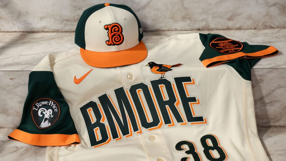 Glenn CookBest: Baltimore Orioles
“Even though I’ve never been to Baltimore and only ever seen games at Camden Yards on TV, I got the inspiration behind the Orioles’ new City Connect jerseys right away. The shade of green they chose is so nice – dark but still unmistakably green, unlike the ‘pitch blue’ that so many teams have gone with lately that teeters too far into black – and it plays beautifully with the cream base and the orange trim that reminds you these are the Orioles, after all.
“The cap is a thing of beauty (though, being Canadian, I’m a sucker for a cap with white panels at the front thanks to the Blue Jays and the Expos), especially with the cap logo again being unmistakably inspired by the stadium architecture without being too ornate.
“I do have quibbles about the ‘BMORE’ wordmark (Is that how locals use it? Should there be an apostrophe or a hyphen between ‘B’ and ‘MORE’?) and the 5 numeral that looks like an upside-down, flipped No. 2. But overall, these are minor nits to pick on a uniform that’s bound to look great both on television and in person.”
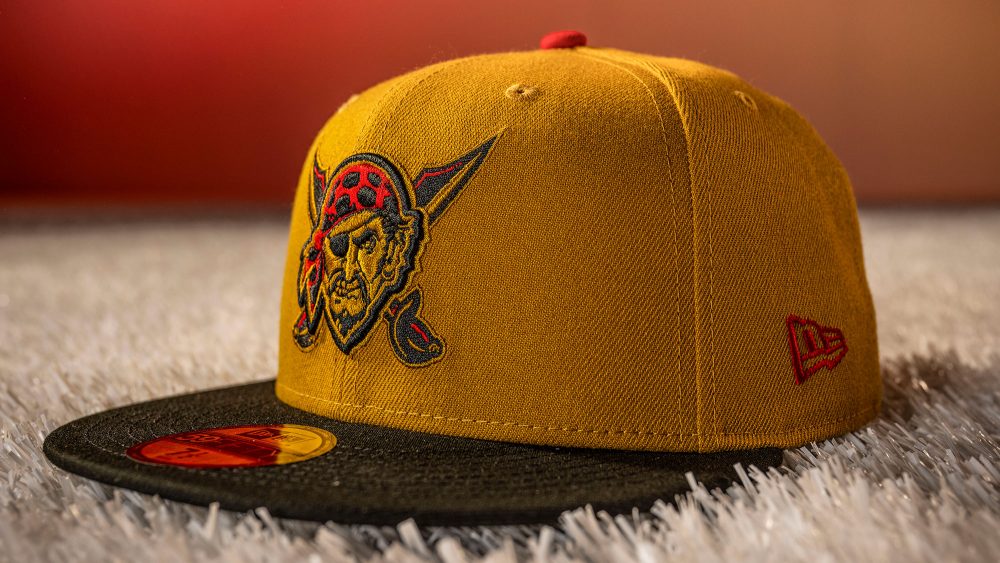 Worst: Pittsburgh Pirates
“Hear me out… I appreciate what the Pirates were trying to do here, but I just can’t get over the shade of gold they chose to go along with the black base. It’s just that tiny bit too dark, which leads to muddiness that brings the whole set down for me. The lack of contrast is most apparent when gold and black meet, but it’s even there on the gold cap. Just a slightly lighter gold and a bit of white in between – maybe in the vein of the Vegas Golden Knights – would lead to much better results.
“I also appreciate the Pirates going out to left field for their wordmark/number font. The nod to local bridge architecture dovetails nicely with the pirate feel, but some of the flourishes throw off the balance for me. The new sleeve patch and the reintroduction of red are nice touches, but overall this set could have used a little more refinement before taking the field.”
 Overall Impressions
“One thing that struck me about the City Connect uniforms released on Thursday was the use of gradients throughout. They’re present in three of the eight sets, but for the most part, they’re subtle. Narrow lines, outlines, drop shadows and caps are places where we haven’t often seen gradients before, and it makes me wonder if there have been advances in embroidery and/or uniform manufacturing technology that Nike and these teams are now putting into use.
“Something else I was glad to see was the continuation of elements from the first go-round of City Connect uniforms for a number of teams, like the Reds, Royals and Padres. Even the Braves’ new set, while not really carrying any elements forward from City Connect 1.0, feels like its spiritual successor. If the goal of the program is to build a stronger connection between a team and its city, and it succeeded at that the first time around, it doesn’t make sense to do a complete overhaul and sever that connection.”
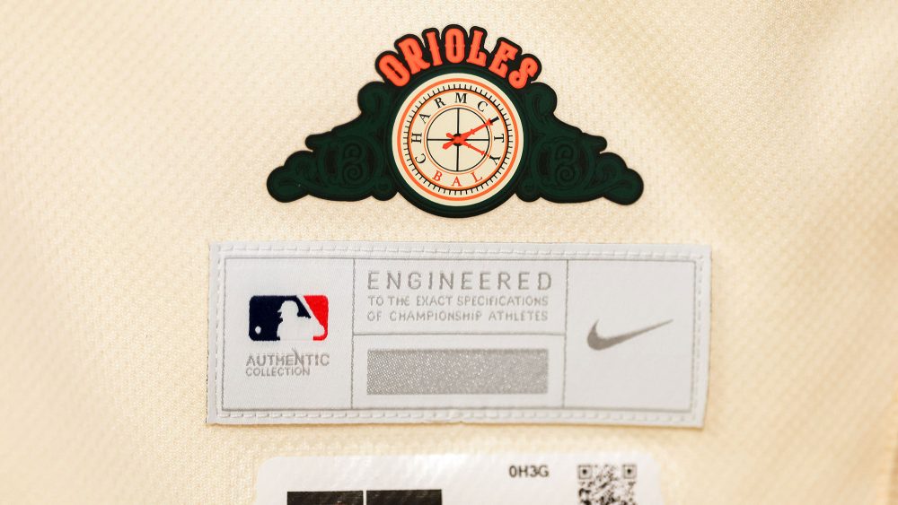 Andrew LindBest – Baltimore Orioles
“You can call me biased as a lifelong Orioles fan, but the franchise absolutely knocked this year’s City Connect design out of the park it appropriately pays homage to. The Eutaw Street plaque on the left sleeve, the subtle warehouse bricks on the sleeves, collar and wordmark, the scoreboard clock above the jock tag, the ornithologically correct bird perched on the wordmark like a weather vane, the Baltimore Baseball Club’s logo – which appears in the scoreboard clock and seats at Camden Yards – on the hat and the addition of green, a prominent color around the stadium… I was in love from the moment the jerseys leaked.
“My only hesitation with putting this among the Major League Baseball’s best City Connect uniforms is the ‘BMORE’ wordmark. You might find an odd mix of locals and out-of-towners who use the phrase when talking about Baltimore, but ‘Charm City’ was the way to go… especially since it’s already included in the clock. Shoot, even phonetic spellings of the city – such as Bawlmer or Baldamor – would have been more appropriate.”
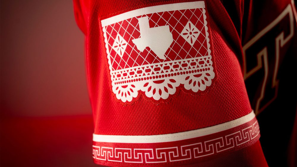 Worst: Texas Rangers
“While I respect the connection to the state’s Mexican heritage and appreciate the smaller details that comprise the Rangers’ uniforms, the color orientation of the ‘Tejas’ wordmark across the chest ruin this look for me. If they removed the piping and made the wordmark a single color, similar to the hat, the uniform would instantly improve. Instead, they’re left with a design that is similar to the Los Angeles Angels’ red alternate jersey, which is one of the worst designs in baseball.
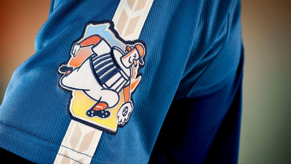
“The Milwaukee Brewers are a close second-worst for me, as well. They’re ‘City Connect’ uniforms and should reflect details about the team’s connection to the city, stadium, etc. They may be Wisconsin’s only team, but this design would be vastly improved by placing ‘Milwaukee’ or ‘Cream City’ at the forefront. The wheat pattern on the sleeve/shoulder stripe and the redesigned Barrelman sleeve patch are a nice touch, however.”
 Overall Impressions
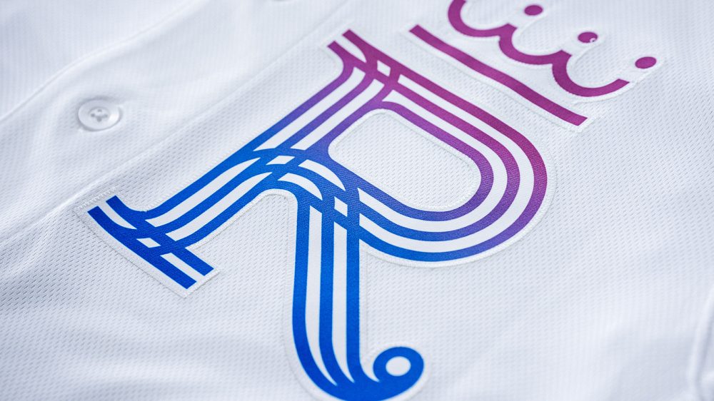
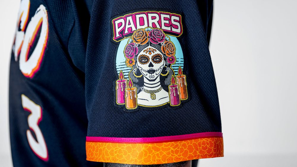
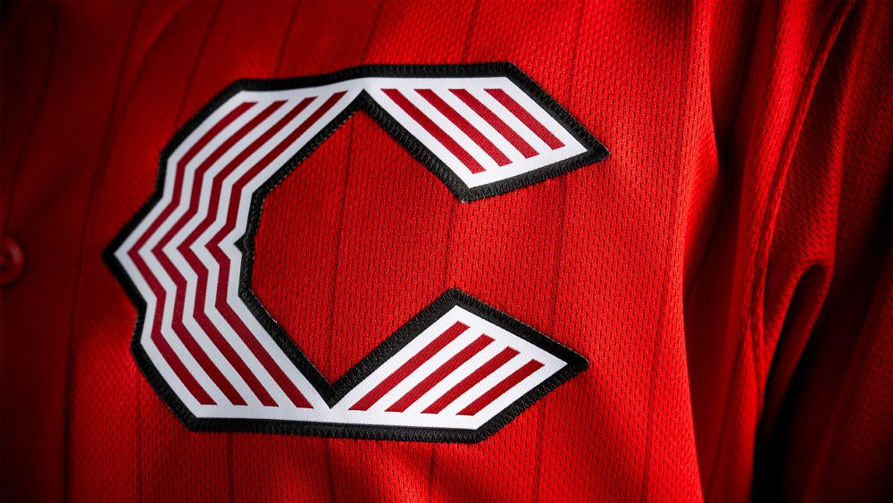
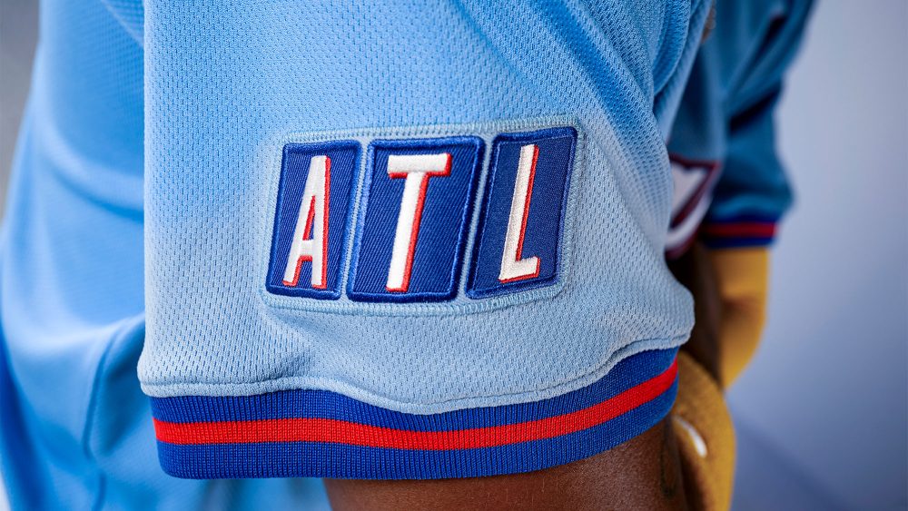
“There is something to love about almost every uniform in the bunch, including the Braves’ script wordmark and the nod to TBS Superstation, the Reds’ use of pinstripes, the Royals’ logo and the connection to the Kansas City flag, the Pirates’ font and interchangeable caps, the Padres’ bold colors, the patterns on the Rangers’ uniforms and the aforementioned details on the Brewers’ design.
“But I also think there are some places for improvement, too. With all due respect to Stance, their socks have never added to a design, and every player who wears long pants will look better because of it – though I guess that’s a discussion for another time. I would have also liked to see the Reds wear sleeveless uniforms, the Royals wear a solid-color cap instead of gradients, the Pirates use a lighter shade of gold and the Padres match their cap design to the wordmark font, but overall, I think this was a tremendous rollout that builds upon many original City Connect designs.”
SHOP: New City Connect jerseys, caps and more are available now!
Photos courtesy of @MLB on X/Twitter.