
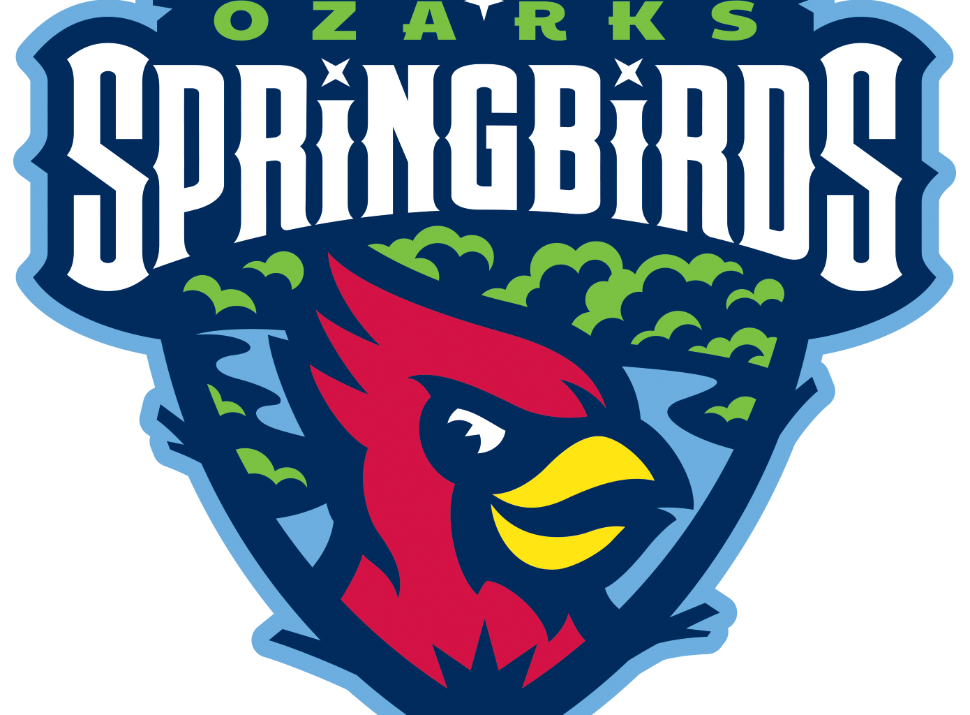

The Springfield Cardinals, Double-A affiliate of the St. Louis Cardinals in the Texas League, unveiled a new identity that maintains a tie to their parent club while establishing a unique brand. The ballclub, which rebranded because the St. Louis Cardinals sold the team, is now the Ozarks Springbirds.
The brand, created by the Louisville-based firm Studio Simon, incorporates elements of the city’s flag, the natural splendor of the Ozarks, and Springfield’s status as “Queen City of the Ozarks.”
The new primary logo features a new cardinal character in the foreground, with foliage and a body of water behind it, all framed by a shield made of branches. The logo also features elements drawn from the Springfield flag, including the top of a shape called the “compass crown” (because of the Queen City), three four-pointed stars, and a field of light blue.
The nickname Springbirds ties the team to its hometown even with the new geographic signifier, Ozarks.
“By naming the team the Springbirds, they are still referencing their city while allowing them to name the team the Ozarks Springbirds, as opposed to the Springfield Springbirds, which would have been redundant,” said Dan Simon of Studio Simon.
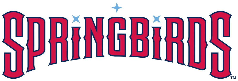
The Springbirds wordmark features the stars from the Springfield city flag, which were placed symmetrically thanks to the fortuitous placement of the two letters I in the word Springbirds.
“It was combination of just dumb luck and problem solving, and we were able to work those stars in in a way that doesn’t feel forced,” Simon said. “It was kind of a miracle. I’m not saying I created a miracle. I was presented with a miracle.”

The team is calling this full-body version of the character “Batbird.” He’s meant to show “the attitude and energy of St. Louis’ top prospects that make their way through Springfield en route to The Show,” the team said in a statement. While it’s distinctly new and unique to Springfield, the Batbird mark evokes the St. Louis Cardinals’ dirty bird logo.
A logo that the team calls the O-Bird will appear on the road jersey and on batting practice caps. The O stand for “Ozarks,” a geographic signifier that the team chose to appeal to the larger southwest Missouri region beyond Springfield.

Speaking of the Ozarks, it’s impossible to mention that region of the country without thinking of the popular TV show Ozark. One of the team’s alternate identities (this author’s favorite) emulates a visual trope from that show—the letter O containing four quadrants, each with a simple lineart illustration. In this case, rather than weapons or drugs or laundered money, the drawings include fireworks, a baseball, a hot dog, and a cardinal.
While this logo came from a collaborative process with the team, for Dan Simon, a fan of the show, it was a no-brainer.
“I was well versed in it,” Simon said. “I didn’t have to research the TV show.”
Simon suggested that the format of the four quadrants could lend itself to different permutations on theme nights, with different illustrations reflecting various promotions.
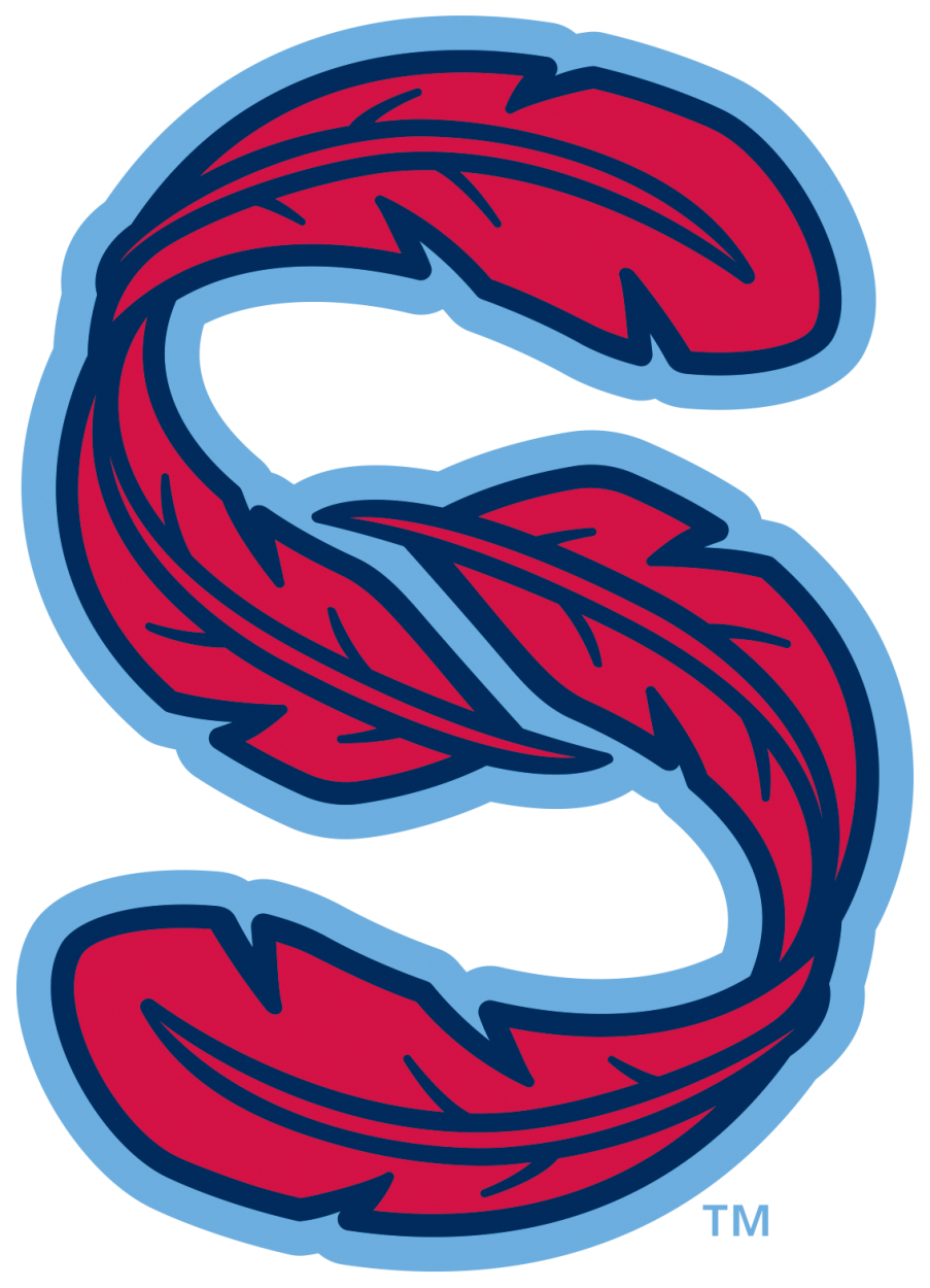
And finally, an “S-Feather” alternate logo creates the letter S out of two cardinal red feathers, reinforcing both the connection to Springfield and the new name, Springbirds, which many fans were already calling the team anyway.
The Ozarks Springbirds will make their debut April 2, 2027, at their home ballpark, Route 66 Stadium in Springfield.