
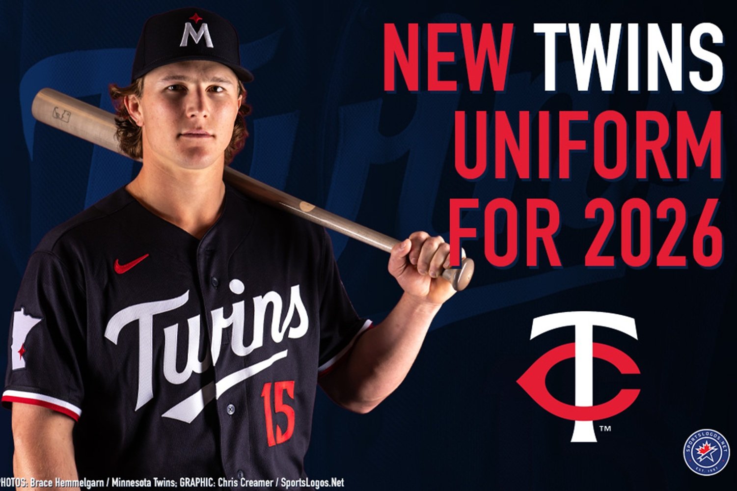
In a rare Friday news dump that didn’t make fans want to reach for their Pepto Bismol, the Twins unveiled an updated alternate navy blue jersey for the upcoming season. The release comes a day after the jersey was leaked in an MLB: The Show 26 trailer.
In the update, the Twins simply took their existing alternate and replaced the ‘MINNESOTA’ across the chest, and replaced it with the script ‘TWINS’ in white lettering. On the right sleeve, the alternate logo of the state of Minnesota with the North Star over the Twin Cities remains. The left sleeve is not shown in any photos released on Friday but it is more than likely reserved for a jersey sponsor patch, which was Securian Financial in the 2025 season.
The ‘MINNESOTA’ blue alternate had been in existence since the Twins rebranded their logos and uniforms prior to the 2023 season.
This is not the first time the Twins have switched from ‘MINNESOTA’ to ‘TWINS’ on their blue jerseys, as they had employed one of each jersey in the 2000s with the ‘MINNESOTA’ jersey used for road games and ‘TWINS’ jerseys used for home games. Both were dumped following the 2009 season when the Twins revamped their road uniforms.
While this is a nice updated homage to those 2000s home alternates, the jersey itself still comes off as a bit bland. The white ‘TWINS’ lettering across the front over the navy blue jersey just does not strike well. The lettering could benefit from either red borders around the white letters, or going further down the rabbit hole of tributing the 2000 jerseys and make the ‘TWINS’ lettering red with white borders.
The same review can also be applied to the numbers on the jersey. The numbers could benefit from some type of border to further emphasize them on the navy blue backdrop. Before this 2023 rebrand, the Twins have always employed some kind of border on their jersey numbering going back to their inaugural 1961 season in the Twin Cities.
While the Twins did right with their 2023 rebrand and moved off the gaudy uniforms with gold trim (never understood the gold even though the team tried to tell us often it was ‘kasota gold’), this new alternate and their uniforms as a whole could use some extra tinkering to make them that much better.
Simply adding some borders to the letters (not the name on the back, though, those can stay as is) and numbers can take these uniforms from alright to excellent.
What do you think of the Twins new jersey? Share your thoughts in the comments below!