
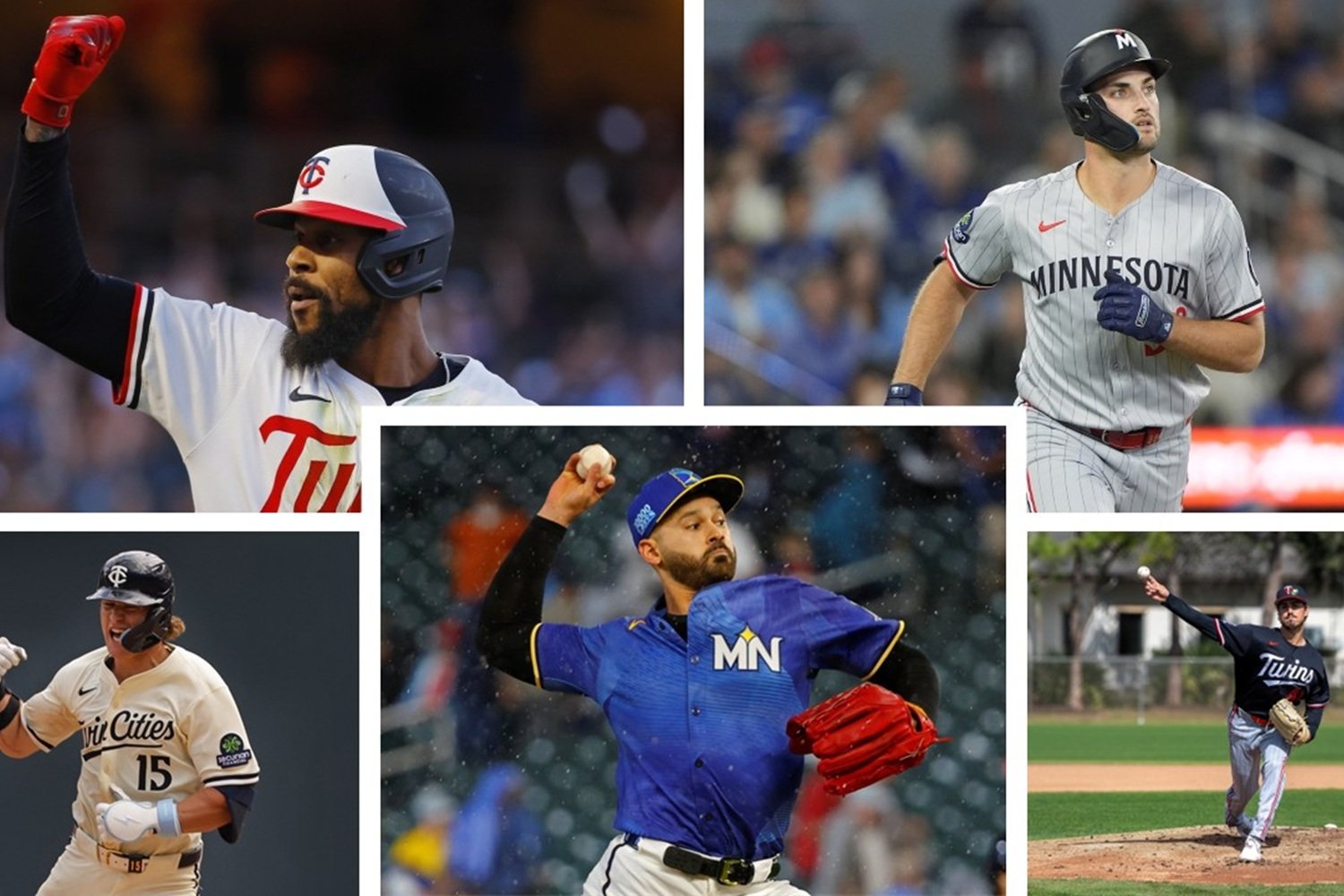
Once players arrive at spring training and start to do baseeball activities in public again, uniform talk always finds its way into the baseball conversation. For the Minnesota Twins, the 2026 season brings five distinct uniform options, which each offer something a little different. Some are rooted deeply in tradition, while others are built to reflect a more modern version of the organization.
When the Minnesota Twins took the field in 2023, it marked the beginning of a new visual era for the organization. After beginning a brand refresh process in 2020, the club unveiled an entirely redesigned on-field identity that included a new primary Twins script, a refreshed TC logo, a modernized Minnesota wordmark, and the return of pinstripes on the road gray uniform.
That redesign also introduced four new uniforms into the rotation, including a home white set, a primary road gray pinstripe look, a navy blue alternate that could be worn both home and away, and a cream alternate featuring ‘Twin Cities’ across the chest for the first time in franchise history.
Since then, Minnesota has continued to evolve its look. The club added its City Connect uniform in 2024 after initially allowing the new branding to stand on its own, and has since made tweaks, including updating the blue alternate jersey ahead of the 2026 season.
With Minnesota continuing to tweak its set of looks, now feels like the perfect time to rank the club’s current threads heading into the 2026 uniform cycle.
5. Road Uniform (Gray)
Minnesota’s gray road look has quietly shifted back toward a more traditional pinstripe design. Paired with the newer white M hat featuring the red North Star above it, the uniform checks plenty of historical boxes. Every Twins player inducted into the National Baseball Hall of Fame wore pinstripes at some point during their Minnesota career, which gives this look legitimate credibility.
Still, it feels more functional than iconic in the current rotation and lands at the bottom of this list.
4. City Connect Uniform
The Twins City Connect uniforms lean heavily into the Land of 10,000 Lakes identity, with an azure blue base and bright yellow accents designed to evoke sunlight reflecting off the water. The club dubbed the look the “Ripple Effect” when it debuted in 2024, and it certainly stands out from Minnesota’s traditional navy-red-and-white color palette.
The switch from matching blue pants to white pants in 2025 helped significantly balance the design. While it remains one of the more unique looks in the league, it still does not quite match the everyday appeal of some of the more classic options.
3. Alternate Uniform (Navy Blue)
This is where things start to get interesting. Minnesota’s updated blue alternate jersey returns in 2026, with subtle but meaningful changes. The base navy color remains, but the arched Minnesota wordmark across the chest has been replaced with a white scripted Twins logo.
It marks the first time since the 1986 powder-blue era that the organization will have a regular road option with ‘Twins’ across the front. That gives this uniform a slight note of nostalgia, but it looks very modern, overall—and a bit pasted-together.
2. Home Uniform (White)
The classic white home uniform remains one of the cleanest looks in the sport. The Twins script stretches across the front with the standalone “T” followed by the connected cursive “wins” underlined in a design that traces back to the 1987 World Series championship season.
Typically worn with the TC hat, which dates back to the franchise’s move to Minnesota, this uniform delivers exactly what a home look should. It’s timeless, without feeling outdated.
1. Alternate Home Uniform
The cream ‘Twin Cities’ alternate continues to be the best look in Minnesota’s closet. Featuring ‘Twin Cities’ across the chest and the crisscrossed ‘M’ and ‘StP’ flag logo, the uniform celebrates both Minneapolis and St. Paul, while bringing back the iconic cream color that fans immediately embraced.
Paired with the navy TC hat featuring cream lettering, this set blends history, civic pride, and modern design into a cohesive package. It feels distinctly Minnesotan in a way few uniforms ever do.
Ultimately, what makes Minnesota’s current uniform set work is the balance between honoring the franchise’s history and embracing a more modern identity. The 2023 refresh gave the Twins a cohesive foundation that finally allowed each look to feel connected, rather than like a collection of one-off ideas from different eras. Whether it’s the classic home whites or the cream Twin Cities alternate, there is a clear throughline that ties the organization’s past success to its present-day ambitions.
As the Twins continue to make subtle updates like the revised blue alternate and experiment with newer concepts through initiatives like City Connect, the uniform lineup should remain one of the more versatile in Major League Baseball. Fans may not always agree on which look deserves the top spot, but having multiple strong options in the rotation is a sign that the brand refresh accomplished exactly what it set out to do.
Do you agree with these rankings? Leave a comment and start the discussion.