
![]()
Rickea Jackson on the best dressed player in WNBA
Sparks forward Rickea Jackson has an immediate answer for who she believes is the best dressed player in the WNBA right now.
Sports Seriously
As the WNBA has grown, so has the number of team jerseys. That means it’s only right to do one thing: rank them!
That’s right. It’s time to cause chaos with a totally nonsensical and very clearly unserious ranking of every jersey for the league’s franchises. This is your fair warning that you most likely disagree with my list, and that’s okay because guess what? It’s my list, and I said what I said.
MORE BIASED JERSEY RANKINGS: PWHL team jerseys ranked, from mesmerizing to ‘take my money’
No, but seriously, do not consider this list as fully thought out and backed with facts. It was built on vibes and gut feeling, not with any sort of logic whatsoever. So, I’m sorry (not sorry) in advance for any shenanigans that are about to ensue. I ranked every jersey from total snooze fest to “inject this in my veins right now.”
Here’s my very biased ranking of all 13 WNBA jerseys:
13. Minnesota Lynx
Minnesota, we really need to have a chat about these jerseys. I give you credit for the Lynx accent on the shorts, but not much else. These are … how do I say this politely? Stale. There, I said it.
12. Las Vegas Aces
Whoever decided the Aces didn’t need the gold accents or card symbols anymore, I just would like to ask one question: Who hurt you?! Is everything alright? Do you need a hug? There’s nothing flashy about these jerseys. They’re not terrible, but boy, they aren’t exactly exciting either.
11. Washington Mystics
Honestly, it was hard not to put Washington at 11, but their slightly fancy font saved them. It also helps that red is one of my favorite colors. So, I make zero apologies for my preferences.
10. Dallas Wings
Finally, we’ve moved from simple jerseys to simple jerseys with *checks notes* bright colors. This isn’t awful, but again, where is the razzle-dazzle, the excitement? As a Texas native, I had such high hopes for you, Dallas.
9. Seattle Storm
Seattle falls in the same boat as Dallas, but I give the Storm credit for keeping their color scheme delightfully simple and well laid out.
8. Atlanta Dream
It’s hard for me to hate a red jersey. It’s just too soothing to the eyes. However, the only excitement here is the detailing on the body of the jersey. A little hint of blue would have been lovely. Maybe I’m too busy daydreaming about the original light blue Atlanta Dream jerseys from 2008. (Bring. Them. Back.)
7. Connecticut Sun
We’re getting warmer. I probably sound like a broken record, but simple font. Simple execution. That said, totally here for the orange as the base with the blue striping on the ends. That’s a great design.
6. Chicago Sky
Finally, we have some more colors. Maybe it’s the creative in me, but I like my designs to have a little pop. Not too much, but just right. A little splash, if you will. Chicago nails that with the blue and black, plus a hint of yellow. Also, the stripes? Yes.
5. Golden State Valkyries
Another team that nailed its jerseys is Golden State. How do you set off black jerseys? With “Valkyrie violet,” of course. Hello! Also, the Bay Bridge hidden in the logo, along with 13 lines for being the 13th WNBA franchise? Magnificient. That’s my kind of carrying on.
4. New York Liberty
So, I know I gave other teams grief about having simple jerseys, but there’s something about New York’s look that makes me wanna lace up and drop 30. I can’t explain it ― and it’ll never happen because my knees are totally cooked ― but it just works, OK? (Truthfully, it’s probably the gold and teal accent colors. They’re just so crispy.)
3. Phoenix Mercury
I said I liked colors, right? Phoenix gives you total desert vibes with the purple and orange hues, and this is my kind of symbolism. Furthermore, can you imagine the fits thrown together with this jersey? 10 out of 10. Get out the way. Color coordination coming through.
2. Los Angeles Sparks
Another jersey that I can’t really explain, but it just works. Maybe it’s the purple perfectly set with the yellow, or the palm tree coming out of Los Angeles. I don’t know, but it gets me going. It’s so lovely. It feels like royalty, and everybody deserves to feel like that.
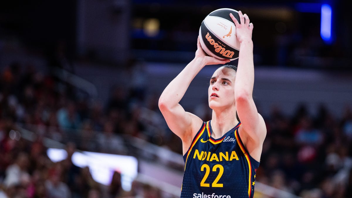
1. Indiana Fever
In full transparency, I had Indiana further down the list. Somewhere in the middle of the pack, until I looked a little deeper. Admittedly, I was not familiar with their game. The blue. The red. The accent yellow. The subtle dots. Oh my gosh. It’s so good.
Then, you’re telling me there are stars I didn’t know I needed down the sides. Please, inject this into my veins right now and take my money, too. And did you see the shorts with the perfect Fever symbol and the matching stars?! I’m in heaven. I’ll be taking no further questions.