
Every now and then I catch myself nodding along to a beat in my head. It’s Nas, If I Ruled the World. And I start to drift.
No, the Suns are never going to wander over and ask me to redesign their uniforms. Thank God, because my graphic design skills hover somewhere between “high school art project” and “PowerPoint clip art enthusiast.” Still, I tinker. I make things for Bright Side readers, slap some colors on a canvas, and dream a little. But clothing design? Uniform design? I’m inept.
And yet I can’t shake the fantasy: what if the Suns actually wore the best uniforms they’ve ever had, all in one season? No gimmicks, no clutter. Just clean, timeless threads that nod to the lineage of this franchise.
If I ruled the world, that’s where I’d start. Imagine that. A set of uniforms that feel new because they’re sharp, but familiar because they remind you of every Suns identity that’s ever mattered. Something pure. Something true.
I saw Canis Hoopus, SB Nation’s Timberwolves site, run with this thought experiment, and it sparked me. So let’s run it. Let’s strip this thing back to its essentials. No Association, no Icon, no marketing-department gobbledygook. I miss the days when we had “home” and “away” and called it good. So here’s my plan: one home, one road, one alternate, and one wild card. Four jerseys to rule them all, four jerseys to carry Suns history forward.
Maybe this is my way of playing dress-up with nostalgia. Maybe it’s my best shot at a “top four Suns jerseys of all time” list. Or maybe it’s just me, nodding along to Nas, trying to create a little order in a world of chaos. Whatever it is, it feels like the right time. A new season is here. A new era waits in the desert. Let’s put it into the ether and see if it sticks.
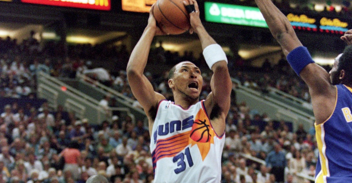
Home Jersey: The White Sunburst
Everyone loves the sunburst. It’s the crown jewel of Suns design, the one jersey that can silence a room. Most people gravitate toward the purple and black versions, and rightfully so. The black, especially, has that aura, that edge.

1994-95: Forward Charles Barkley of the Phoenix Suns looks to pass during a Suns game verus the Detroit Pistons at America West Arena in Phoenix, AZ. (Photo by Icon Sportswire) Icon Sportswire via Getty Images
But me? I find myself coming back to, the one that doesn’t get nearly enough love, is the white.
Yes, the black didn’t arrive until the ’94–95 season, and the purple throwbacks have had their moment in recent years, basking in nostalgia’s glow. It was nice seeing them in the spotlight again during their 30th anniversary in 2022-23. But the white home sunburst? That jersey is clean. It’s sharp. It’s iconic. It’s the kind of uniform that doesn’t need to shout, because its presence is timeless.
If I ruled the Suns’ closet, this is the one they’d pull out every night at home. A statement of identity in its simplest, most elegant form. The desert sun, stitched into white fabric, burning bright without needing the flash.
This fabric deserves more time in the desert light, basking where it belongs. In my world, it wouldn’t be tucked away or treated as nostalgia. It would be out front, gleaming under the arena’s spotlights, finally getting all the shine it has earned.
Away Jersey: The Purple Wild West’s

SACRAMENTO, CA – 1990: Kevin Johnson #7 of the Phoenix Suns dribbles against the Sacramento Kings circa 1990 at Arco Arena in Sacramento, California. NOTE TO USER: User expressly acknowledges and agrees that, by downloading and or using this photograph, User is consenting to the terms and conditions of the Getty Images License Agreement. Mandatory Copyright Notice: Copyright 1990 NBAE (Photo by Rocky Widner/NBAE via Getty Images) NBAE via Getty Images
I’ve never understood why the Suns rebranded away from the Wild West font. Maybe it was inevitable. Every franchise goes through its “new era, new look” phase. But the Suns didn’t need it.
For the better part of their first 25 years, the jerseys barely changed outside of that single font shift, and they didn’t have to. The elongated Wild West script paired with that lighter shade of purple was perfection.
Teams spend decades chasing an iconic look, the kind of uniform that never needs tinkering. Think Yankees. Cowboys. Dodgers. Elegant. Simple. Eternal.
The Wild West jerseys were that for Phoenix. They were the one time “Phoenix” stretched across the chest and looked like it was meant to be there forever.
If I ruled the Suns’ closet, that’s the design I’d resurrect. The iconic look that needed no rebrand, no gimmick. Just timeless identity, stitched in purple and gold.
Alternate Jersey: The Valley

PHOENIX, AZ – MAY 10: Devin Booker #1 of the Phoenix Suns looks on during Game 5 of the 2022 NBA Playoffs Western Conference Semifinals on May 10, 2022 at Footprint Center in Phoenix, Arizona. NOTE TO USER: User expressly acknowledges and agrees that, by downloading and or using this photograph, user is consenting to the terms and conditions of the Getty Images License Agreement. Mandatory Copyright Notice: Copyright 2022 NBAE (Photo by Barry Gossage/NBAE via Getty Images) NBAE via Getty Images
If we’re going to live in a world where alternates are a given, then my pick has to be the Valley City Edition jerseys. They’re back this year, and rightfully so.
First debuted in the 2020–21 season, they became an instant icon. The uniform of a Finals run, the uniform of a 64-win season. That pixelated gradient, wrapping itself into the outline of Camelback Mountain, finally put the desert front and center.
It was the first time the organization fully embraced the Valley it calls home, and they nailed it.
It wasn’t just a jersey. it was a vibe, a movement. Nothing has ever felt more Phoenix than that set. If I ruled the Suns’ closet, it would never leave the rotation. We wouldn’t have to wait for the NBA to run out of ideas and introduce their favorites once again. It’d live here and we’d see it whenever the heck we wanted to.
The Special-Occasion Jersey: 2023-25 Statement Editions

PHOENIX, ARIZONA – FEBRUARY 01: Mikal Bridges #25 of the Phoenix Suns gestures during the game against the Atlanta Hawks at Footprint Center on February 01, 2023 in Phoenix, Arizona. The Hawks beat the Suns 132-100. NOTE TO USER: User expressly acknowledges and agrees that, by downloading and or using this photograph, User is consenting to the terms and conditions of the Getty Images License Agreement. (Photo by Chris Coduto/Getty Images) Getty Images
Another black jersey, yes. But one of the cleanest, sharpest looks this franchise has ever put on hardwood.
Stripped down in the best way: three bold white letters across the chest, numbers kissed with that familiar gradient and trimmed to match. Nothing busy, nothing loud. Just sleek. Iconic. Chef’s kiss? Yes. Chef’s fuggin’ kiss.
Maybe I’m in the minority here. Maybe it’s because these jerseys got dragged through a tumultuous run of mediocrity that their reputation doesn’t shine as bright.
But the uniforms themselves? They stand apart. If I ran the Suns’ closet, these would come out on special occasions: Christmas Day, rivalry nights, marquee showdowns with heavyweights. NBA Cup games? Sure. Why not?
Officially retired, yes. But in my rotation? Absolutely.
Yeah, it’s probably a silly concept. But I realized I hadn’t spilled much ink on uniforms this offseason. You’re welcome. I spared you the deep dive on the new all-black threads with Phoenix stamped across the chest. I held back, let it simmer, saved my energy for this. Because this…this is the chance to let my imagination off the leash. To tell you what would happen if I ruled the world.
What would you do if you ruled the world?