
It is a slow day around Bright Side, the kind of day where you start digging through the corners of the NBA looking for something worth talking about, seeking something that sparks a little curiosity. And here we are. Uniform talk. Always a good lane to wander down.
There are whispers that the Minnesota Timberwolves, Atlanta Hawks, and Houston Rockets are all looking to make updates next season. Nothing official yet, but these are the same channels that had people in Phoenix buzzing before the 2023 refresh, so there is something to it.
And when you look at what Minnesota is doing, it hits a nerve in the best way.
Those original Timberwolves sets, the ones that take you back to the early days, are clean. They are the same set that Isaiah Rider donned while winning the 1994 Slam Dunk Contest. That whole vibe from their 1989 introduction, there is something simple about it. It feels right. Before the late 90s shift into something louder and more complicated, those uniforms had a clarity to them.
They have brought them back in pieces over the years with little throwback runs here and there, but bringing them back full-time feels like a smart play. It taps into memory, it taps into identity, and it gives fans something that feels authentic.

MINNEAPOLIS, MINNESOTA – DECEMBER 30: Anthony Edwards #5 of the Minnesota Timberwolves dribbles the ball against the Los Angeles Lakers in the first quarter at Target Center on December 30, 2023 in Minneapolis, Minnesota. The Timberwolves defeated the Lakers 108-106. NOTE TO USER: User expressly acknowledges and agrees that, by downloading and or using this photograph, User is consenting to the terms and conditions of the Getty Images License Agreement. (Photo by David Berding/Getty Images) Getty Images
And yeah, there is a little jealousy there. Because I look at that and immediately think about the Phoenix Suns. The recent refresh the organaization did has been solid. Bringing back the Sunburst, tying in elements of the past, it all works. It looks good. No complaints. But there is another look that lives in the back of my mind, one that never really leaves.
Those Wild West uniforms.
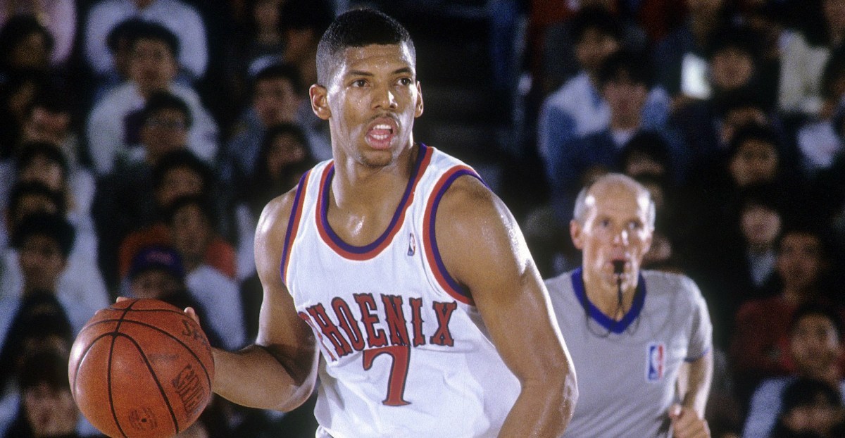
When Phoenix arrived in 1968, their original uniforms had ‘Phoenix’ written across the chest in a sans font. But after the 1972-73 season, the team made a subtle tweak that was a stroke of genius. They morphed the sans into a western font that stretched across the chest, with the names on the back in that same style. It was simple and unmistakable. It was not trying too hard. It did not need to. There is elegance in that simplicity, and the Wild West unis had balance that feels natural when you look at it. Not loud, not muted, but right in that space where it sticks with you. And very Phoenix.

LANDOVER, MD – CIRCA 1978: Paul Westphal #44 of the Phoenix Suns looks to make a pass against the Washington Bullets during an NBA basketball game circa 1978 at the Capital Centre in Landover Maryland. Westphal played for the Suns from 1975-77. (Photo by Focus on Sport/Getty Images) Getty Images
The team wore them until the introduction of the Sunburst in 1992. We had nearly 20 years of Wild West, the look that lasted the longest in the Valley.
I caught a glimpse of it again this past weekend as I was watching the NCAA Tournament. It was St. John’s Red Storm against the Kansas Jayhawks. Both teams were running that western-style font across the chest, and it pulled me right back. It reminded me how good that look can be when it is done right. You see it with the New York Yankees, the Los Angeles Dodgers, the Dallas Cowboys, and the Los Angeles Lakers. They find something that works, and they stay there. They build identity through consistency. The Suns had that once. It is still there in the archives, still there in the highlights, still there in the memory.
One thing that does catch me off guard in this era of uniform overload, with statement editions and city editions dropping every season, is how little the Phoenix Suns have leaned into the Wild West font. It is sitting right there. It is part of the DNA of the franchise. And yet, it barely shows up.
Yeah, last season you had “The Valley” City Edition uniforms in that style, and it looked clean, although the “The” above “Valley” wasn’t something I was fond of. But the last time we saw “Phoenix” in that Wild West look was 2015-16, and it came on those gray sleeved uniforms that never really landed. The design felt forced, the sleeves felt unnecessary, and it buried what should have been the focal point.

PHOENIX, AZ – FEBRUARY 25: Ronnie Price #14 of the Phoenix Suns drives up the court against the Brooklyn Nets during the game on February 25, 2016 at Talking Stick Resort Arena in Phoenix, Arizona. NOTE TO USER: User expressly acknowledges and agrees that, by downloading and or using this Photograph, user is consenting to the terms and conditions of the Getty Images License Agreement. Mandatory Copyright Notice: Copyright 2016 NBAE (Photo by Barry Gossage/NBAE via Getty Images) NBAE via Getty Images
That is what makes it so puzzling. In a time where teams are constantly searching for identity through design, constantly pushing new looks, new colorways, and new concepts, the Suns have a built-in answer. That font carried the franchise for two decades. It is recognizable, it’s tied to the history, and it connects generations of fans without needing an explanation.
And yet it sits on the shelf.
You would think with all the resources, all the marketing muscle, all the attention to brand storytelling, they would tap into something that already resonates. Something that already feels like Phoenix. Not as a one-off, not as a nod, but as a real part of the rotation. Because sometimes the strongest move is not creating something new, it is bringing something back that never needed fixing in the first place.
So yeah, credit to Minnesota. It is a sharp move. Nostalgia hits, fans connect, and with modern design and marketing layered on top, it opens the door for some really clean merchandise. If I were a Timberwolves fan, I would be all in on it.
The Hawks’ dipping back into the Hawk across the chest look follows that same path. Lean into what worked, remind people of what made it stick in the first place. There is a reason those designs linger. While the Mutumbo era uniforms will not be a full-on rebrand like Minnesota, it’ll be nice to see them on the court.
Then you get to Houston, and it feels like more of the same. The Rockets have never quite found that signature look. There have been moments, flashes, but nothing that settles in. Even the 90s shift with the pinstripes felt off, a little late to the party, a little too much going on. Some teams never quite land on it.
Which is why I keep coming back to Phoenix. There is a version of this franchise that already figured it out. That clean, Wild West font, orange on purple with a white stroke or orange on white with a purple stroke; it’s simple and strong. Ah, if we only knew how good we had it as kids. Youth is truly wasted on the young.
Maybe one day it will come back in full. Maybe one day they will lean into that identity again. Because sometimes the best move is not to reinvent anything. It is to remember what already worked and let it live again. Mr. Ishbia, please make it so.