
The Orlando Magic are releasing their long-awaited rebrand today. A new logo and three new jerseys include “the star” symbol that was prominent in the team’s ’90s and early 2000s designs. The franchise’s colors remain its traditional blue, black and silver. Thoughts, anyone?
— Josh Robbins (@joshrobbins.bsky.social) 2025-06-03T14:07:05.109Z
Using nostalgia on sports fans is such a dangerous game for teams out there. Especially when dealing with uniforms.
As sports fans, these things are precious to us. Even the slightest differentiation from the thing that we grew up loving will infuriate scores of people. Those feelings are so ridiculous and stupid. They probably shouldn’t matter that much. But those feelings are also exactly what make us the sports fans that we are.
So, with that in mind, I must say the Orlando Magic seem to have completely lost the plot with their new uniforms. The team unveiled new threads and a new court on Tuesday.
I have…thoughts.
“A modern classic,” says everything you need to know about these new Magic uniforms. It’s very clear what Orlando is going for with these. The team wanted to recreate the look of the Shaquille O’Neal-Penny Hardaway Orlando Magic without actually bringing it back.
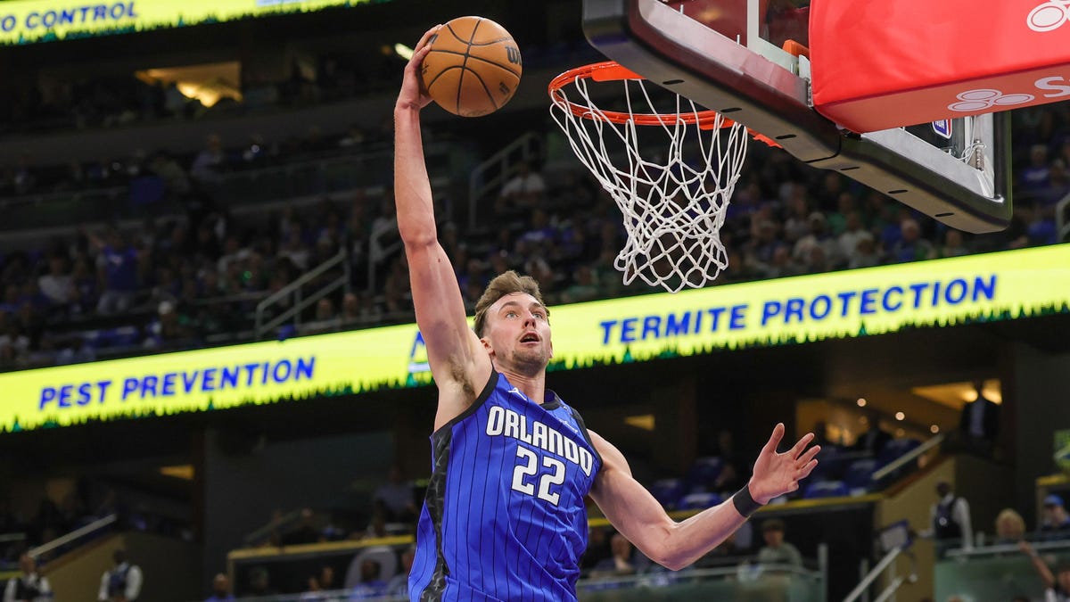
The look features the star at the center of the team’s logo, pinstripes, and white and blue uniforms for home and away colors.
The home and away white and blue joints are just…fine. They’re not the Shaq and Penny joints, but they hold up on their own. It’s the alternate uniform that just feels icky.
This jersey feels like an amalgamation of every look the Magic have had through the last three decades. It’s solid at the top and underscored by a sash with the Magic logo in it, followed by pinstripes the rest of the way. This uniform is doing a lot — and not in a good maximalist sort of way. It almost feels like Orlando couldn’t decide what look it wanted to go with so it chose every single one.
And this is precisely the problem that arises with the concept of a “modern classic.” There’s really no such thing. Something can be modern. Something can be a classic. But it’s almost impossible for something to be both.
It’s possible to create modern uniforms that build upon foundational designs from the past. It’s also reasonable to do 1-to-1 replications of looks from the past, too — that’s why Hardwood Classic jerseys are a thing. Nostalgia is always a good strategy. But when you try to mix the two into something that doesn’t really make much sense, you tend to get a mess that nobody really cares for.
That’s what these new Magic uniforms feel like. Maybe they grow on people with time. Maybe they’ll look better as the team continues to play in them. We’ll see.
But, right now? Man. Just bring back the ’90s jerseys and give the people what they want, Magic.