
Dear Chevron,
It’s been five years since you took over. Those five years have been, well, not ideal.
I know, of course, that the team’s downward trajectory throughout your tenure has not been your doing.
Advertisement
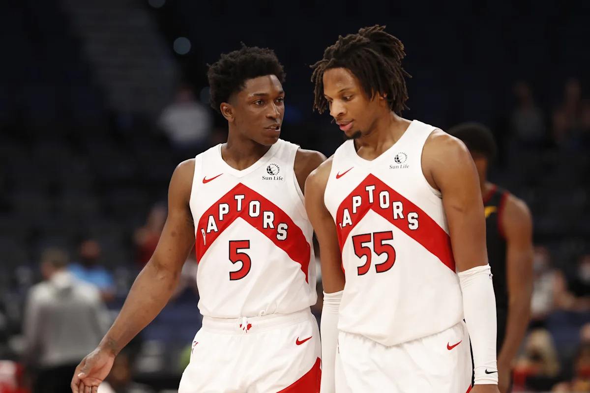
You did not draft Malachi Flynn over Desmond Bane, nor did you convince Fred VanVleet to take the money in Houston.
You did not force the team to relocate temporarily to Tampa, just as you got your promotion to the primary jerseys. No, you did not hold onto Pascal Siakam too long, only to trade him as his value tanked ahead of his impending free agency. And it was by no fault of your own that the team’s championship core, built to win in 2019, had aged and mostly left Toronto within a couple years. These things were not, in fact, your fault.
And yet it cannot be helped that these things happened under your watch. Just as you were immortalized by Game 6 in 2019 at Oracle Arena, you’ve also become inseparable from the subsequent plunge into play-in jostling and lottery simulators.
I know what you’re thinking: Those 1995-’99 Raptors had far less success than we’ve had the last five years. Why don’t those uniforms have a stink to them?
Advertisement
The answer is simple, if not slightly cruel: Those jerseys were nice. They look cool, even on a losing team. They ooze nostalgia. To be radically transparent, you fit none of those criteria.
You look clunky. A red jersey with a black chevron containing red lettering with white outlines — it’s just too damn busy. The purple dino jerseys evoke the ‘90s and the charm of an upstart franchise. You evoke a multinational oil and gas corporation.
You’ve had your moments, in fairness.
Like many of the Raptors’ homegrown players in the mid-2010s, you, too, started off as a project. You were much smaller when you graced the sides of the uniforms dating back to the 1999-’00 Vince Carter dunk contest jerseys, and all the way through the Bosh, Bargnani and early Lowry/DeRozan eras. You’d pointed downwards originally. But in 2015 they flipped you upside down because, well, We the North.
Advertisement
By 2017 you were given your first starring role on a jersey. It was a black jersey with a gold chevron across the chest, the word “NORTH” written in black — clean, simple and a nice use of the OVO colors.
The following year they added the same thing but in white, as well as the red-and-white “NORTH” jersey that looks like a Canadian flag — which the team wore when it clinched the NBA championship.
It was that happy memory, I think, that inspired the team to promote you from an alternate look to the team’s visual identity, from its jerseys all the way to the Raptors’ court design. And for that memory alone, you will always have a place in the Raptors’ greatest moments.
But years of mediocrity have tested people’s faith in you. The team even moved away from the court in a quiet admission that there is, in fact, such a thing as “too much chevron.”
Advertisement
For me, “too much” chevron is when it’s featured on anything more than an alternate jersey. Fair or not, your goofy-looking shape is seared in my brain with images of Aron Baynes push shots and Vision 6’9 lineups held scoreless for minutes at a time.
It’s time to move on.
Sure, I admire your uniqueness. I honestly can’t come up with a single team in NBA history who’s worn a jersey that so prominently features the chevron.
But maybe all those teams were onto something.