What do the Buffalo Bills and Paris Saint-Germain have in common?
Until PSG won the Champions League in 2025, both teams had been on the cusp of winning the biggest prize in their respective sports, but kept falling short. Now, a jersey also ties the two entities together.
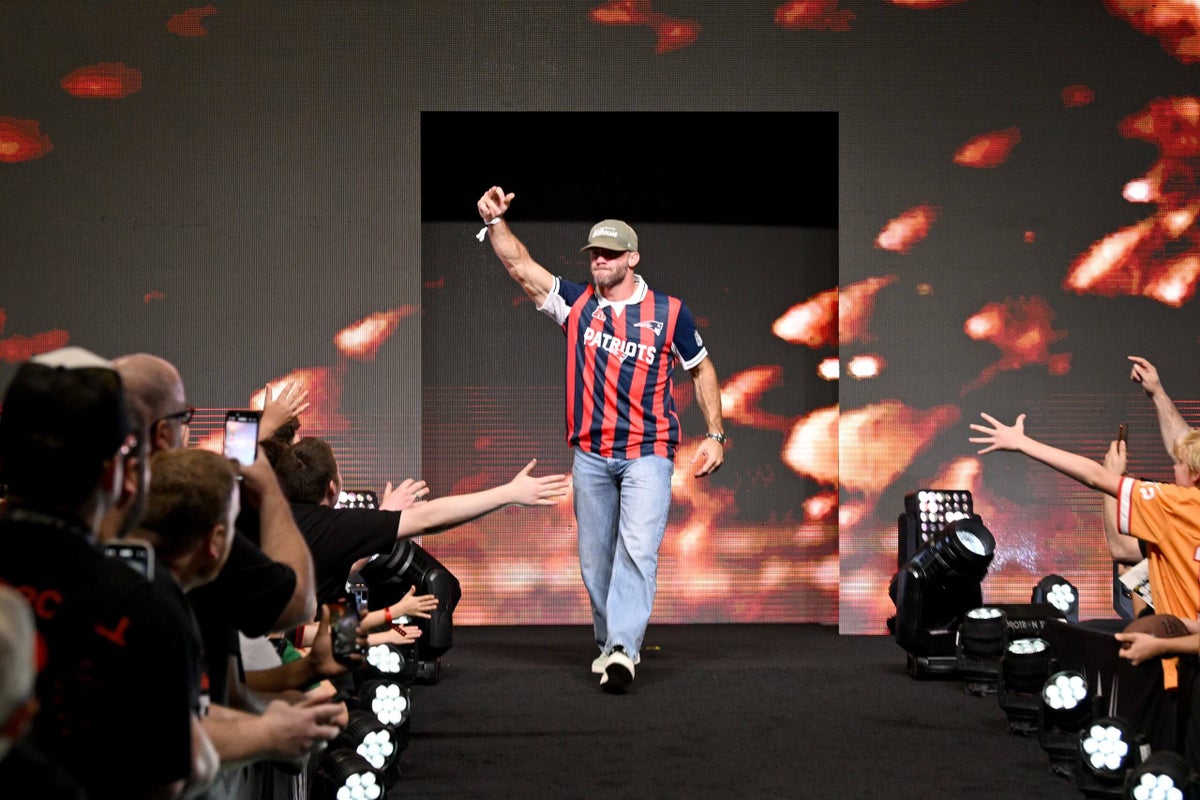
Fanatics have released a ‘Football Meets Football’ collaboration with a Bills top that looks very similar to the strip PSG wore in the 1998/99 season, when Jay-Jay Okocha was on their books. First made available exclusively at Fanatics Fest in New York City over the summer, the shirts were given a wider release on Friday, priced at $100 each, through the Fanatics and NFL Shop websites.
They were also available at a pop-up store in Dublin, Ireland over the weekend for the Pittsburgh Steelers vs. Minnesota Vikings game played in the city. Next year, a second edition will be released, but those will be inspired by national team kits in honor of the 2026 World Cup.
There are 32 of the crossover kits in total that aim to combine soccer and NFL culture, so we decided to put together a light-hearted ranking of them. If you disagree with our order, have your say in the comments below!
32 – New York Jets
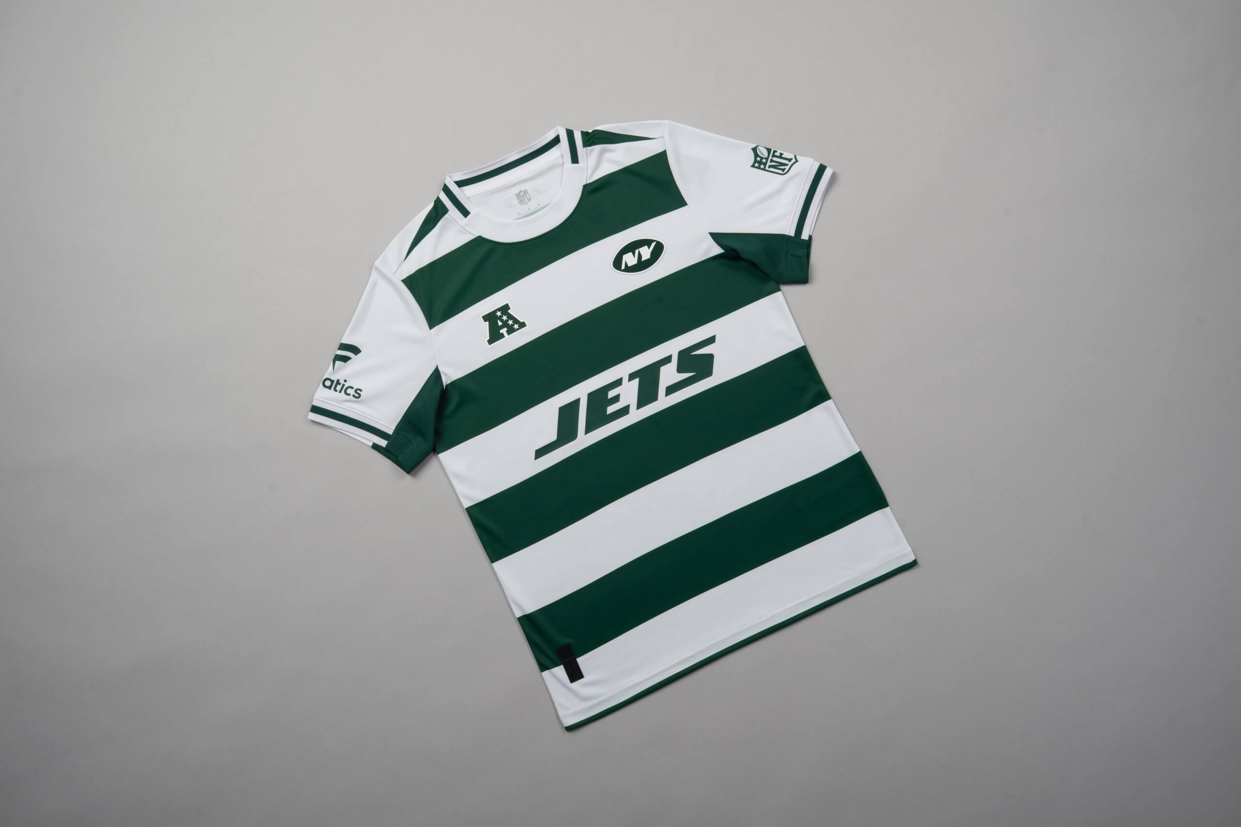
Someone had to finish last and in the end, that honour goes to the Jets.
This jersey, which is inspired by Celtic FC’s famous hoops, has the vibe of a Christmas gift a relative bought for you that you only wear when you’re going for a run and have an extra layer on top to cover it up. But I suppose that shame is consistent with any Jets shirt.
31 – Denver Broncos
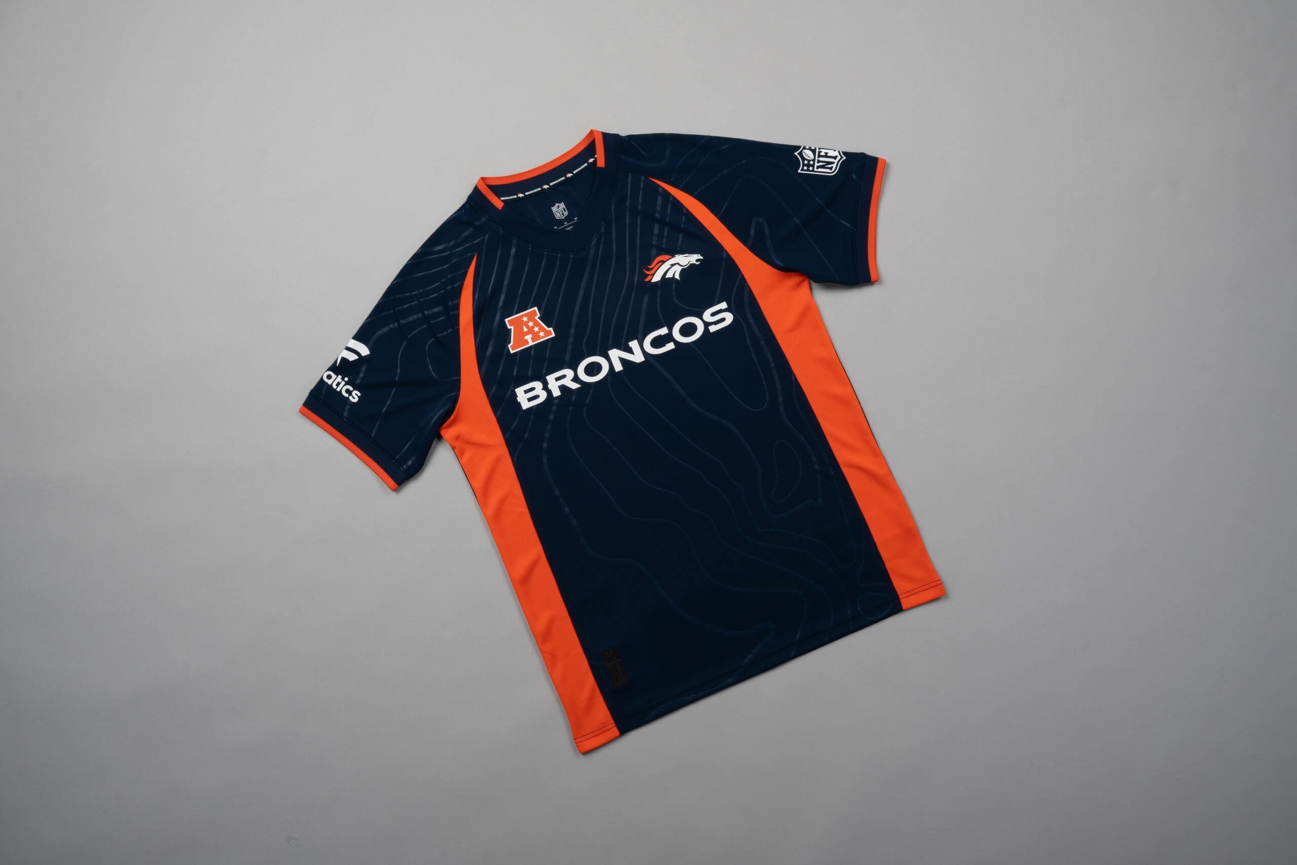
I’m not really sure what this jersey is trying to be. The map contour lines on the upper section are a bit too geography textbook-ish for my liking.
The famous Broncos-themed orange stripes down the side are… something. Overall, it’s not terrible, but given the quality of the other designs on the list, it could rank no higher than second-last.
30 – Atlanta Falcons
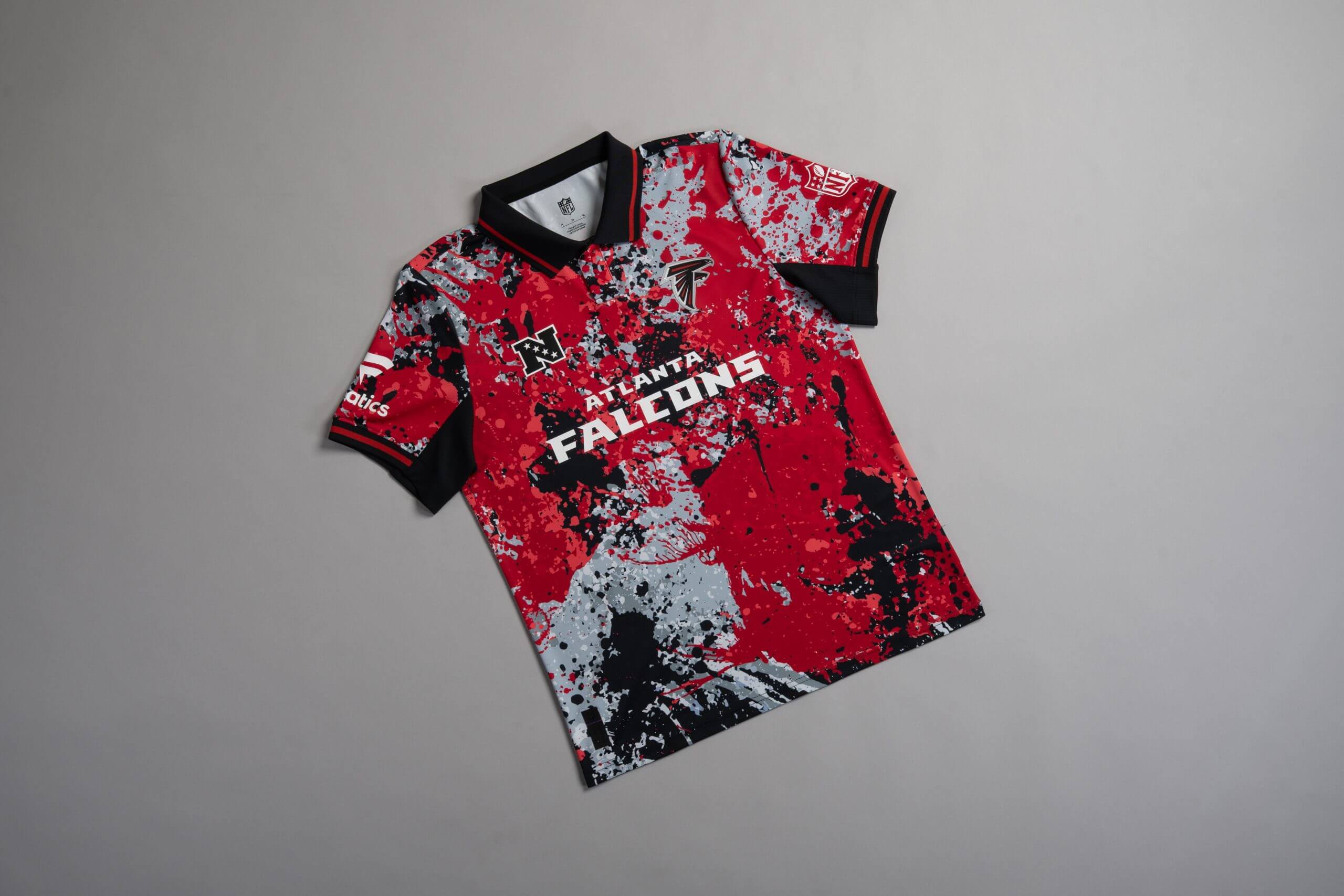
We have reached the first of many kits that could reasonably be considered a top-10 or bottom-10 selection.
This kits reminds me of an annoying painting in an art museum. The type where the person next to you says they see the ‘deeper meaning’, but you stand there looking at a random splatter of paint on a canvas while feeling very confused.
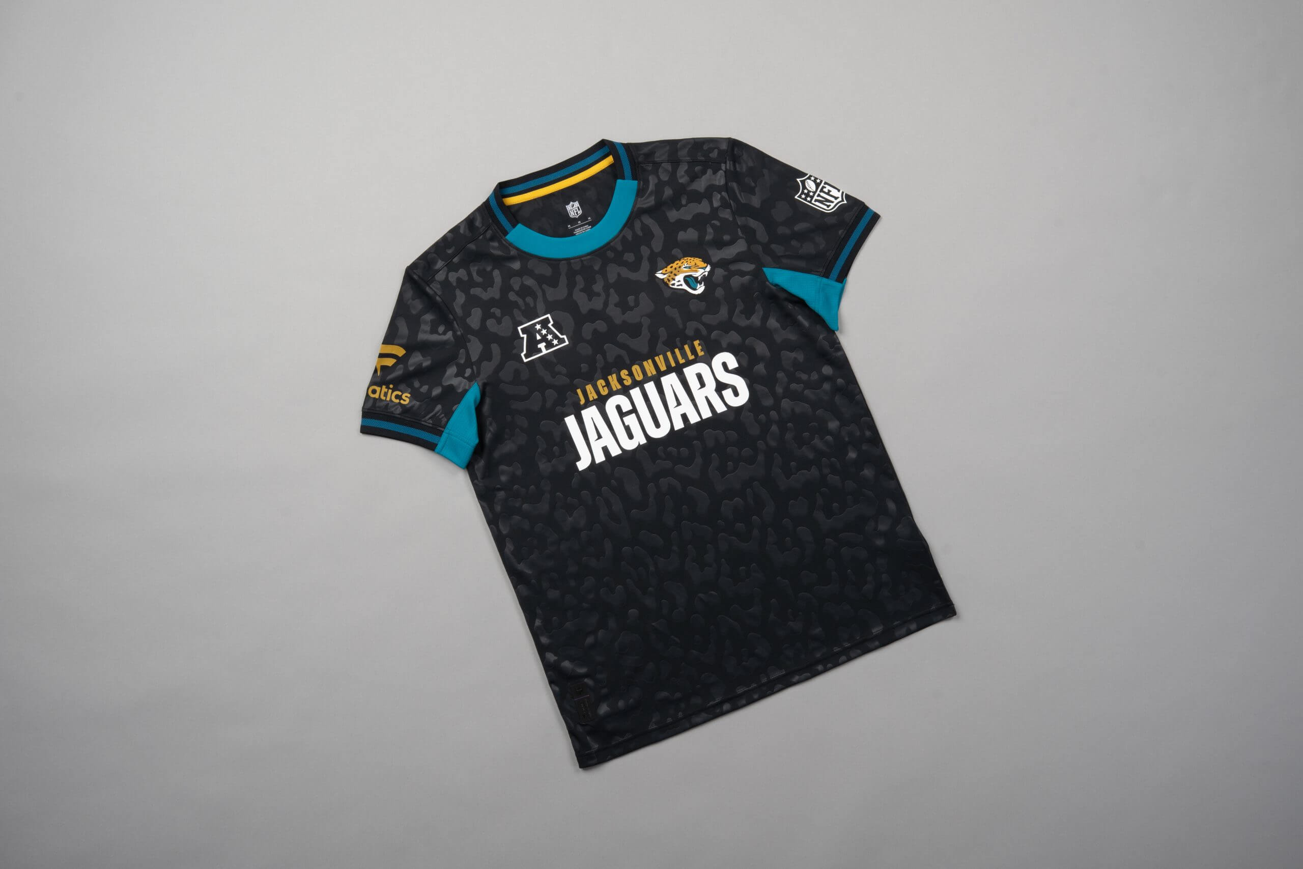
29 – Jacksonville Jaguars
I don’t mind the sublimated jaguar spots style here, but it looks like the air bubbles that are produced when you put a screen protector on your phone and can’t quite get a smooth fit.
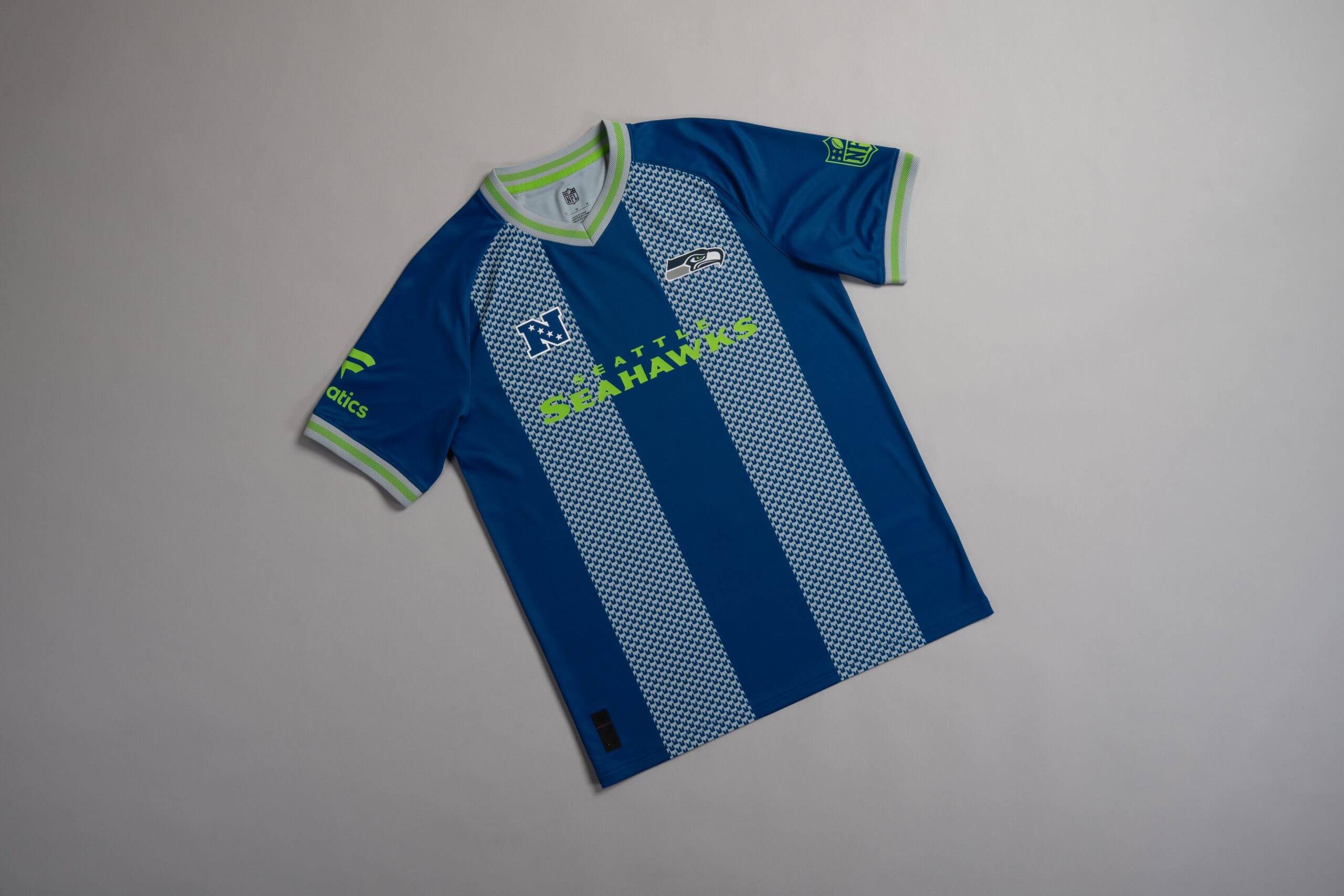
28 – Seattle Seahawks
The green and grey sleeve detail looks good, as does the collar, but the two stripes in the middle look like the curtains at my grandma’s house. Or as if the shirt was run over by a van.
The Seahawks have popularised the navy blue and lime green combination, which is stylish, but I can’t look past the two random strips of knitwear in the middle of an otherwise decent design.
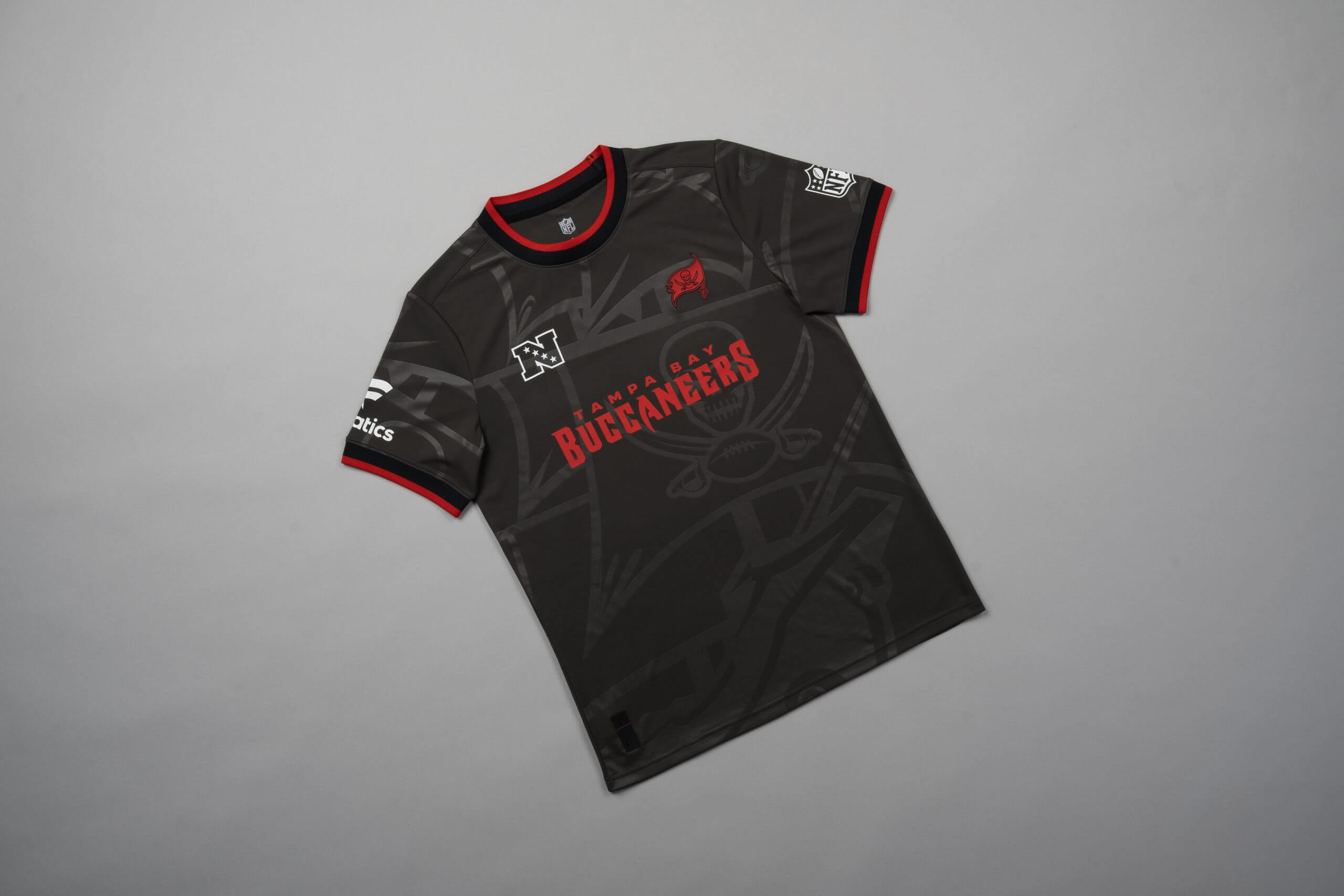
27 – Tampa Bay Buccaneers
Given the colors and theme the Bucs offer, this one just doesn’t quite live up to expectations. There has to be a better way to execute a pirate ship design on a shirt.
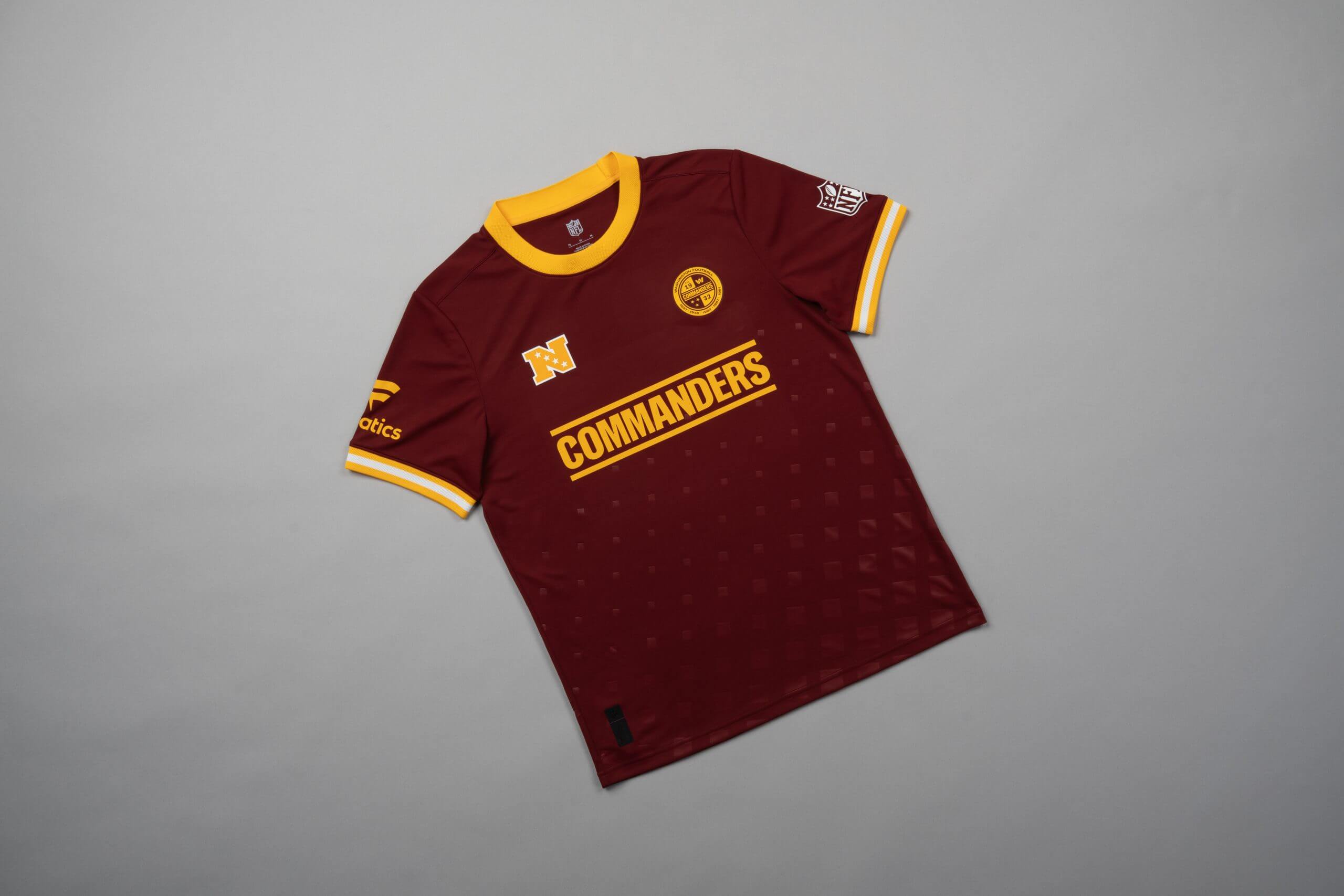
26 – Washington Commanders
If I was an art critic I would say the dots that start in the middle of the design and gradually get bigger are indicative of Jayden Daniels’ rookie season starting well and ending in a huge way.
But I am not an art critic and that would be a massive reach. So instead I’ll point out that it looks a bit Windows 95.
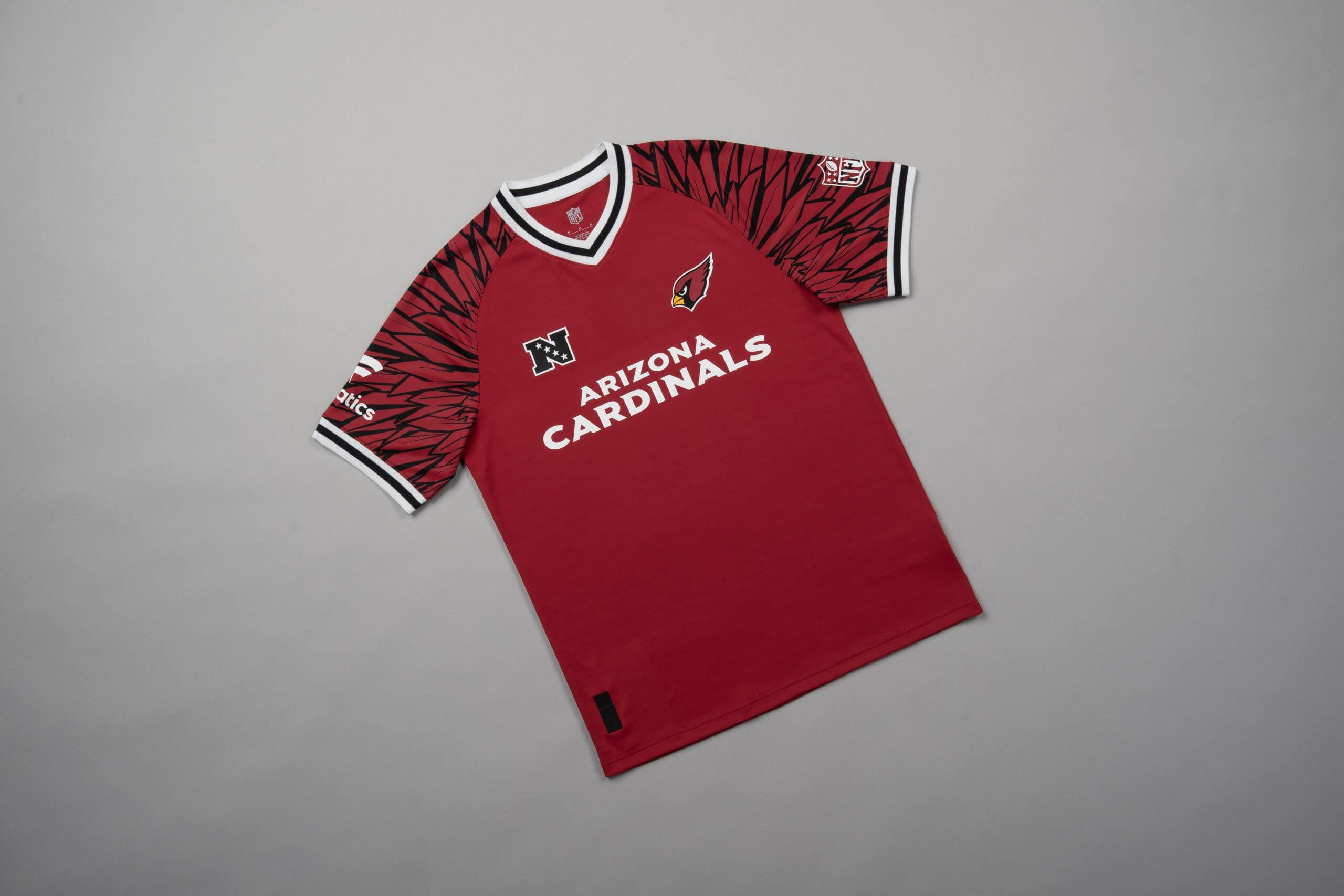
25 – Arizona Cardinals
Have you ever watched a sitcom and one of the later episodes in the season is just a collection of flashbacks from earlier episodes, because they ran out of budget? That’s how this feels.
I doubt budget was actually an issue here, and to be fair, it does feature the feathers of the northern cardinal, the bird on Arizona’s crest, but it feels a little incomplete.
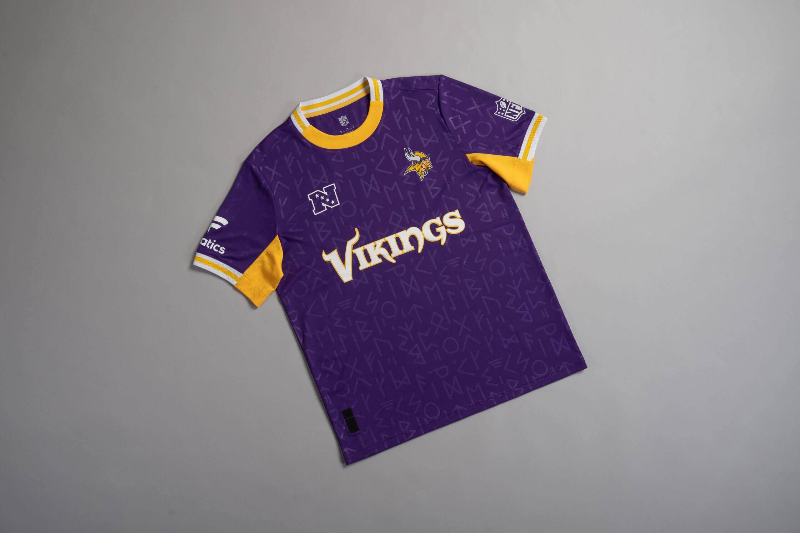
24 – Minnesota Vikings
If I wore this while I was out shopping, people might think I am communicating in code with another member of the public who I wish to relay a message to but not in a way that is overtly obvious to those around us.
That’s not really my vibe, but it may be yours, so you may have this higher in your own personal ranking.
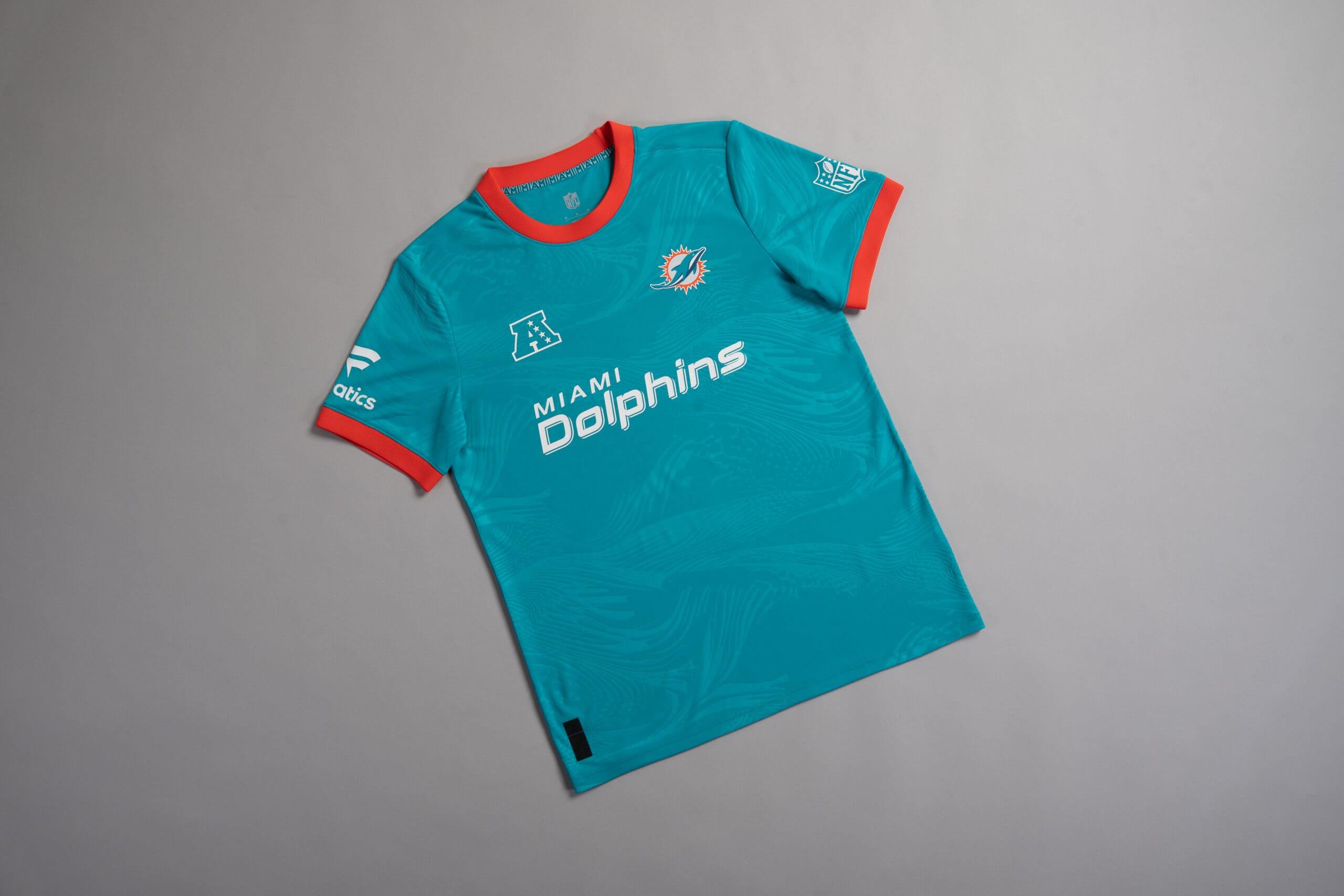
23 – Miami Dolphins
The wave effect is nice, but the collar and sleeves design isn’t quite doing it for me. The orange colour scheme just feels a little bit too abrupt.
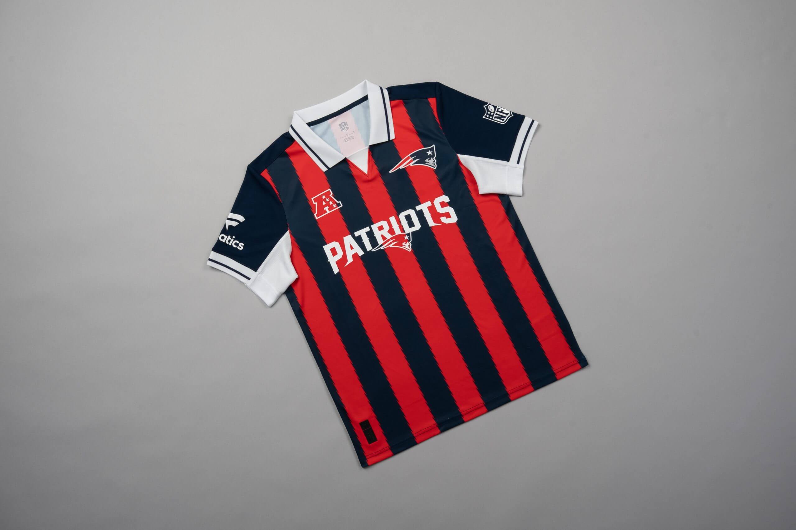
22 – New England Patriots
I have a pet peeve with designs that feature a striped pattern on the body of something a like t-shirt or hoodie, but not on the arms.
The blue line on both the collar and sleeves is a nice touch in what looks like a design inspired by Italian soccer team AC Milan, but the disconnect between the middle of the shirt and the sleeves limits its potential.
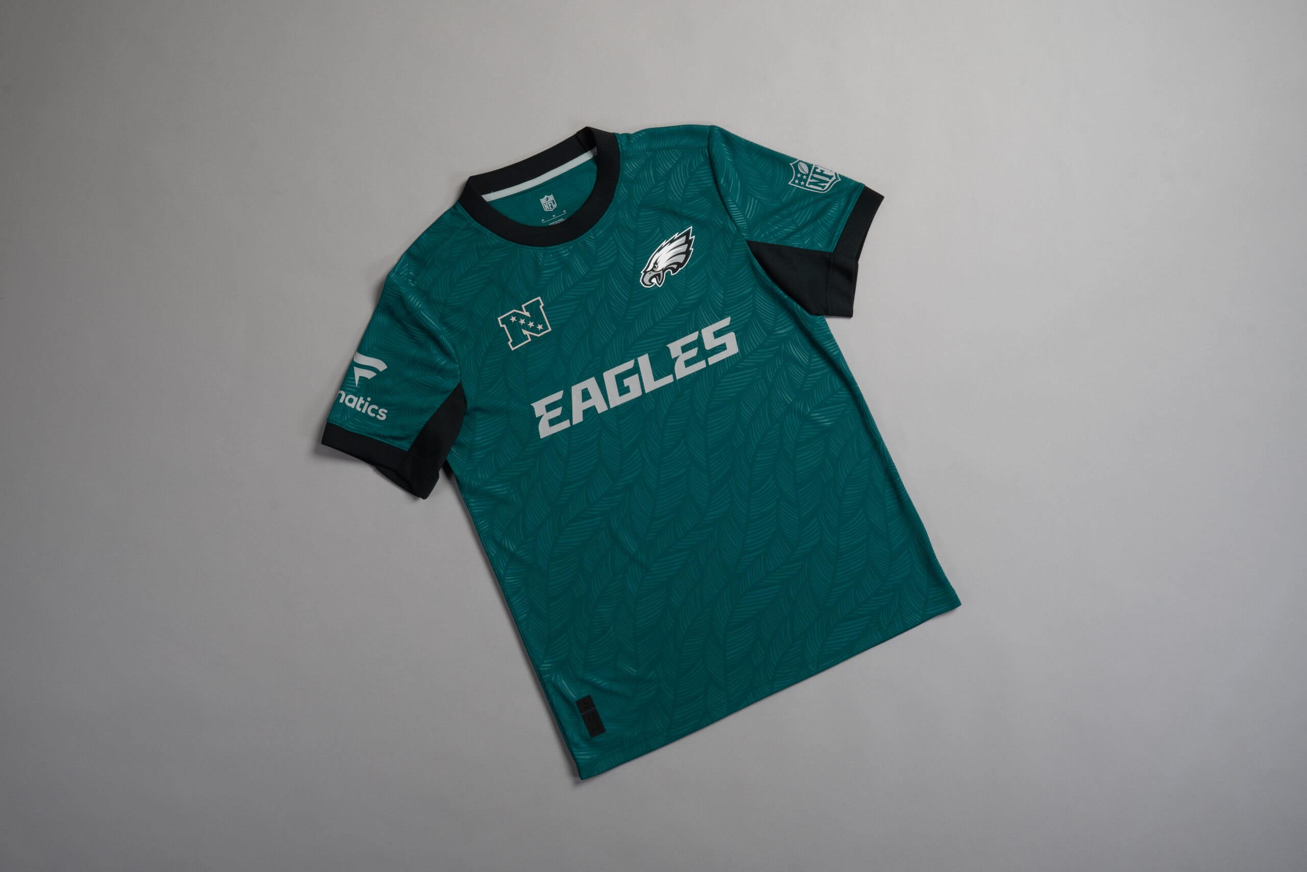
21 – Philadelphia Eagles
This offering doesn’t really feel make me feel much when I look at it.
I don’t massively dislike it, at the same time, I wouldn’t ask my boss for an advance to try and fund the purchase either. It’s okay, nothing more, nothing less.
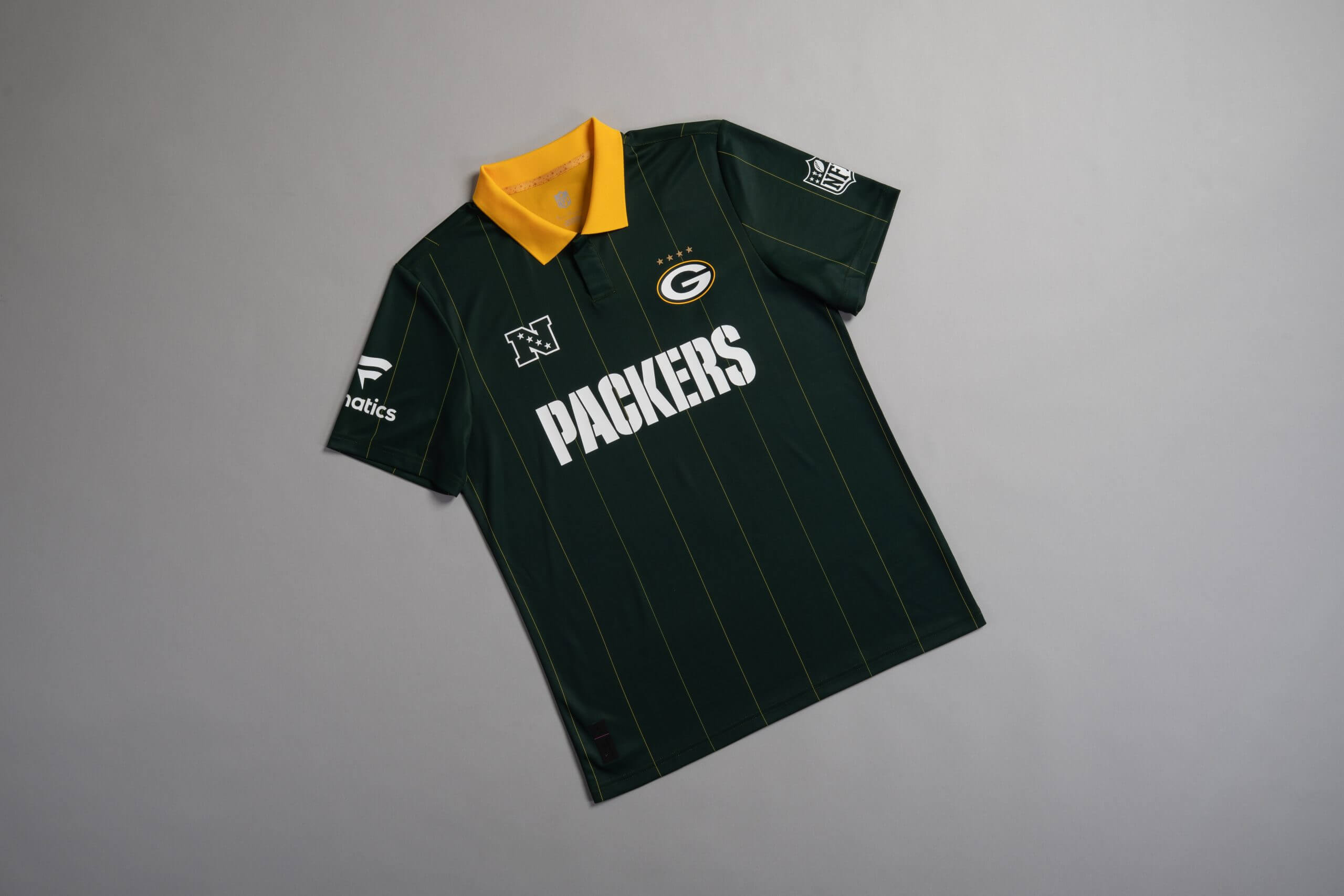
20 – Green Bay Packers
I am pretty sure I’d feel like a referee if I wore this while I was out and about. I’ll be waiting for the bus and then the next thing you know, I’m officiating the queue and checking tickets for no reason.
The design is bold. It takes guts to deviate from the norm, with the norm for a lot of these jerseys being that the collar has the same colour as the end of the sleeves. This piece of work has my respect, but I can’t rank it higher than 20th.
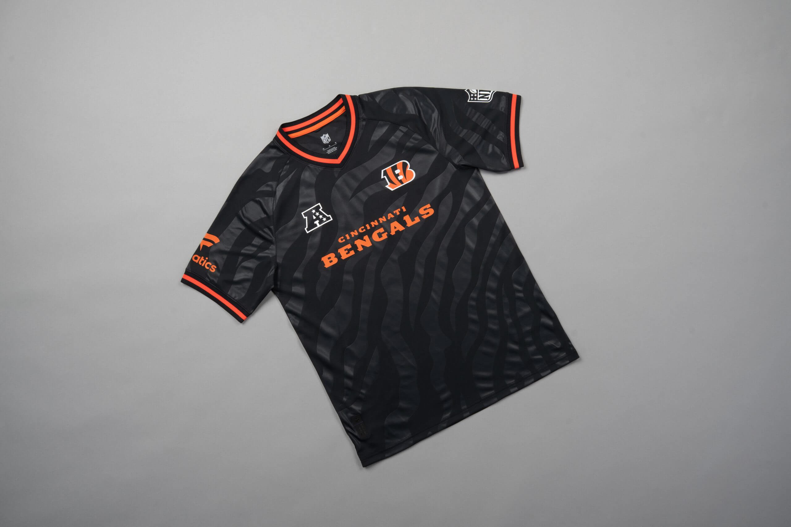
19 – Cincinnati Bengals
The Bengal tiger stripes are decent, but no more than serviceable in my opinion.
The jersey gives me the same feeling I get when I buy some hot food from a convenience store. Solid, but not spectacular.
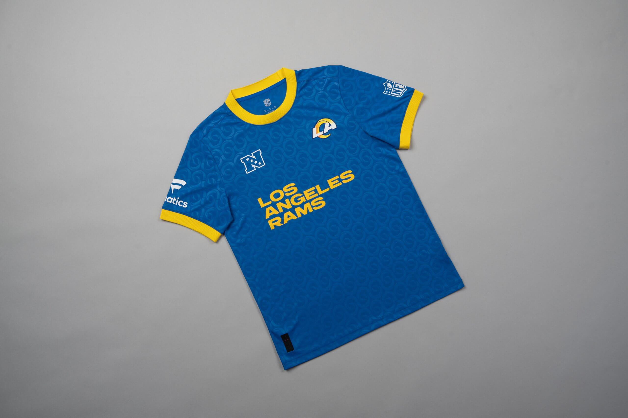
18 – Los Angeles Rams
This particular design makes me hungry. I saw the swirly horns, which are a nod towards the Rams’ branding, in the background, and started to think about cinnamon rolls.
For reasons that can only be described as scientific, accurate and valid, I have given this design a lower ranking simply because I’m trying to eat healthy and this isn’t helping.
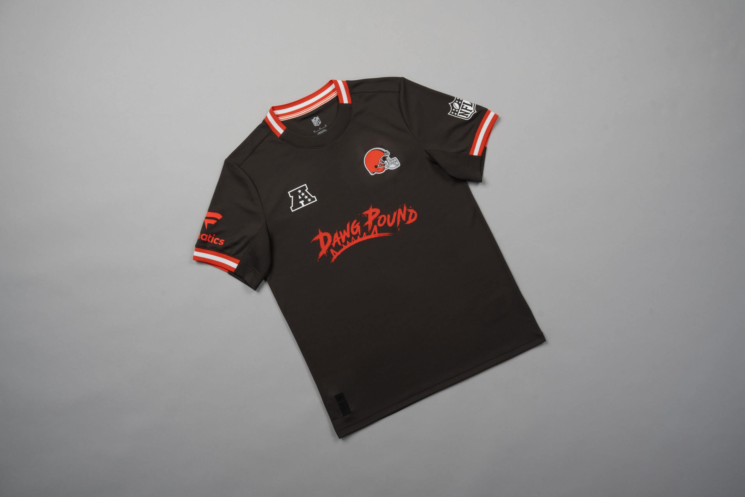
17 – Cleveland Browns
Part of me thinks the Browns jersey should be ranked much higher. It’s a little boring but at the same time, it’s somewhat classy.
Let me know in the comments how accurate or terribly wrong this is, because I can’t work out if #17 is the right spot, five spots too low or five spots too high.
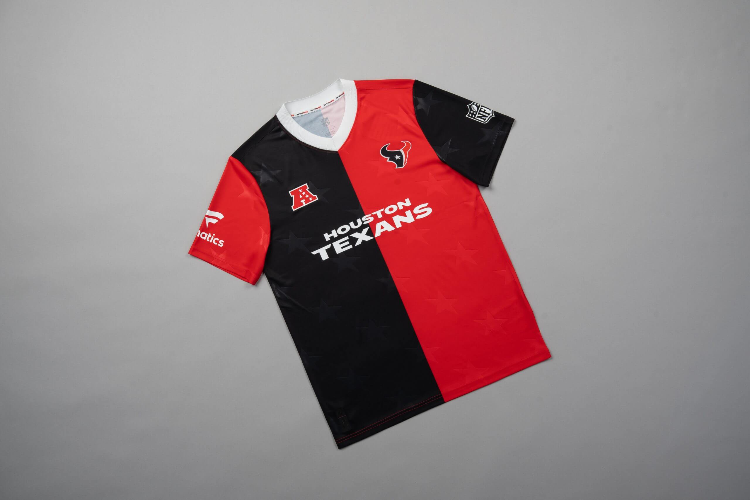
16 – Houston Texans
We are now at the halfway point.
If I chose to pursue a career in tenpin bowling, I reckon I’d wear something like this. Having said that, it’s still a nice item of clothing.
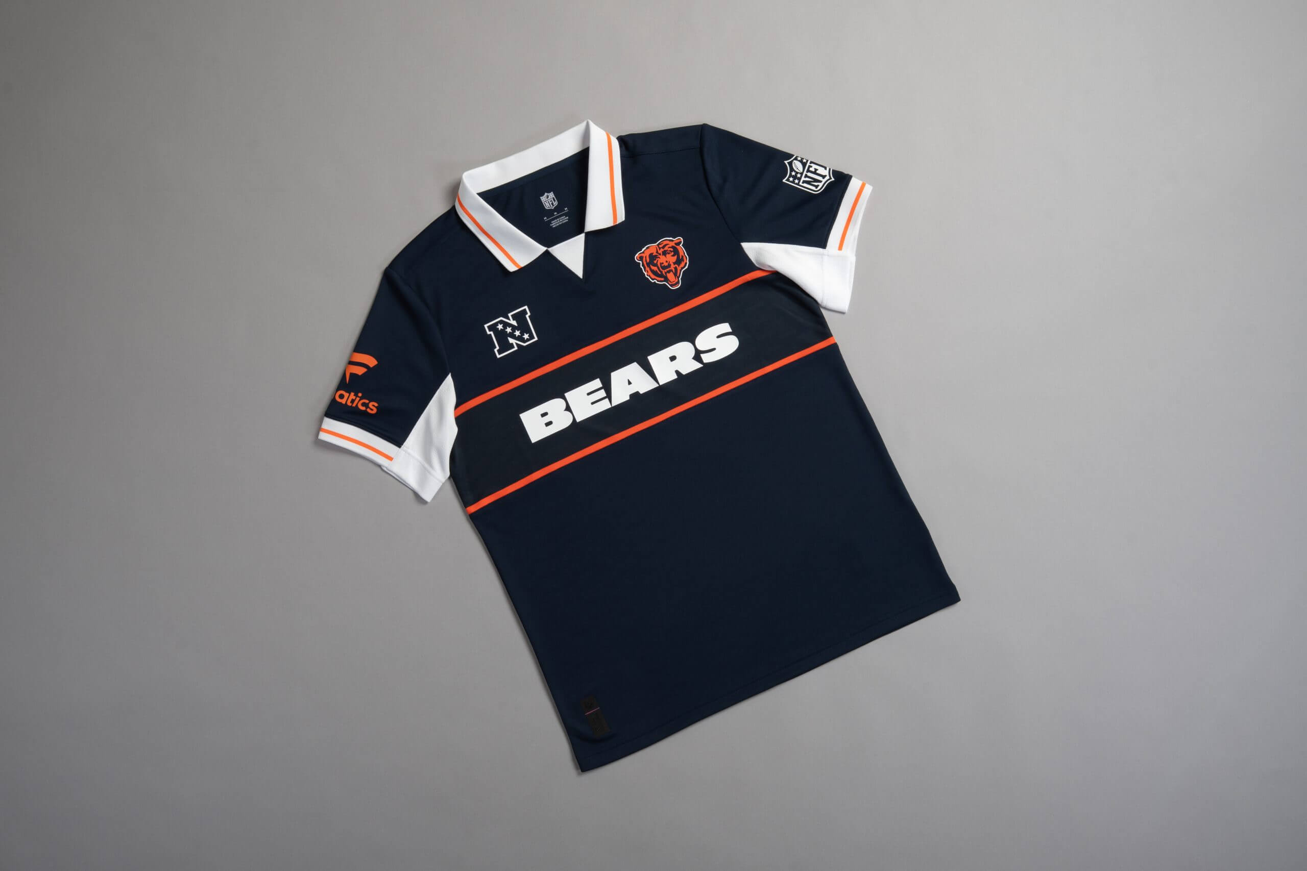
15 – Chicago Bears
The Bears’ offering is modelled after the jumper (sweater) that legendary Bears head coach Mike Ditka used to wear during his time as head coach in the 1980s and early 1990s.
It’s a classy design with a storied history. The two lines that house the Bears wording has a no nonsense aura about it, just like the Bears’ defence back in the day.
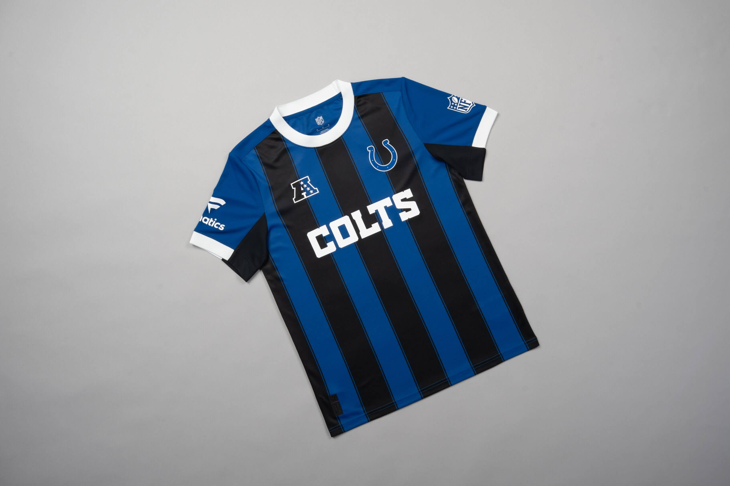
14 – Indianapolis Colts
Champions League runners-up Inter are known for having a famous blue and black kit. The decision to go down the same route for the Colts was commendable.
You’ll notice the AFC logo is also both blue and black and that subtlety isn’t lost here. But it’s also not providing the wow-factor some of the other designs do.
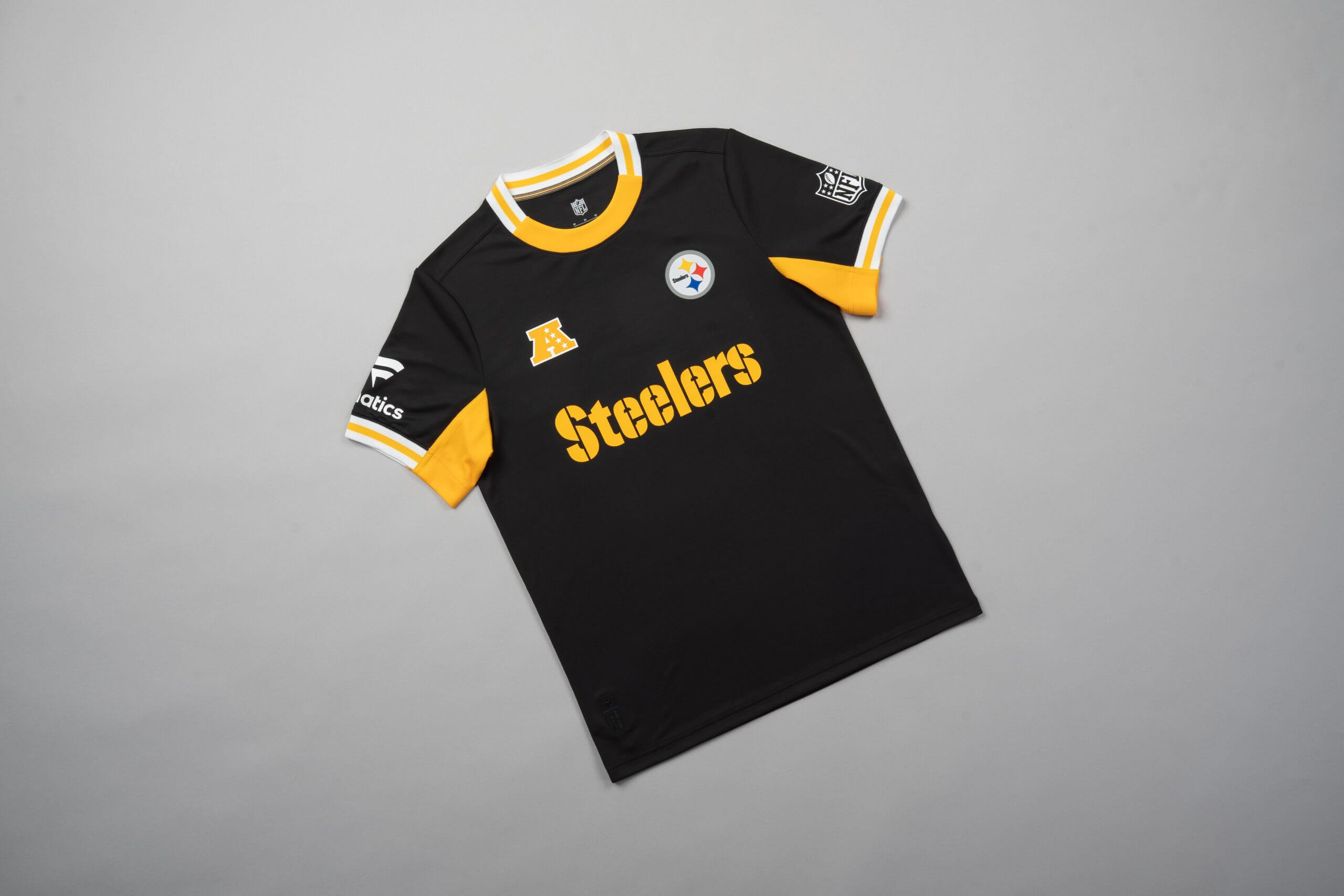
13 – Pittsburgh Steelers
This jersey is a strong representation of how the Steelers franchise has performed in the post-season in the past decade. They are a good team but one who don’t seem to make much noise when the lights are brightest.
It’s a well-put together jersey, but it’s not so good that someone would ask you to AirDrop them a link to it at a party.
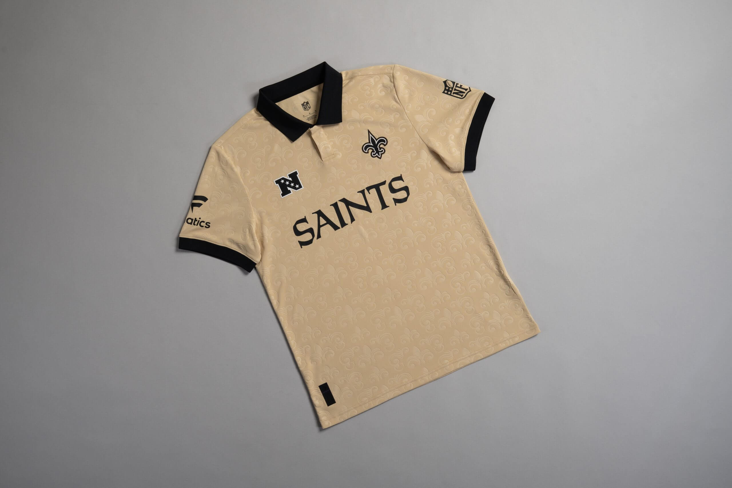
12 – New Orleans Saints
If the two strips on the Seahawks jersey remind me of the curtains at my grandma’s house, then the fleur-de-lis design on this Saints jersey remind me of a table cloth I would expect to find at a friend’s house who is far richer than me.
The simplicity of a gold backdrop with subtle hints of black is impressive. It’s a bit too on the side of being a pointless table accessory for me to rank it any higher, but it’s a solid design.
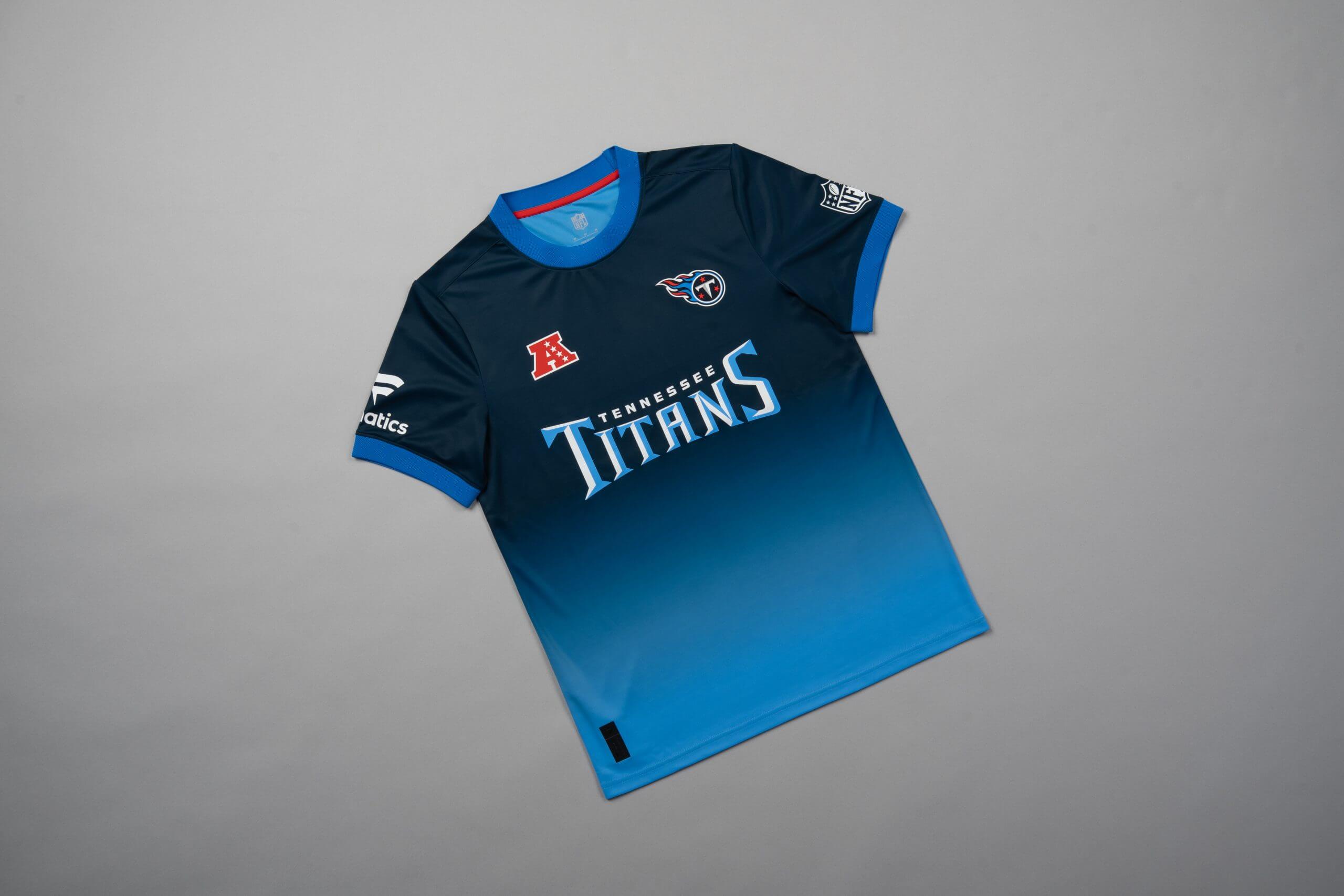
11 – Tennessee Titans
This will be one of the more controversial picks. To some, this is a brilliant faded design that mixes two shades of blue really well.
To others, it looks like the bottom half of the design has annoyingly faded away in the washing machine. For me, it works, but I’d understand if you have this ranked lower.
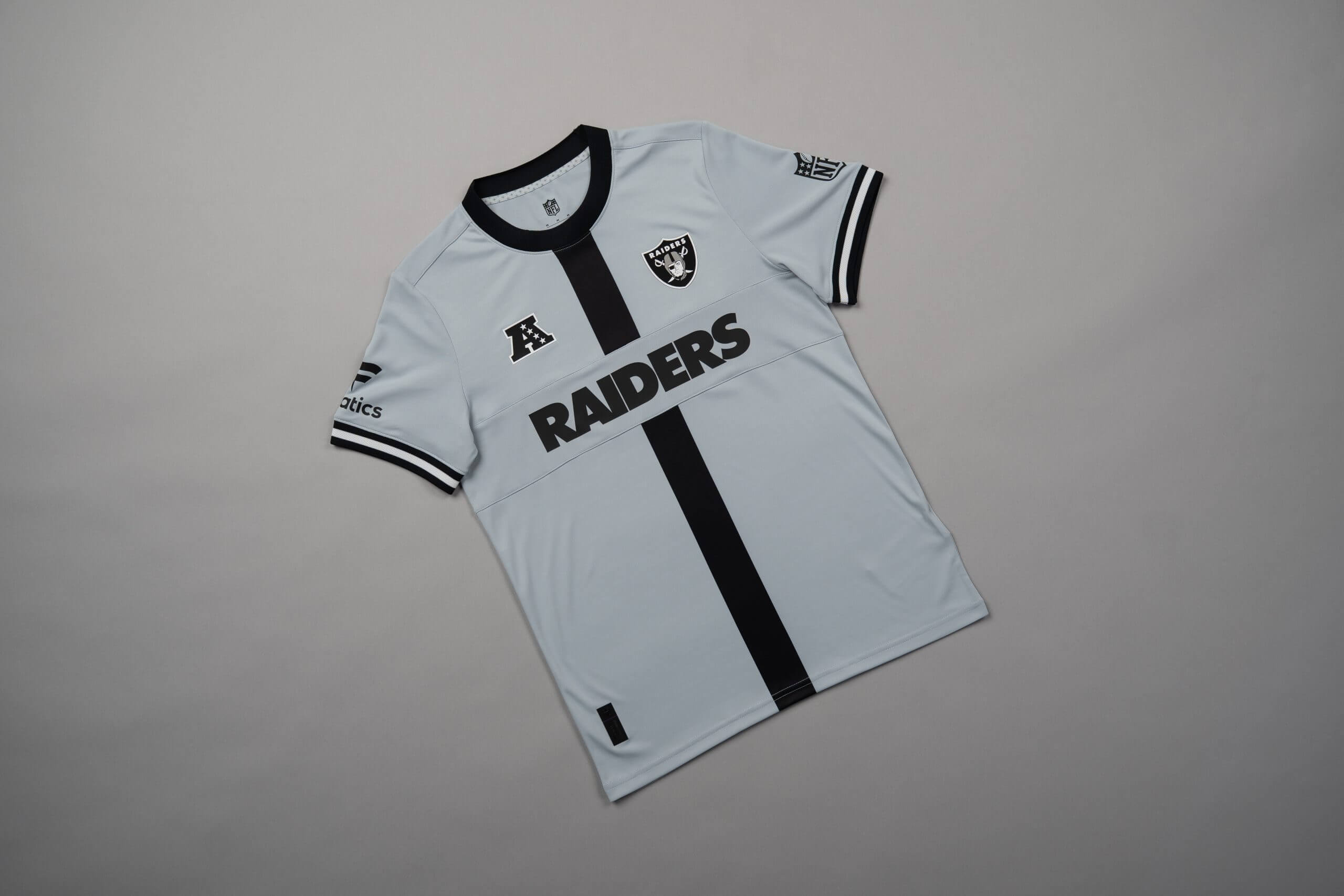
10 – Las Vegas Raiders
The first top-10 entry is a grey offering from the Raiders that should be dull but somehow isn’t.
Grey typically isn’t a colour associated with fun, but the background, lettering, stripe down the middle and sleeve design, have defied logic to propel the Raiders into the higher echelons of these rankings.
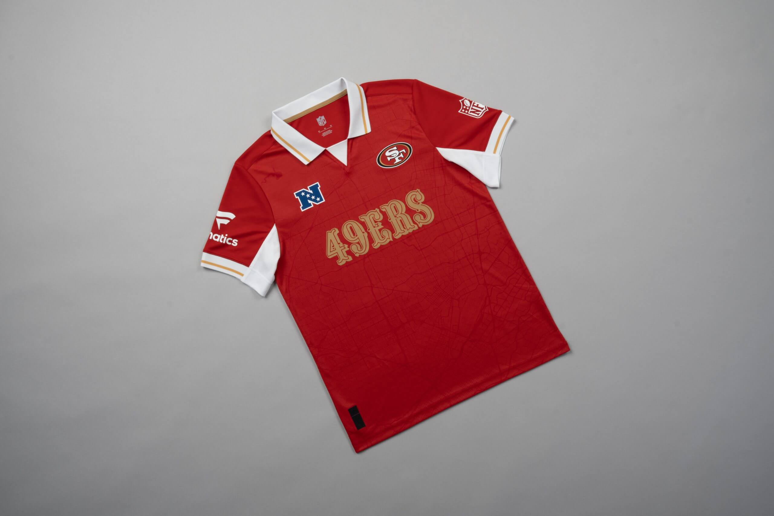
9 – San Fransisco 49ers
The street map backdrop effect here could be a nightmare to iron. I came here to buy a cool sports jersey and all of a sudden I’m trying to iron out creases that have the same strength and graininess as the Incredible Hulk.
Having said that, it works, but the NFC logo being blue and not gold or white, feels like a missed opportunity, so it’s at the lower end of the top 10.
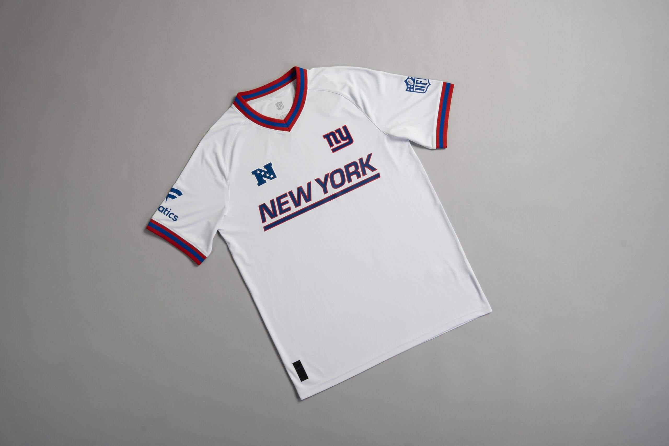
8 – New York Giants
For some reason, the underline effect beneath the Giants lettering is screaming Google Docs at me.
Now I’ve seen it, I can’t un-see it, which means I can’t rank it any higher than I have. Nonetheless, it’s a well put together jersey.
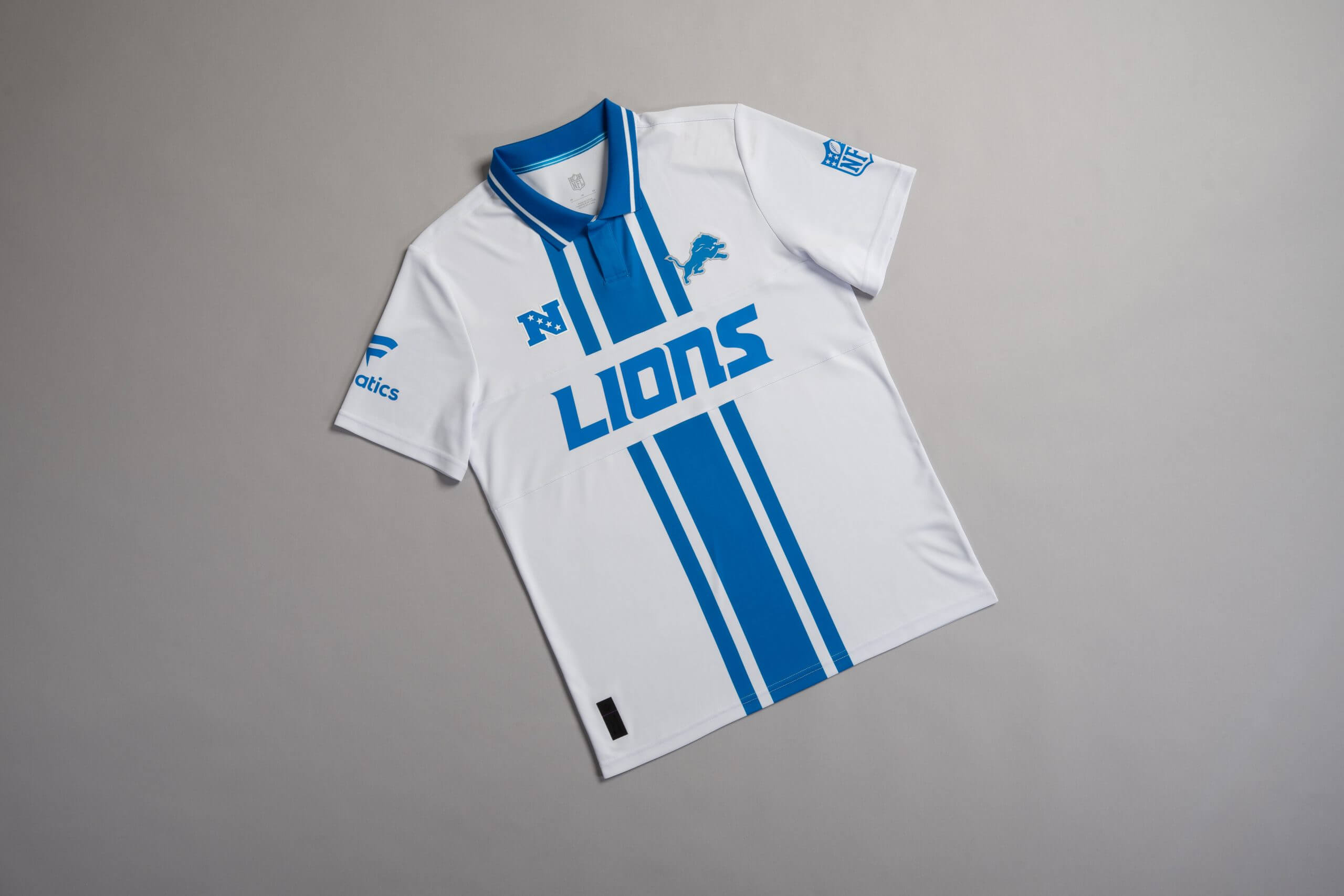
7 – Detroit Lions
In Dan Campbell’s introductory press conference as Lions head coach in 2021, he said his team are going to “bite kneecaps”. I still can’t say with accuracy what I think he meant by those words, but my guess would be, he wanted a team that prioritised toughness over finesse.
This Lions jersey echoes that sentiment. It features a strip down the middle which resembles a race track, so you can run away from Dan Campbell and keep your kneecaps intact. Jokes aside, it’s a stylish design worthy of being included in the top 10.
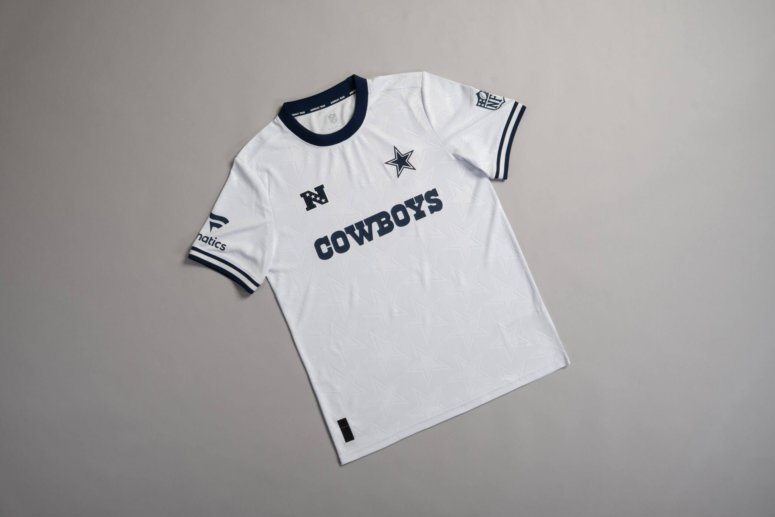
6 – Dallas Cowboys
The Cowboys design is a fusion between something you might expect Real Madrid to wear and another one from the tenpin bowling range.
The stars in the background of the shirt give off the kind of vibe that says, “I know how to dress but also, I’m ready to bowl a 300 at a moment’s notice”.
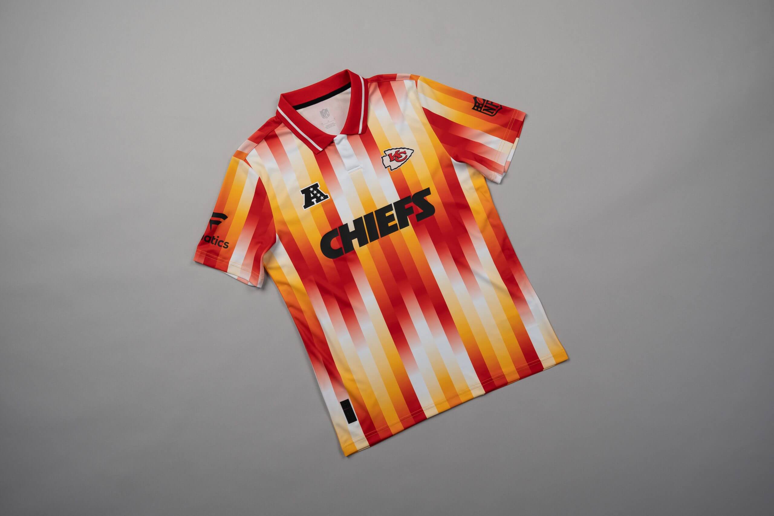
5 – Kansas City Chiefs
I don’t know why this works, but it does. Admittedly, it’s pretty random, but not so random that you think there was no thought process behind it.
This is the type of thing Chiefs head coach Andy Reid might wear to an event with a smart-casual dress code, and I for one, am here for it.
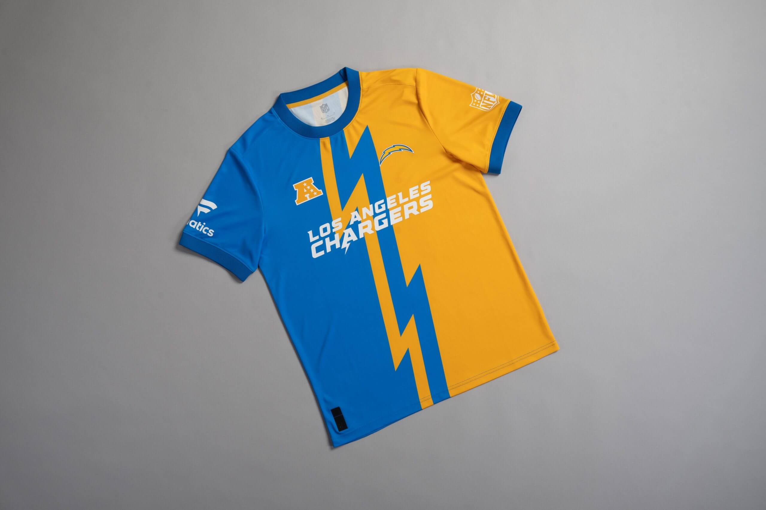
4 – Los Angeles Chargers
The Chargers’ jersey is loud, in your face and demands attention. Usually, garments that fit that description miss the mark and come across as doing too much.
It treads a fine line between a show-stopping item of clothing and something your embarrassing uncle wears to dinner at a restaurant on a family vacation. But thankfully, it’s on the right side of that equation.
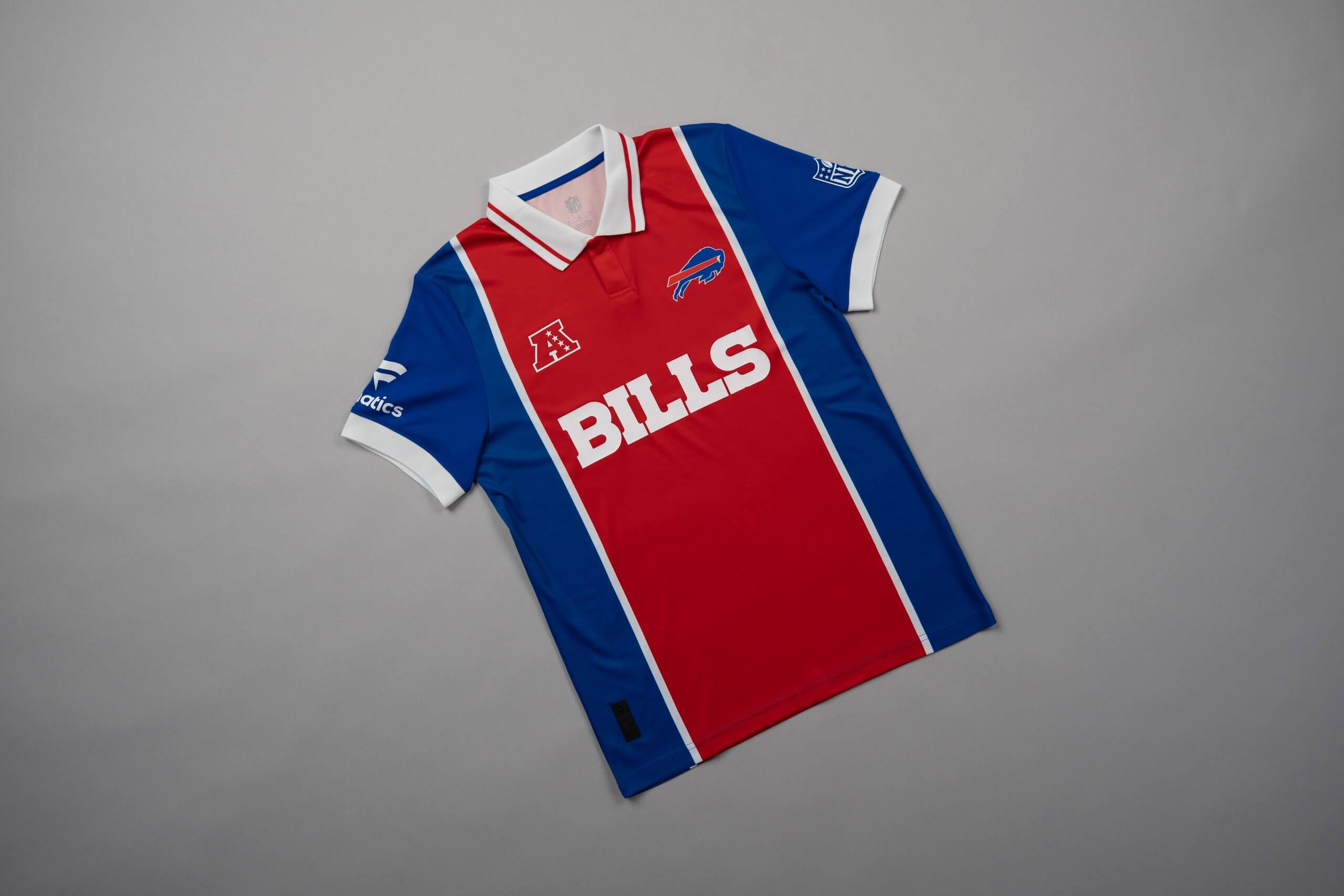
3 – Buffalo Bills
Let’s get the elephant in the room out of the way. It looks like an old PSG kit and that’s no bad thing.
Once you get past the fact it’s modelled around a soccer kit that was released nearly 30 years ago, and appreciate the blue, red and white colour way combining to provide more synergy than Lionel Messi, Luis Suarez and Neymar at the peak of their powers for Barcelona, it’s easy to see why it ranks so highly.
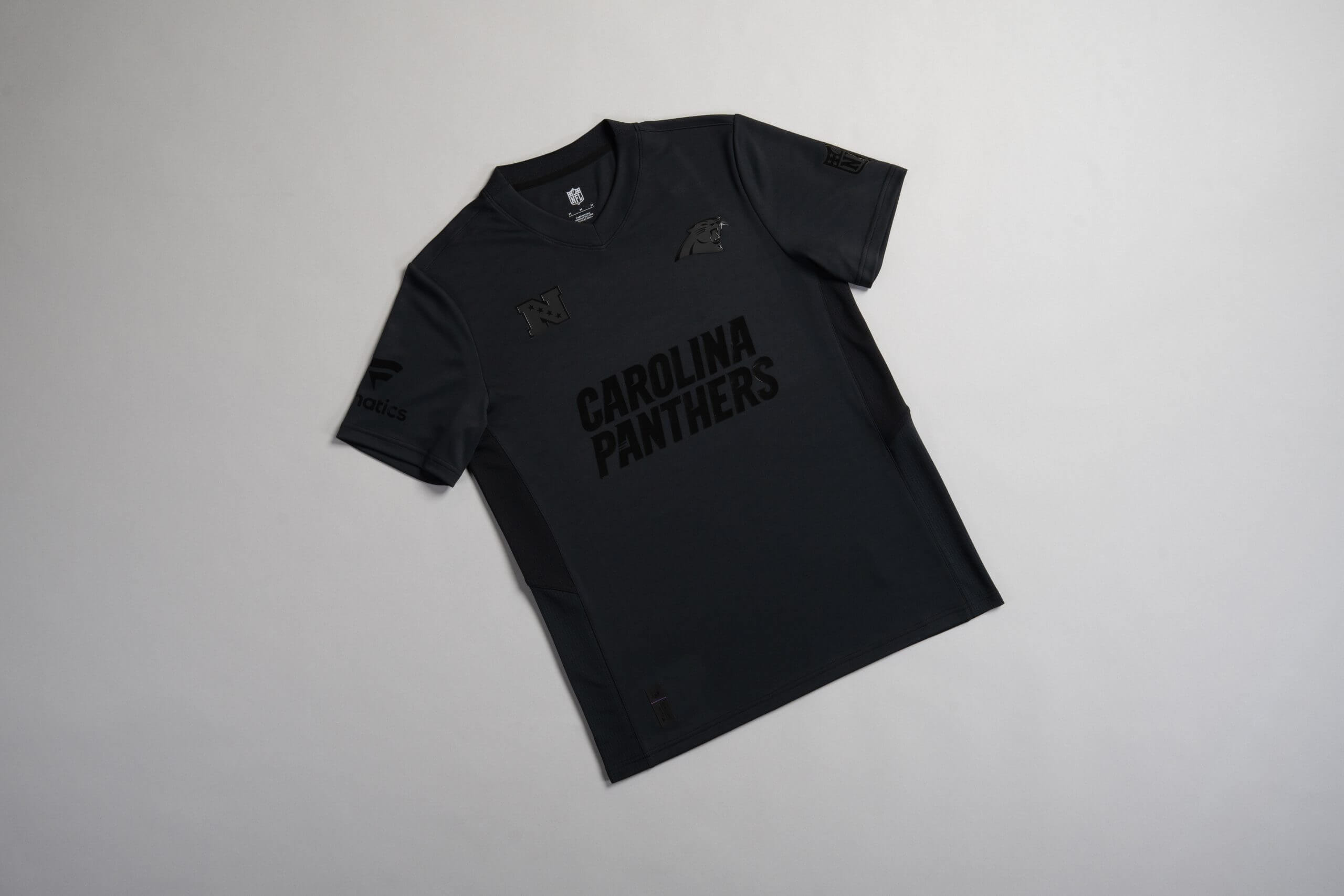
2 – Carolina Panthers
All-black jerseys run the risk of being boring, but this offering from the Panthers is anything but.
While the designers of the rest of these kits zigged, and added multiple colours, the Panthers designer zagged, and kept things super simple. No notes, a great design all round.
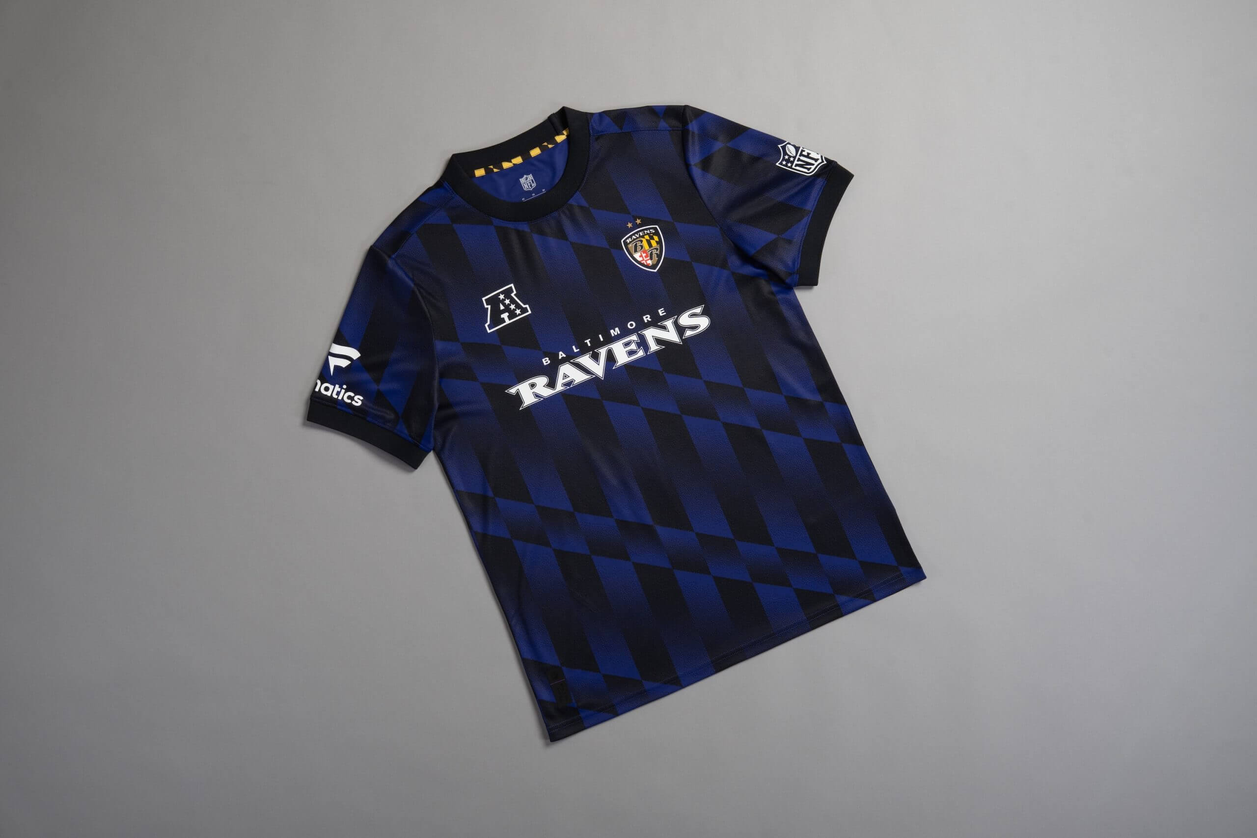
1 – Baltimore Ravens
If you ever owned a PlayStation 1, the design will remind you of the loading screen you used to see when you turned on the console. It’s an understated, subtle piece of work that still packs a punch.
There’s nothing not to like about it, unless you are a Steelers fan, in which case, you probably have it ranked 32nd.
The Athletic maintains full editorial independence in all our coverage. When you click or make purchases through our links, we may earn a commission.
(All photos: Fanatics)

