
The San Francisco 49ers — who will be one of eight teams this season to receive a new “Rivalries” uniform — have announced what they are calling a “refreshed brand kit.” In so doing, have they dropped some hints at what their forthcoming Rivalries uniform will be?
The Niners have stated, “The 49ers Faithful may have begun to notice a change in the creative elements and visual themes across all digital platforms. These visual themes will be updated onto all social platforms, our team website, the official 49ers app, any email communications from the team and beyond.”
The team first teased the refresh on social media, confirming it this morning.
The focal point of the refresh is what the team is calling the “Floating” SF logo, and in a splash photo announcing the change, the SF is shown in three different colors across three different backgrounds. “SF” appears in a what is a shaded/gradient gold, as well as in red and black.
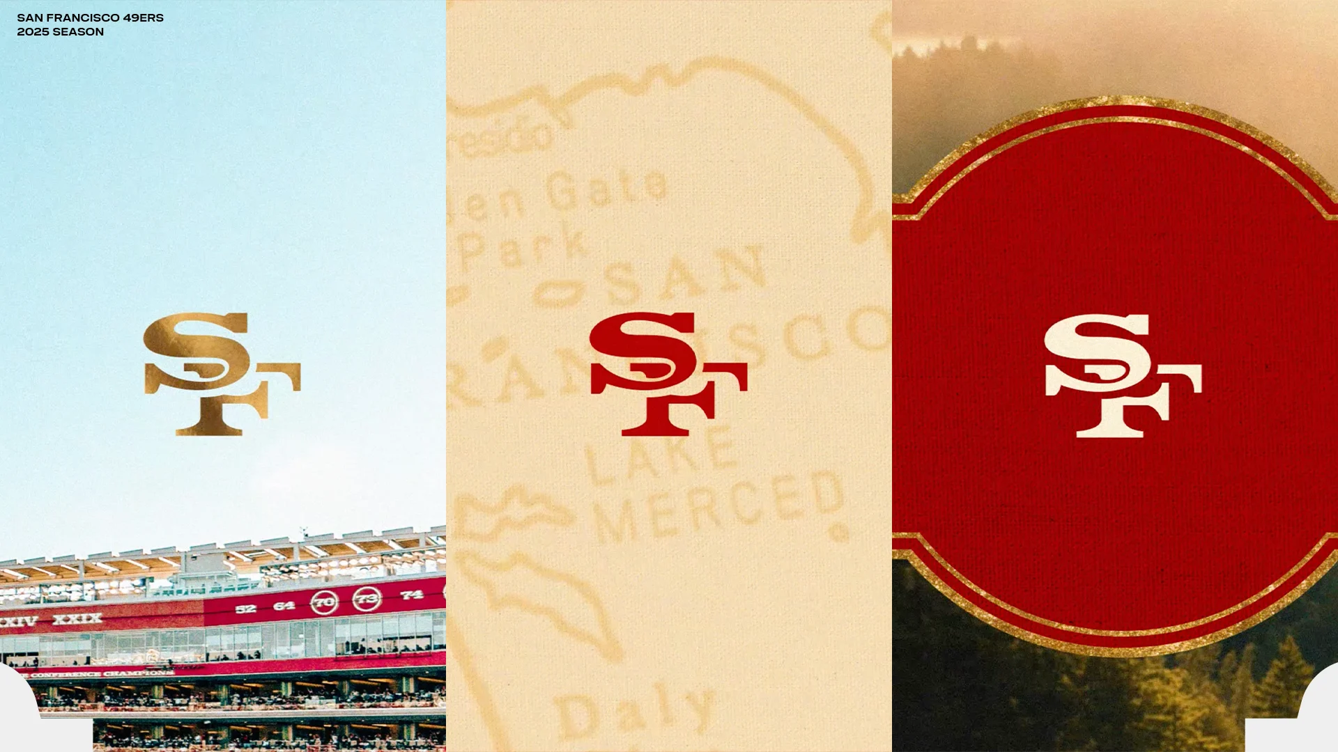

According to the team, the “Floating SF” logo made its first appearance on 49ers helmets in 1962, “the iconic SF logo originated without any outline border on the lettering as it sat centered in a bold red oval. The intertwined SF remained without a black border on the lettering until 1989. The core SF lettering, extracted from both borders and the oval, now serves as the signature element in the Floating SF logo. Simple, classic, and clean, the Floating SF takes the spotlight for an array of new 49ers design elements.”
You can check out more of the 49ers helmet history here. Back in 1962, the 49ers were a red and silver team. And if you’re really curious, you can check out the entire 49ers uniform history here.
In addition, the 49ers have unveiled what they are calling “Faithful Script.”

Per the 49ers, “The earliest history of San Francisco was often found penned in the Spencerian handwriting script that originated in the United States at the time of the 1849 Gold Rush. The spirit of the ’49er and the devotion of The Faithful are embodied in the free-flowing Faithful Script. The font’s fluidness serves as a connective anchor to the bold fonts and big ideas emblematic of our modern-day Golden State.”
How the new “Faithful” script relates to any future uniforms is as yet unclear.
Further, the team has altered their color palette, drawing from the “rich landscapes throughout Northern California, and is coupled with the playful naming of the signature colors Montana Red, Primetime Black, Heritage Cream, and the Gold Rush Gradient.”

Two of the colors clearly reference two very impactful former players: Joe Montana and Deion “Prime Time” Sanders. The “Heritage Cream” is a completely new color — interestingly shown with red lettering on the cream background; two of the three other colors are also shown using the cream color as a contrast. The “Gold Rush” gradient is pictured with black lettering. Lest you think the team is dropping white, “these shades will also complement the color white, which is a mainstay within the 49ers uniform,” per the team.
There’s more: the 49ers have also introduced a new shape which they’re referring to as “Western Container.”

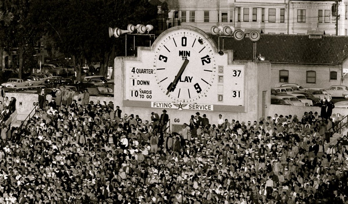
San Francisco describes it thusly: “From the Victorian homes lining the streets of San Francisco to the art deco landmarks known around the world in the city by the Bay, the shapes of the architecture of the West Coast are noted for fusing rounded edges with angular corners. An homage to the end-zone clock which also served as a scoreboard at Kezar Stadium, the first home of the San Francisco 49ers, our Western Container is a frame for all manner of new imagery while carrying the various styles of our historic structures.”
Here’s a look at the Kezar Stadium clock — the similarities are there.
Finally, and in what could be the biggest hint so far on the forthcoming Rivalries uniforms, is what the team describes as “Map Texture Design.”
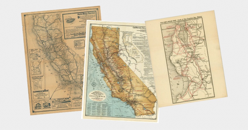
The storytelling on this one is … something: “The prospectors and pioneers who flocked to Northern California in the mid-1800s relied on maps to navigate the trails in search of fortune. While many of those early trails and settlements have faded into history, their legacy lives on in the region’s transformation—from gold mines to innovation hubs like Silicon Valley. Our Map Texture design draws inspiration from that history, incorporating elements that reflect the movement, exploration, ambition, and growth that have shaped California. These textures nod to the journeys that brought generations here—many of whom are now part of the 49ers Faithful.”
As we’ve seen with so many sublimated NBA and MLB “City” jerseys, will the 49ers use the map texture inside any cream elements? While I don’t believe the Niners (or any team) would go full sublimation for a jersey, I could easily see the map texture pattern inside any cream elements (logo, stripes, wordmark, numbers) the team uses for its Rivalry uniform.
__________
Phew. That’s a lot to digest. Does any of it hint at the new unis the AFC East and NFC West (“Rivalries”) will be receiving later this year? Perhaps. It seems clear Nike is intending to do to the NFL what it has done with MLB (“City Connect”) and the NBA (“City Edition”). So the storytelling involved with this new “refresh” has all the hallmarks of the basis of a new uniform. But which — if any — of the new elements would be destined to be the Niners new alternate?
Will the new uniforms be cream? The new color could serve as an accent color. What about “Primetime” black? Would the 49ers opt for another BFBS uniform to fulfill their Rivalries requirement? The return of the “Floating SF” logo is also interesting. Would the team use just the “SF” as their helmet logo for the new uni?
Honestly, I could see the 49ers Rivalry uniform using the gradient gold shade for their helmet, with a red (or black, ugh) “floating SF” logo, a red jersey with cream stripes and numbers (with a map texture gradient), and perhaps cream pants. And the new “Faithful” script as a jersey wordmark above the numbers.
Or, it could be something completely different. Do you find these to be clues to a new uni?
Since we can only guess at the general direction Nike/NFL is going with the future Rivalries kits (although based on what was done with the “City” uniforms in MLB and the NBA, those probably give us a roadmap as to how they’ll eventually turn out), for now we should just wait and see.
Thoughts?