
The Washington Commanders took another visible step toward solidifying their long-term branding direction on Tuesday, subtly debuting an updated logo concept that leans further into a warrior identity.
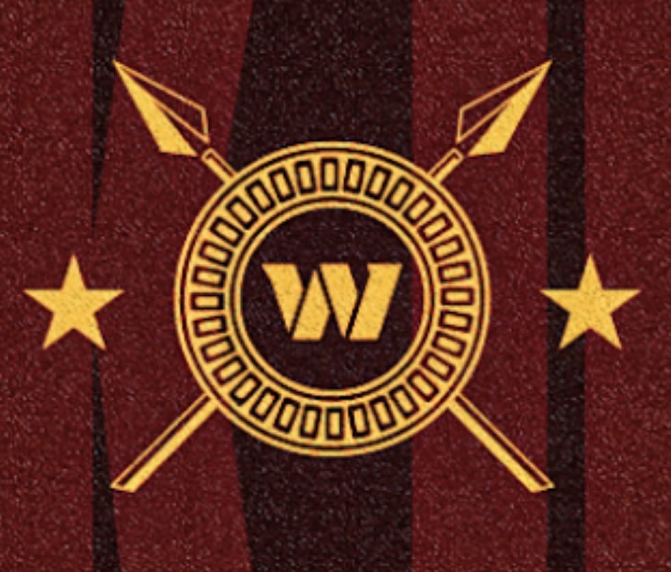
The new net-style logo features a shield with the familiar “W” at its center, flanked by two crossed spears piercing through the shield. The imagery marks a noticeable shift toward more traditional warrior symbolism and aligns closely with themes team owner Josh Harris outlined publicly last fall.
The logo debut follows Harris’ clearest comments to date on the franchise’s future branding. In an October interview on The Varsity with John Ourand podcast, Harris directly addressed speculation surrounding the team’s name and identity, making it clear the organization is committed to moving forward as the Commanders.
“We’re embracing the Commanders name,” Harris said at the time. He pointed to the team’s branding relaunch during the Navy’s 250th anniversary celebration, describing the Commanders as “leaders of warriors.” Harris explained that the team’s vision draws inspiration from multiple historical eras, including Roman leadership, Native American tribes, and modern special forces, all tied together by shared warrior symbolism.
He specifically referenced swords and spears as recurring elements, calling them “the tip of the spear,” and highlighted Darrell Green’s ceremonial spear slam during a game as an example of how the franchise is weaving that identity into its on-field presentation. Harris reiterated during the interview that the team would not revisit another name change, stating plainly, “We’re embracing the Commanders name, and we’re staying with it.”
The debut of the shield-and-spears logo appears to be a visual extension of that philosophy. While the team has not formally announced broader branding changes tied to the logo, the design suggests the organization is continuing to refine and strengthen its Commanders identity rather than move away from it.