
Published February 9, 2026 at 8:24AM
Courtesy Washington Commanders
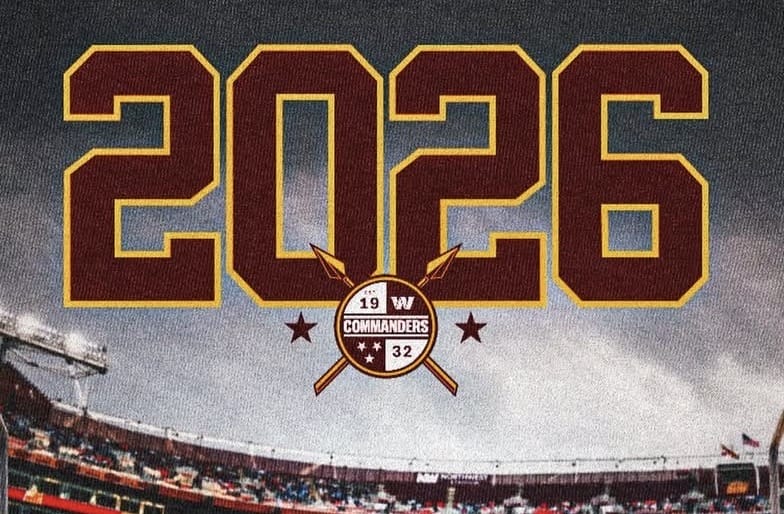
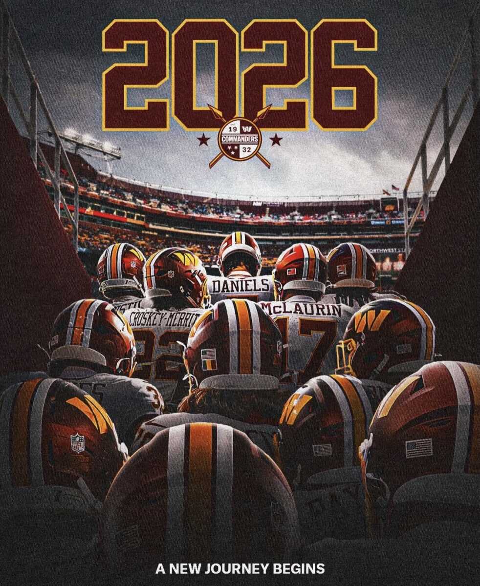
For the second time in a week, spears are front and center in Washington Commanders branding tied to the start of the 2026 season. The team shared a new logo featuring crossed spears, this time placing the Commanders crest at the center instead of the standalone W seen in last week’s mock draft graphic.
In the full image (seen below), players are shown wearing the “Super Bowl Era” jerseys that made a limited return for a couple of games this past season. Those uniforms could become the team’s primary look again once league uniform regulations allow for a full switch.
The repeated use of crossed spears signals a continued move toward more traditional warrior symbolism. It closely mirrors themes outlined by team owner Josh Harris last fall, when he publicly addressed the direction of the franchise’s branding and identity.
The logo’s debut follows Harris’ clearest comments to date about the future of the team name and imagery. In an October appearance on The Varsity with John Ourand podcast, Harris said the organization is fully committed to the Commanders identity. He pointed to the team’s recent branding rollout during the Navy’s 250th anniversary celebration and described the Commanders as “leaders of warriors.”
Harris explained that the vision draws from multiple historical eras, including Roman leadership, Native American tribes, and modern special forces, all connected through shared warrior symbolism. He specifically highlighted swords and spears as recurring elements, referring to them as “the tip of the spear,” and cited Darrell Green’s ceremonial spear slam during a game as a clear example of how that identity is being incorporated into the on-field experience. Harris emphasized during the interview that the franchise would not revisit another name change, stating plainly that the team is embracing the Commanders name and moving forward with it.
 Courtesy Washington Commanders