
The Atlanta Falcons unveiled new home and road uniforms on Thursday morning, adding a few modern touches to an otherwise classic design while also keeping their 1966 throwback uniforms in the rotation.
🏈 NEW UNIFORMS ARE HERE: The Atlanta Falcons have officially unveiled their 2026 uniforms.
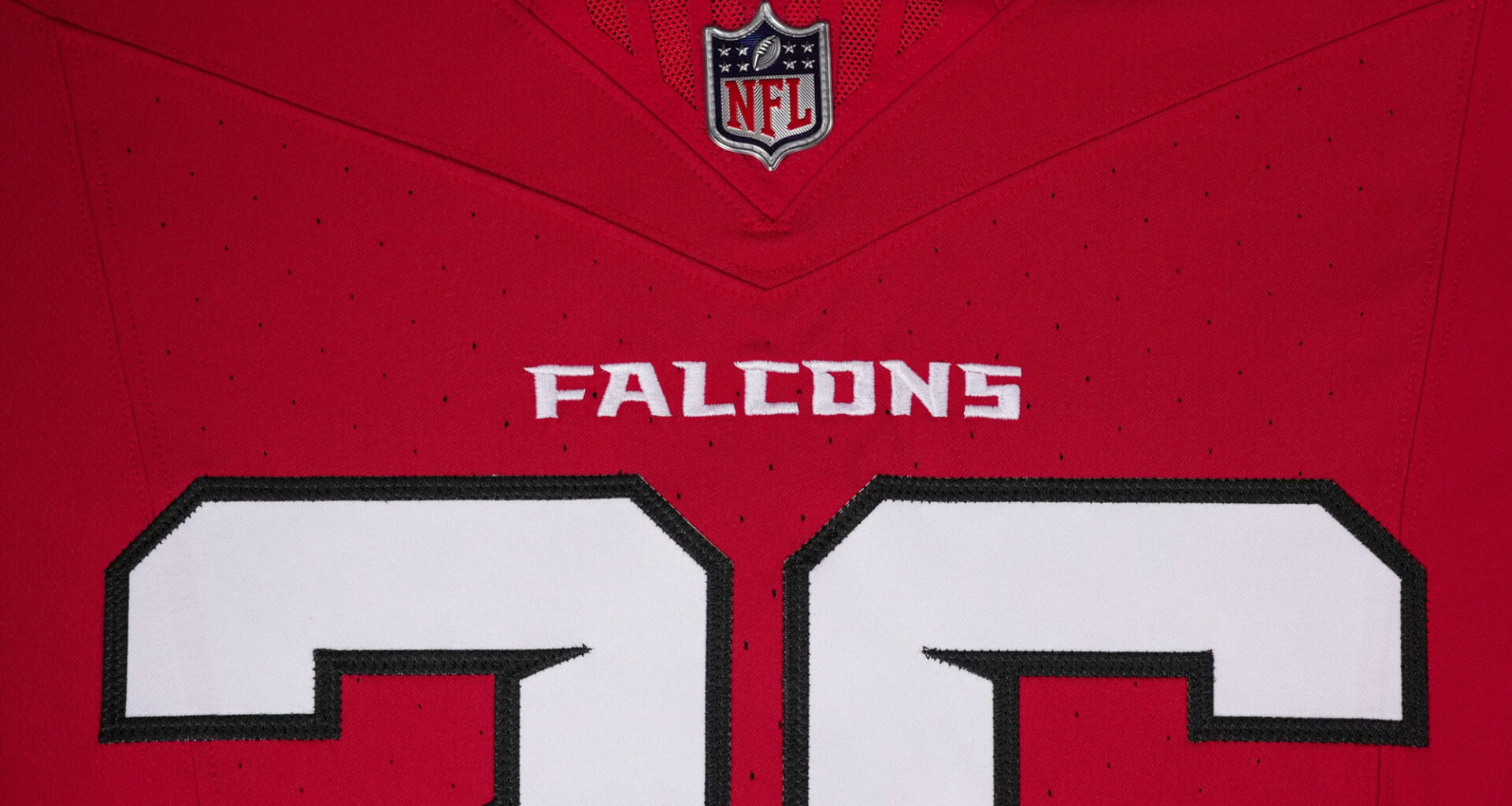
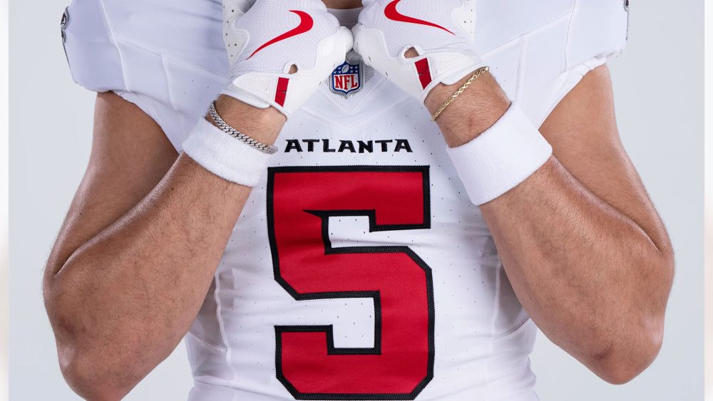
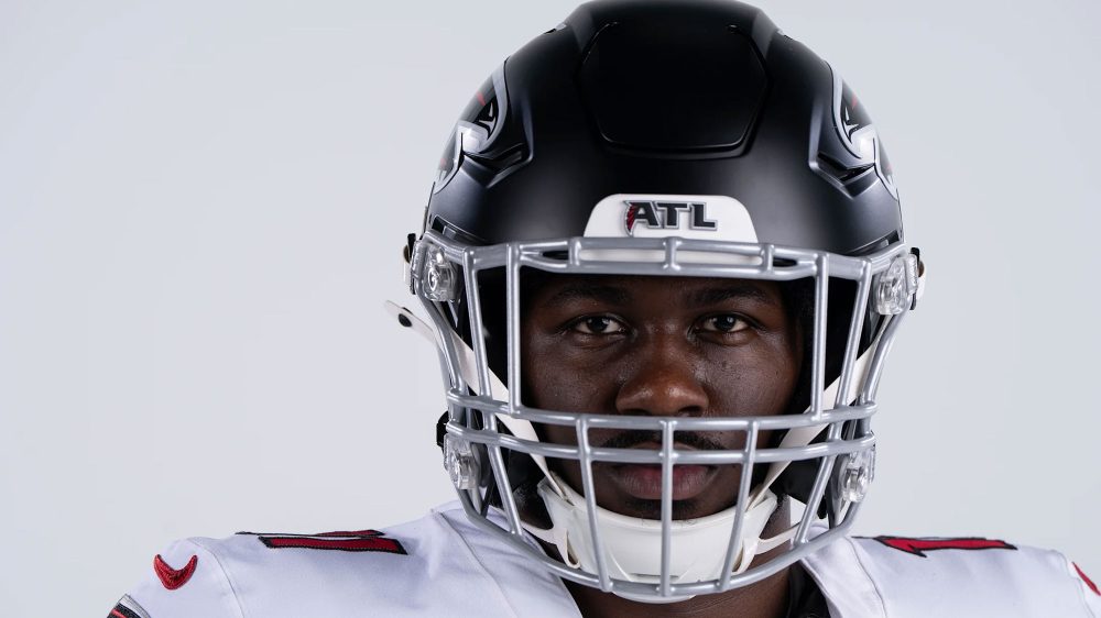
A new red home + white road jersey, notched numbers, updated helmets, and “Dirty Birds” inside the collar. Throwbacks survive.
More pics + details: https://t.co/MJQ1Ft21MY
— Chris Creamer | SportsLogos.net (@sportslogosnet) April 2, 2026
Now that we’ve had some time to reflect, we – the staff at SportsLogos.Net, including founder Chris Creamer and contributors Andrew Lind and Glenn Cook – have decided to share our reactions to the Falcons’ updated look.
We received a tremendous response our reactions to the Tennessee Titans’ redesign last month, so we’re going to continue to give our thoughts to new uniforms across the four major sports while keeping our coverage of the unveiling(s) as unbiased and informative as possible.
We’d love to hear your thoughts in the comments, as well!
SHOP: Get your new 2026 Atlanta Falcons jerseys now!
Chris Creamer: “It’s not often the pants are what pull a uniform together, but that’s the case here with the new Falcons uniforms.
“On their own, the new jerseys don’t give you much. No striping, just a sleeve patch, very little going on. But once you put the full set together with the pants, it clicks. The balance shows up, the contrast works, and suddenly it reads like a complete uniform instead of an otherwise lackluster top half. I can’t wait to see how it looks with silver.
“The number font is one of the few areas where they tried something interesting, and it’s handled properly. Block numbers keep it traditional, the notch adds just enough character. It acknowledges the modern logo without forcing the rest of the uniform to follow it. That’s the right approach. If your primary mark is contemporary, you can’t pretend the rest of the identity lives in the 1970s. You need a bridge, and this is one of the few spots they built one.
“The helmet decision does the same thing at a larger scale. Keeping black connects this set to the era most people associate with the franchise, the only stretch in which the team tasted a little success. The rest of the uniform shifts back toward something more traditional. It’s essentially a design merger rather than an actual uniform redesign.
“And really, that’s what this whole set is: a compromise. Want a red helmet? You’ve got throwbacks. Prefer black jerseys? Same deal. This is the middle ground, something stable they can wear every week without restarting the debate every few years. It’s designed to satisfy most people, not push anything forward. And right now, that’s what wins.”
Andrew Lind: “The Falcons will always have a hard time pleasing everyone with a uniform redesign, as a large portion of their fanbase believes that red should be their primary color and the other believes it should be black. Personally, I find myself in the latter group, so I’m disappointed that – for as great as the 1966 throwback uniforms are – that they are currently the only black jersey in the closet… and, yes, I preferred the mixed era look with the 1990s black helmet over the original red lids.
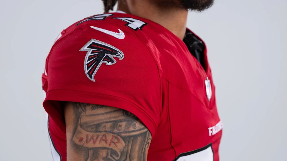
“As for the design itself, I was initially surprised by the decision to retain a silver facemask instead of returning to black, but the hints of silver throughout the rest of the design – including the logo on the helmet and sleeves and the stripes on the pants create some nice contrast. I’m also a massive fan of the number font. Though it will immediately remind some of Michigan State, circa 2010, it’s ultimately a block font with a small nod to the red stripes in their logo.
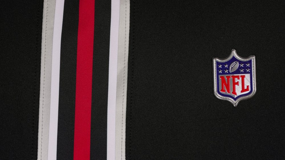
“I’m especially impressed with the pants stripes, which perfectly match the silver-white-black-red-black-white-silver design you see when you look at the Falcons’ logo. I’m also glad it was only restricted to the pants, because – despite the Falcons having history with stripes on the helmet and sleeves – it would overpower the design. My only critique is that I would have liked to see the red in the stripes be tapered to further match the logo.
“Overall, the foundation of an elite uniform set exists, but there are still few things missing, including a black jersey that follows the same design as the red home look and silver pants. I also think you could appease the other side of the fanbase by wearing the red throwback helmet with current decals with their white road jerseys, as well as introduce red alternate pants for a Color Rush-style game or two. Still, it’s a significant upgrade over their previous look and perfectly threads the needle between classic and modern.”
Glenn Cook: “Oh, Atlanta. You were thiiiiis close. But you didn’t quite get all the way there. Don’t get me wrong – the Falcons’ new uniforms are an absolute upgrade over the gradient-laden, techno-fonted eyesores they’d worn for the past six seasons. But with just one or two tweaks, they could have truly achieved the “authentic” and “timeless” status they’re touting on their website.
“The most obvious of those tweaks would address the lack of striping and silver on the jerseys. The Falcons introduced a beautiful new silver, white, black and red striping pattern on their pants in this unveiling, which ingeniously mirrors the placement of colors in the team’s primary logo. Yet it’s nowhere to be found on the jerseys.
“In fact, for all the marketing speak about leaning into a “Legacy of Silver” that was part of Thursday’s announcement, there’s a distinct lack of silver on the jerseys themselves. Just a little bit of that pants stripe carrying over to the sleeves, with or without the falcon logo overtop, would go a long way to bringing the whole look together. But maybe the way jerseys are cut and worn in the NFL today makes the return on investment in sleeve stripes less appealing.
“There’s so much to love in these uniforms: the silver facemask, the number font (the notches in which also tie back to the primary logo), the return to wearing red at home. Perhaps, once we see them in game action, those positives will drown out the small negatives. But for now, I can’t help but feel that the Falcons were tantalizingly close to a timeless classic.”
Photos courtesy of @AtlantaFalcons on X/Twitter.