
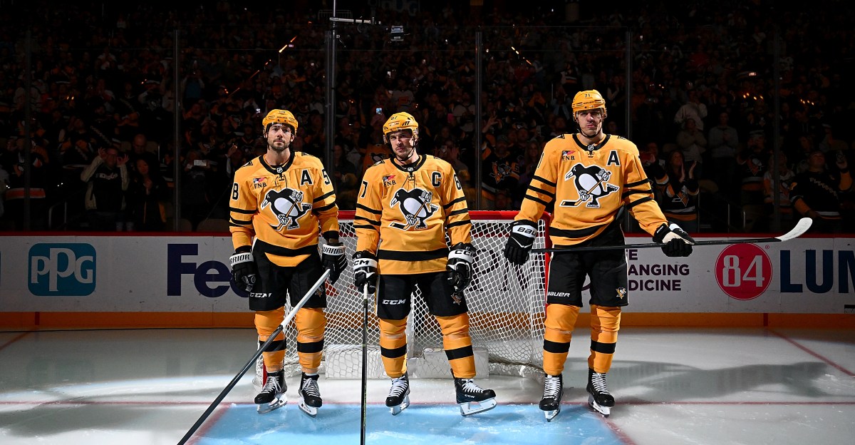
Let’s shift to jersey talk on an off-day Sunday for the Penguins. The Pens recently revealed their new yellow alternate jerseys that they will wear for every Thursday home game this season and a couple of select weekend games.
These rankings are always personal and subjective. It’s always fun when one person’s least favorite is another’s most treasured. Feel free to give your take. We’re sticking with only the Sidney Crosby era from 2005-present and including the outdoor jerseys as well.
Huge shoutout to the great resource of NHL Uniforms, great database to check out jerseys over the years from all the hockey teams.

I believe only used for the 2014 Stadium Series and maybe once more, the 2014 Stadium Series jersey was more of a flop than a hit. The front logo appeared to have a silver impact in the middle that showed in an odd way (I think a beer company sponsored the game and this jersey almost looked like a nod to that, whether intended or not). The numbers on the back were extra long for visibility in the outdoors. Not a good one.

Perhaps best known for the jersey that Sidney Crosby and Evgeni Malkin both suffered major injuries in over different games in 2011, this alternate doesn’t leave a good feeling. Worse yet, it’s a combination of different design concepts and colorings similar to what the team wore from 1967-80, yet never in this exact form (i.e. the light blue stripes were dark, the scarf Penguin wasn’t used). It resulted in a busy mish-mash of different concepts that didn’t land well. It’s a shame that it’s seemingly ruined the likelihood of a dark blue jersey again, the potential was there but what they came up with wasn’t it. Moving on.

The Penguins never had a white PITTSBURGH black/gold diagonal jersey, and now we see why after the design of the 2021 “reverse retro” concept. It throws you off from the nostalgic black version of the ‘90s that didn’t really land well. That was the point of the “reverse” part of a reverse retro jersey but it’s an idea that no one asked for or particularly wanted in this instance. To me this is kind of like getting a Philly Cheesesteak on rye bread — it’s almost right but they didn’t quite get the order right when they put it on the wrong type of bread (or jersey color, in this case). So that spoils the dish.

The first Penguin jersey in history to date that features zero amount of white on it anywhere for a Stadium Series jersey. The helmet with a logo on one side it was a cool idea, the rest just kinda looks like the printer messed up and put yellow in the logo where the white was supposed to go. Having a big arm stripe, a medium single bar on the socks, a thin bar at the bottom of the jersey and nothing on the pants looks uneven. The keystone PA logo on the pants is a very nice mark— especially since these jerseys were designed for an outdoor game against the Flyers who had matching designs— but the rest of the looks feels half baked. Not a big fan.
#8: The new alternate (middle)

The new look is, well, OK. It’s very yellow and has a new jersey font that gives Nashville Predator vibes. Maybe some are a fan of the new concept of the new shoulder logo that features, well, random enough ancillary symbols but that came out of no where with no obvious connections to the established branding the team uses. Luckily they went ahead and put it on both shoulders for good measure. The triple arm striping looks busy and a modest attempt to break up all the yellow and it doesn’t match in width to single bottom bar across the bottom or the single bar on the socks. Out of necessity and ease they stuck with the regular pant shell, which sticks out to not flow cohesively with this concept considering the pants have a white stripe that isn’t found anywhere on the all-yellow/black top. On the plus side, this is the first matte helmet the team has used, which has no advertisement on it and is a big plus to have a team logo and not a corporate one. The white outlining of the number looks sharp, just a shame that’s all of the white involved, besides the interior of the logo and the part from the holdover pants. Maybe it will grow on me after seeing it more, for now it’s just there.
#7: Return of the Robo Penguin

Some will have this one a lot higher on their personal rankings, which is totally fine. To me, it’s not the best sort of Robo Penguin design which would have been nice to see more retro shoulders and radiant across the middle of the shirt, but considering the concept was a reverse retro jersey that might have been difficult to work in. Instead, we were left with this sort of compromise where at least fans looking to see Crosby/Malkin got to play in a Robo Penguin jersey, ever so briefly, but it didn’t leave a lasting mark or seem like it will be returning to the ice again in the near future. They also used the same pant shell, so there was a “normal” skating Penguin logo on the leg just kinda leftover and still sticking around. The Robo Penguin in general is a very polarizing subject, which makes it ironic that it ends up just kinda in the middle for me. I’d be fine with the occasional RoboPen (though I’m not a huge fan of it) but the offering they designed was far from ideal use of it.
#6: Yellow comes back (middle)

A fitting tribute to the 1980-84 jerseys brought a mainly yellow jersey back to the Penguins in 2018. As far as yellow jerseys go, this is the one; a classic look brought back and nice play off the existing black and white jerseys that the team used as the regular color schemes. They made the hockey stick in the logo yellow and not white for the first time (aside from the all black/yellow jersey), which looks pretty cool. It’s also nice they kept white on the arms to better tie in with the pants, giving a differentiator to the current yellow alternate. This is only sixth on the list, but I like it well enough, more that others just popped a little more or were a little more appealing and exciting.
#5: Steelers inspired yellow

This Stadium Series jersey is similar to the yellow jersey above. It ups it a notch with the excitement factor that has a nod to the Steelers by making the numbers in the style of the football team that calls Heinz err Acrisure Stadium home. This was a cool concept that worked, would have loved to see some type of logo moved from the shoulder to the front leg of the pants for an added special touch, maybe keep on the Steelers theme by using a helmet with a logo on one side, something a little more creative was left out there. It was too niche to last very long but it wasn’t designed to stick around. For a special event this one was about pitch perfect.
#4: ‘90s Nostalgia at its best (middle)

The Pens brought back the classic diagonal PITTSBURGH block font from 2021-25 for the first time in the traditional black since they wore it from 1992-97. The memories associated with this jersey give it the power, in the mind’s eye you can almost see Mario Lemieux pulling this sweater on to win the scoring title despite undergoing cancer treatments or expect to see Ron Francis pop up and make a perfect pass to Jaromir Jagr for a goal. A lot of that is age-related and might not hit the same for everyone, but that’s what made this nostalgia done right. It’s a great alternate because it doesn’t stray or try to reinvent what worked in the first place with the concept.
#3: The 2023 Winter Classic throwback

Really liked these 1920’s inspired Pittsburgh (hockey) Pirates outfits, which as a trivia note was the first pro Pittsburgh team to ever use black and gold as its jersey colors. It would have been even nicer if they could have worked in the crest that the old team had into the arms or shoulders. The creamy off-white worked well, especially for the outdoor game and having Penguins in a cursive font on the helmet and pants flowed very well and was a nice addition for a baseball stadium. It’s also a very nice touch that the inside of the collar (like the new yellow alternate) has the white/blue checkers from the city of Pittsburgh’s flag on it. You can’t see it when the players play but that’s a bonus when getting one that adds a little something extra.
#2: So good they made it the regular jersey (middle uniform)

The Penguins faded out the “Vegas gold” colors of their home and away jerseys starting in 2014 by using the middle jersey as an alternate. This jersey is basically what the team wore from 1980-92 before inexplicably changing it up in the middle of a championship run. It was such a good alternate that it eventually graduated into the standard home jersey from 2016-present and likely will be around for years to come and put the ’Vegas gold’ out to its rightful place in pasture. This is THE classic Penguin look to have.

This is what it’s all about, a throwback to the classic 1968-71 look. It also helps that Crosby made it his own for a new generation with his outdoor shootout winner in the first Winter Classic back in ‘08. When you want a perfect alternate jersey, to me this hits all the notes. It’s outside of the normal scheme that the team wears so it’s something different, yet still rooted in history. The colors contrast well in any sport but especially well on the ice for a hockey game and the jersey itself is clean and uncluttered. The arm striping and bottom effectively breaks up the single color and is complemented by the socks and pants doing the same. Do I want to see the team wear this 41 times a year at home or in the playoffs? No. Is it the best alternate the team has had in the last 20 years? To me, yes.