
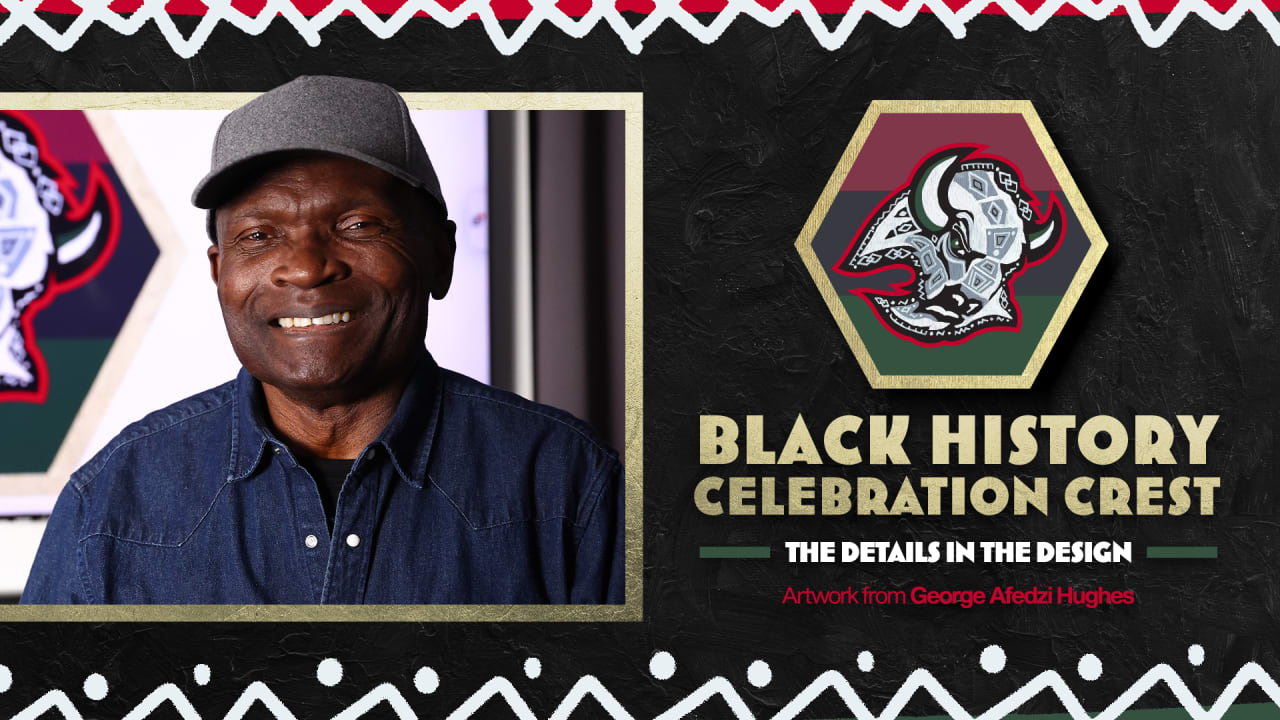
The Sabres logo served as a more refined starting point than Hughes’ usual abstract palette, but one core essence of his work – the idea of giving new meaning to an existing piece – very much remained.
Hughes studied the logo and offered various takes before arriving on his final, hand-painted design. He carefully placed Adinkra symbols – native to the Akan people of Ghana – throughout the logo, each containing their own meaning: the interlocked diamonds for justice and law; the black diamond for beauty and strength; the comb for grooming; and another diamond-shaped pattern symbolizing strategic work.
The logo is encased by a hexagon, which Hughes describes as an efficient structure symbolizing interconnectedness, balance and harmony. It’s gold color is a nod to the natural resources that Africa has contributed throughout the world.
In the background sits the red, black and green Pan-African flag. And, atop the head of the Buffalo, the gray arrows are intentionally divided but pointed toward the same direction.
“Even though the gray arrow is fractured, the peaks of the diamonds are pointing toward one another, showing that there’s still continuity through blood, through lineage, through heritage,” Hughes said.
Hughes hopes that by adorning these designs – the Adinkra symbols, the Pan-African colors – on top of the Sabres logo, it will spark curiosity as to their origins and meanings.
“I want the work to impact [people] aesthetically, for them to see some sort of artistry in the design, even though the predominant structure of it is the same as the logo,” he said. “I want the designs on top of the Sabres logo to bring them some kind of a hint of the African heritage.”