

— Previous article
POST GAME THREAD: The Mets defeated the Pirates by a score of 10-0 - Wed, Sep 07 @ 06:35 PM EDT - Doubleheader Game 2
Next article —
Mets to this subreddit after the DH sweep
You May Also Like

Addison gets pranked
Addison gets pranked
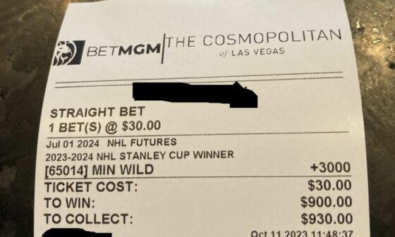
I like these odds!
I like these odds!
WAKE THE FUCK UP WILD FANS ITS THE FIRST REGULAR SEASON GAME AND IT IS AT XCEL ENERGY CENTER!
WAKE THE FUCK UP WILD FANS ITS THE FIRST REGULAR SEASON GAME AND IT IS AT XCEL ENERGY…
10 comments
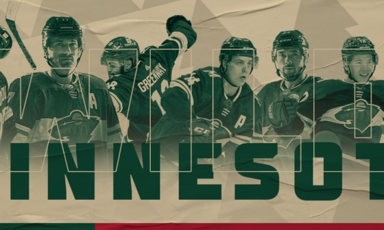
https://www.icethetics.com/concepts/wild-in-wheat
I have been dying to see this version. I want one
Makes me think of Iowa Wild
Yeah I’d buy this in a heartbeat
I’d love to see a wheat colored alternate like this
more dirty dishwater against white ice.
​
Wheat still is and will always be a terrible idea
I see butter. Also, why we gotta have so many extra details? I just want one that’s simple
This is the greatest thing I’ve ever seen.!!!
I feel like I’m the only one on this sub who doesn’t like the wheat color/type logo scheme. It looks dirty to me…
Give this one to Iowa 😣