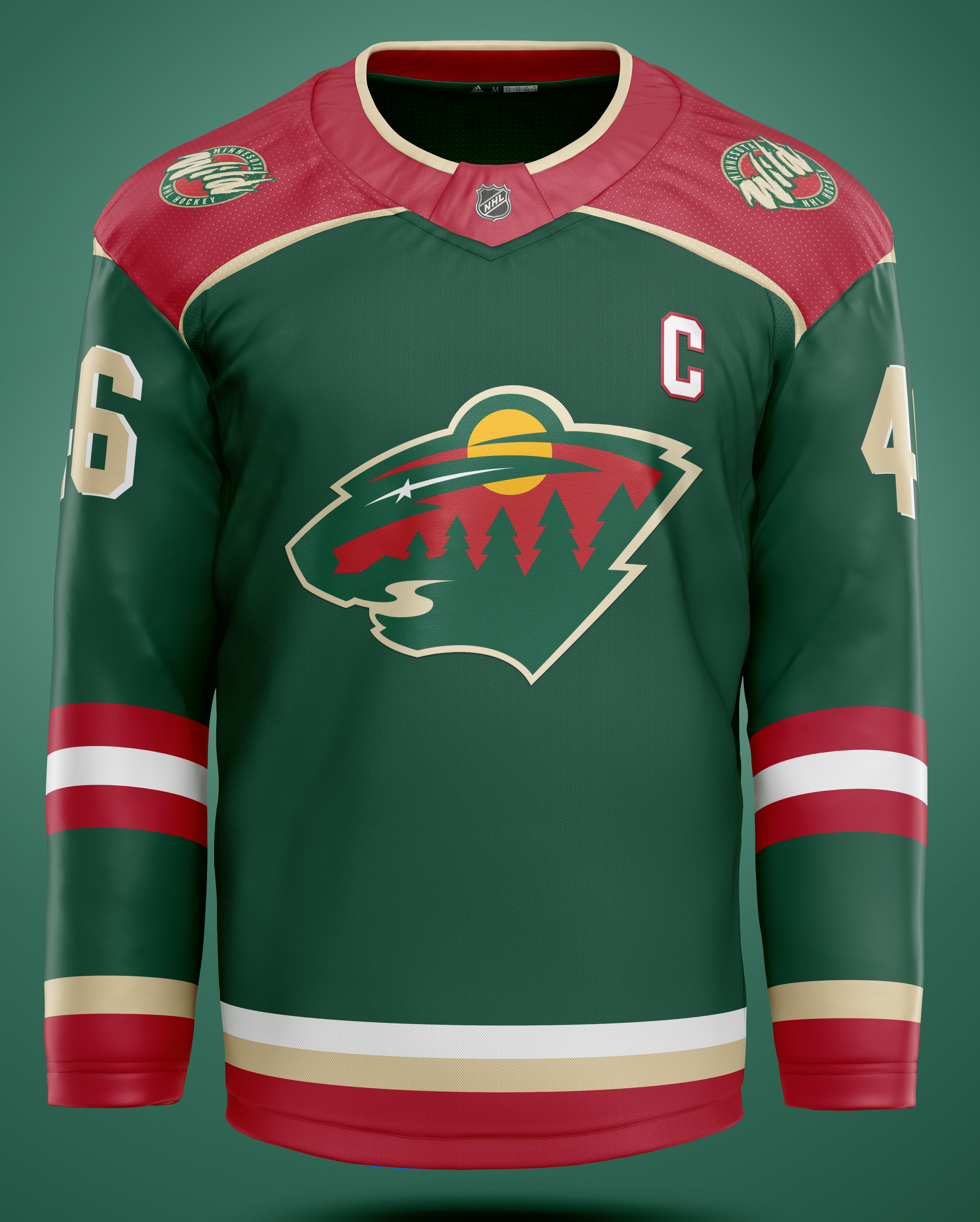
Rookie designer attempts a Minnesota Wild jersey. Let me know your thoughts!
September 12, 2022
Rookie designer attempts a Minnesota Wild jersey. Let me know your thoughts!
6 comments
Beautiful.
I dig it!
I think that there’s definitely room for more red in our jerseys, but with regards to this concept I’m not a fan of 2 things: the unevenness of the wheat piping around the shoulder yoke, and the fact that the arm and waist stripes don’t match
Echoing that adding more red is nice. The different coloration for the “C” compared to the sleeve number font is throwing me. As well as having an outline on the “C” but a drop shadow on the sleeves.
Would like to see it with some more uniformity of font design, it’s a good start!
Beautiful sweater. My only feedback would be to make the C just a little bigger.
I dig it but the shoulders look weird
I like it. I’d probably ditch the 3D effect on the numbers, it doesn’t do much for me, especially since the C and front logo are flat. I’d also maybe replace the shoulder patches with the “state of hockey” logo, but that’s just my preference.
Overall very solid. Nice job.