
— Previous article
ROSTER MOVES: 🔹 INF Otto Lopez recalled from Triple-A and will be active tonight 🔹 OF Lourdes Gurriel Jr. (left hamstring strain) placed on 10-day IL, retroactive to Sept. 8
Next article —
FTS - The butthole of America
You May Also Like
San Jose Sharks: Howdy from Broadway…
Howdy from Broadway🤠

Celebrating Randy Hahn.🍾
Celebrating Randy Hahn.🍾
San Jose Sharks: ONE TIMER …
ONE TIMER 🥷
17 comments
Amen
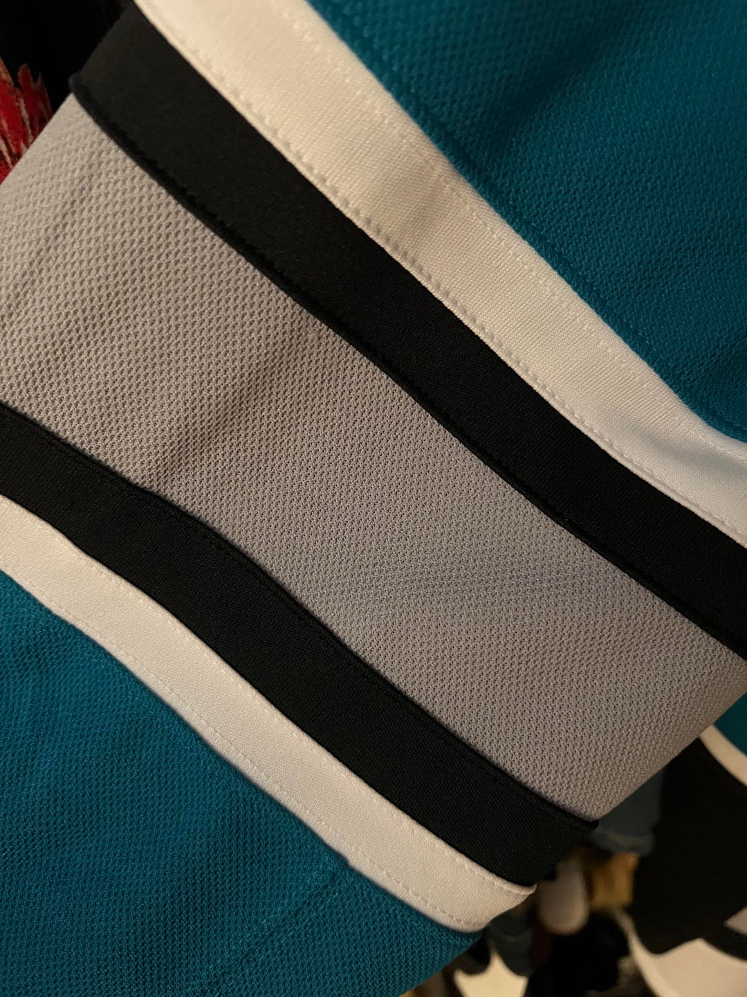
Really needed some grey on it in general to be an instant winner for me. Still really like the road unis tho
I did like the grey. But I’m also for trying something new.
The lack of orange is exciting. It wasn’t even the right shade orange to go with the teal.
You want gray stripes? So that the new jersey’s can look even more like the originals? Doesn’t that defeat the purpose of rebranding?
Personally I’ve never liked the grey much at all. It doesn’t pop and dulls any contrast between light and dark shades.
Eliminating the orange is good.
Having the same crest on both shoulders and having the 2 neutral colors (white, black) and just teal makes these jerseys VERY boring IMO. Some people may view that as clean or sleek. But to me its just boring. I really like the Cuda’s grey jersey best jersey the org released this year Imo.
Tbh, I think the throw back rebrand trend is starting to get really old. I love that the sharks decided to pay homage to the past while also moving forward.
I said this over in /r/hockeyjerseys but, I kind of wish the stripes didn’t feature the middle color. For example, thin black, wide white, thin black on the home version (basically just move the stripe design from the away jersey to the home jersey).
I like what they came up with a lot. I do want some gray but am not sure where to put it that feels like an improvement to this sweater variation. The stripe pattern they went with is really tasty. Maybe gray rims (neck rims, cuffs, and bottom opening).
I would love to see it with gray helmets, pants, and skates maybe.
Stripes beats no stripes. But grey/shark skin was so sick
They just look like something you’d find at target- I’ll always be a laces person I miss those but I do like the stealth fin on the shoulders
The new notgrey stripes will be more appreciated when they complement the new teal chrome helmets!
I was hoping for a return to the grey stripes, but I don’t hate the new look.
Grey with the wave pattern would have been sick
Agreed
Grey would’ve broken up a lot of the similar colors
See they just haven’t unlocked the gray stripes yet
Is that teal more along the lines of the older teal they used? I can’t tell.