If this is truly the city jerseys, this is a massive downgrade from last year.
This is the drizzling shits.
Literally the worst Wolves jersey I’ve ever seen. The font too…. bring back the trees, leave this garbage on the cutting room floor.
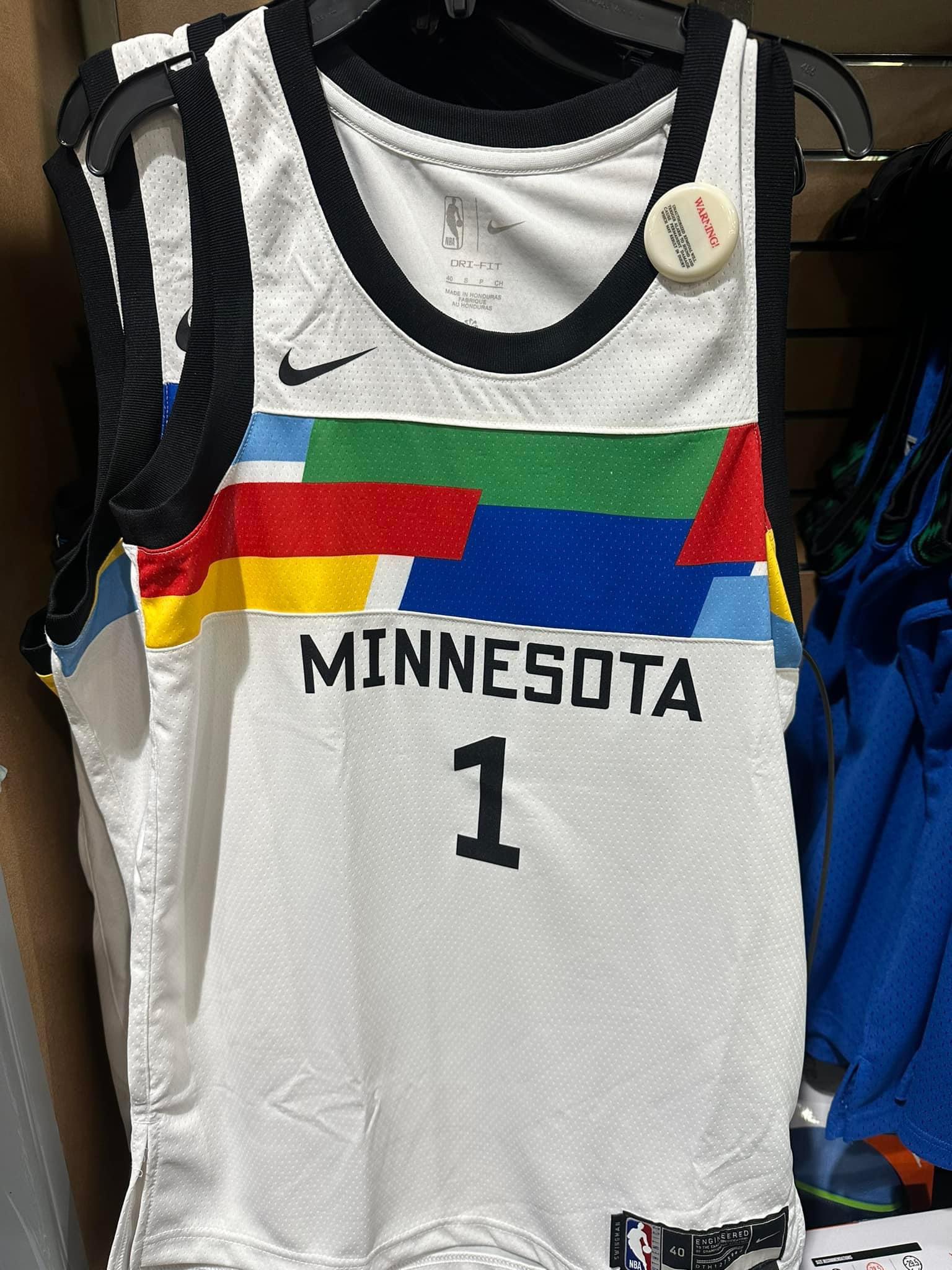
The front one has yellow and red going into the armpit on the bottom left. The one behind it has blue and yellow and the blue under the Nike logos do not match either so I am holding out hope its not legit
Booooooo
I own every jersey we’ve ever put out. I think I’ll let last year’s city editions be the book end
Wow. I thought the mock ups were bad, but I figured the actual product would be better. This is somehow worse. Worst Wolves jerseys ever
Rec league
Even shitty jerseys look good next to the trophy.
This looks like some rando stock colors design anyone can buy and they put your teams name on it.
Shit looks like a middle school track singlet.
Ew
Why’s nobody talking about the jerseys to the right of them though 👀 trees back?
Need to see the full uniform before I judge
yeah this is disgraceful
I hate this
Am I the only one that likes them..?
Just so crazy that upon the initial leak they must have received nothing but negative feedback. Too much momentum to pull the plug?
Jazz seemed to have gone through similar with their *practice* jerseys and they couldn’t get those scrapped either.
Fuck I was really hoping they would redesign them after that initial leak, these are ass
Does anyone else not absolutely hate it
Bob Dylan would be disappointed if he saw these
Limited edition….🤣
Minnesota Nuggets…. Masterpiece 👏👏👏
Can we bully them into changing it?
I personally like it but it’s a serious downgrade from last year’a
Is it too early to say those are the worst jerseys of all time? Yuck
Is this even real???
They are all wrinkled like it was balled up in a gym bag.

27 comments
If this is truly the city jerseys, this is a massive downgrade from last year.
This is the drizzling shits.
Literally the worst Wolves jersey I’ve ever seen. The font too…. bring back the trees, leave this garbage on the cutting room floor.
The front one has yellow and red going into the armpit on the bottom left. The one behind it has blue and yellow and the blue under the Nike logos do not match either so I am holding out hope its not legit
Booooooo
I own every jersey we’ve ever put out. I think I’ll let last year’s city editions be the book end
Wow. I thought the mock ups were bad, but I figured the actual product would be better. This is somehow worse. Worst Wolves jerseys ever
Rec league
Even shitty jerseys look good next to the trophy.
This looks like some rando stock colors design anyone can buy and they put your teams name on it.
Shit looks like a middle school track singlet.
Ew
Why’s nobody talking about the jerseys to the right of them though 👀 trees back?
Need to see the full uniform before I judge
yeah this is disgraceful
I hate this
Am I the only one that likes them..?
Just so crazy that upon the initial leak they must have received nothing but negative feedback. Too much momentum to pull the plug?
Jazz seemed to have gone through similar with their *practice* jerseys and they couldn’t get those scrapped either.
Fuck I was really hoping they would redesign them after that initial leak, these are ass
Does anyone else not absolutely hate it
Bob Dylan would be disappointed if he saw these
Limited edition….🤣
Minnesota Nuggets…. Masterpiece 👏👏👏
Can we bully them into changing it?
I personally like it but it’s a serious downgrade from last year’a
Is it too early to say those are the worst jerseys of all time? Yuck
Is this even real???
They are all wrinkled like it was balled up in a gym bag.