[OC] Animated Average Points Scored vs Points Allowed Through Week 5
October 11, 2022
[OC] Animated Average Points Scored vs Points Allowed Through Week 5
28 comments
How the fuck are we .500 with the worst offense in the league I genuinely don’t get it
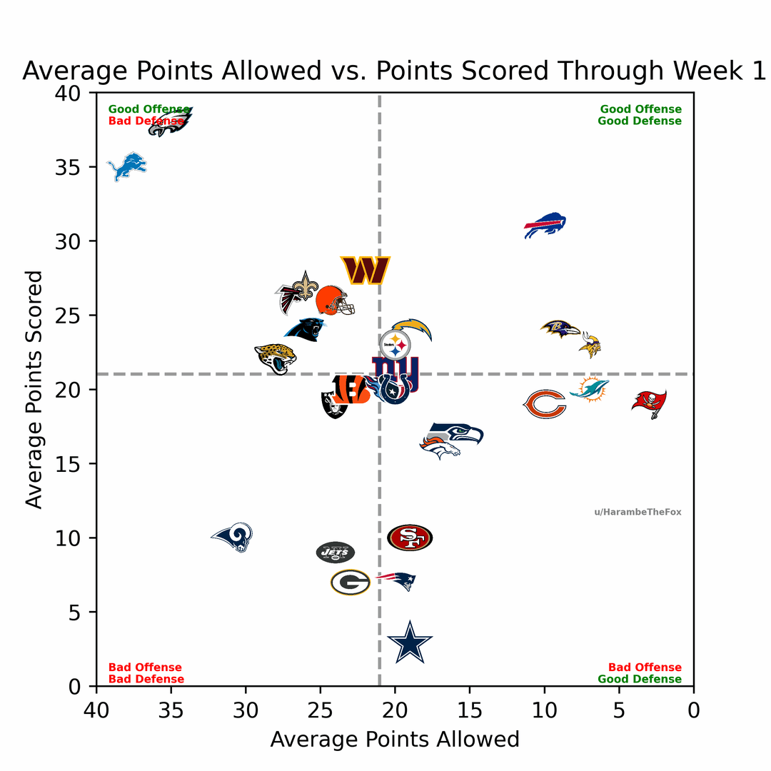
This is my first time doing anything animated using python and matplotlib and wow was it difficult, but I finally ended up with a finished product I’m satisfied with. I’m slightly upset with how reddit nerfs the gif FPS but what can you do, at least it’s not too clunky. You can check out my code and get access to my logo bank [here](https://github.com/ashtoncb12/NFLStats). As always if you have any questions or suggestions based on my charts or code please feel free to reply or DM me!
I think we might be doing okay so far.
Hey, Our offense is constantly improving! There really was nowhere to go but up.
In our defense we should probably be closer to the middle since 14 points were given up by our offense.
Casually getting worse each week. Love it
We are getting incrementally better on both sides… but we still suck!
Watching Pittsburgh just fall into the bottom left makes me sad
Regression to the mean before … let me fly – goes the Bills
I like how instead of there being a a bunch of teams in a diagonal around the league average, they are off-set in the Jaguars-Steelers diagonal. You can thank the Chiefs, Lions and Seahawks for that.
Tough to see the Ravens declining production on O in animated form. Come back to us Lamar!
The Vikings are right in the center, the most average 4-1 team of all time
Packers have been extremely mediocre this season and the numbers back it
Pats sneakily inching up towards the top right quadrant.
Granted it’s because we’ve made it out of the tough first month and are headed into a fairly manageable series of games before another murderer’s row.
Love it! Thanks
Looks like pics 2 and 3 are the exact same, just with different labels on the axes.
Great work otherwise though!
Hmmm yes, I like this graphic
Giants just look like they’re navigating the pocket with 31 pass rushers flying all over the place
Our logo looks so cool when it’s moving up
A small bit of advice. If you’re doing a chart animation, please hold on the final result for a few seconds
Yay we’re mediocre instead of bad!
We’re consistently getting worse. Blame Canada.
Is this offensive scoring or total points? The Steelers are bad this year on offense and we’ve had a couple defensive touchdowns. That 60ish points is could be worse than it looks.
Lol at us
Hello fellow good offenses
The funniest part was watching the Lions sky dive
Nice the see the 9ers offense climbing. Our defense is amazing!
The Cardinals defense has improved since week 1. Unfortunately the offense has not done the same thing

![[OC] Animated Average Points Scored vs Points Allowed Through Week 5](https://www.rawchili.com/wp-content/uploads/2022/10/sk28pm71d6t91-1080x1024.gif)
28 comments
How the fuck are we .500 with the worst offense in the league I genuinely don’t get it
This is my first time doing anything animated using python and matplotlib and wow was it difficult, but I finally ended up with a finished product I’m satisfied with. I’m slightly upset with how reddit nerfs the gif FPS but what can you do, at least it’s not too clunky. You can check out my code and get access to my logo bank [here](https://github.com/ashtoncb12/NFLStats). As always if you have any questions or suggestions based on my charts or code please feel free to reply or DM me!
I think we might be doing okay so far.
Hey, Our offense is constantly improving! There really was nowhere to go but up.
In our defense we should probably be closer to the middle since 14 points were given up by our offense.
Casually getting worse each week. Love it
We are getting incrementally better on both sides… but we still suck!
Watching Pittsburgh just fall into the bottom left makes me sad
Regression to the mean before … let me fly – goes the Bills
I like how instead of there being a a bunch of teams in a diagonal around the league average, they are off-set in the Jaguars-Steelers diagonal. You can thank the Chiefs, Lions and Seahawks for that.
Tough to see the Ravens declining production on O in animated form. Come back to us Lamar!
The Vikings are right in the center, the most average 4-1 team of all time
Packers have been extremely mediocre this season and the numbers back it
Pats sneakily inching up towards the top right quadrant.
Granted it’s because we’ve made it out of the tough first month and are headed into a fairly manageable series of games before another murderer’s row.
Love it! Thanks
Looks like pics 2 and 3 are the exact same, just with different labels on the axes.
Great work otherwise though!
Hmmm yes, I like this graphic
Giants just look like they’re navigating the pocket with 31 pass rushers flying all over the place
Our logo looks so cool when it’s moving up
A small bit of advice. If you’re doing a chart animation, please hold on the final result for a few seconds
Yay we’re mediocre instead of bad!
We’re consistently getting worse. Blame Canada.
Is this offensive scoring or total points? The Steelers are bad this year on offense and we’ve had a couple defensive touchdowns. That 60ish points is could be worse than it looks.
Lol at us
Hello fellow good offenses
The funniest part was watching the Lions sky dive
Nice the see the 9ers offense climbing. Our defense is amazing!
The Cardinals defense has improved since week 1. Unfortunately the offense has not done the same thing