
— Previous article
I would like the new reverse retros a lot more if they made the logo far more Rockies-like
Next article —
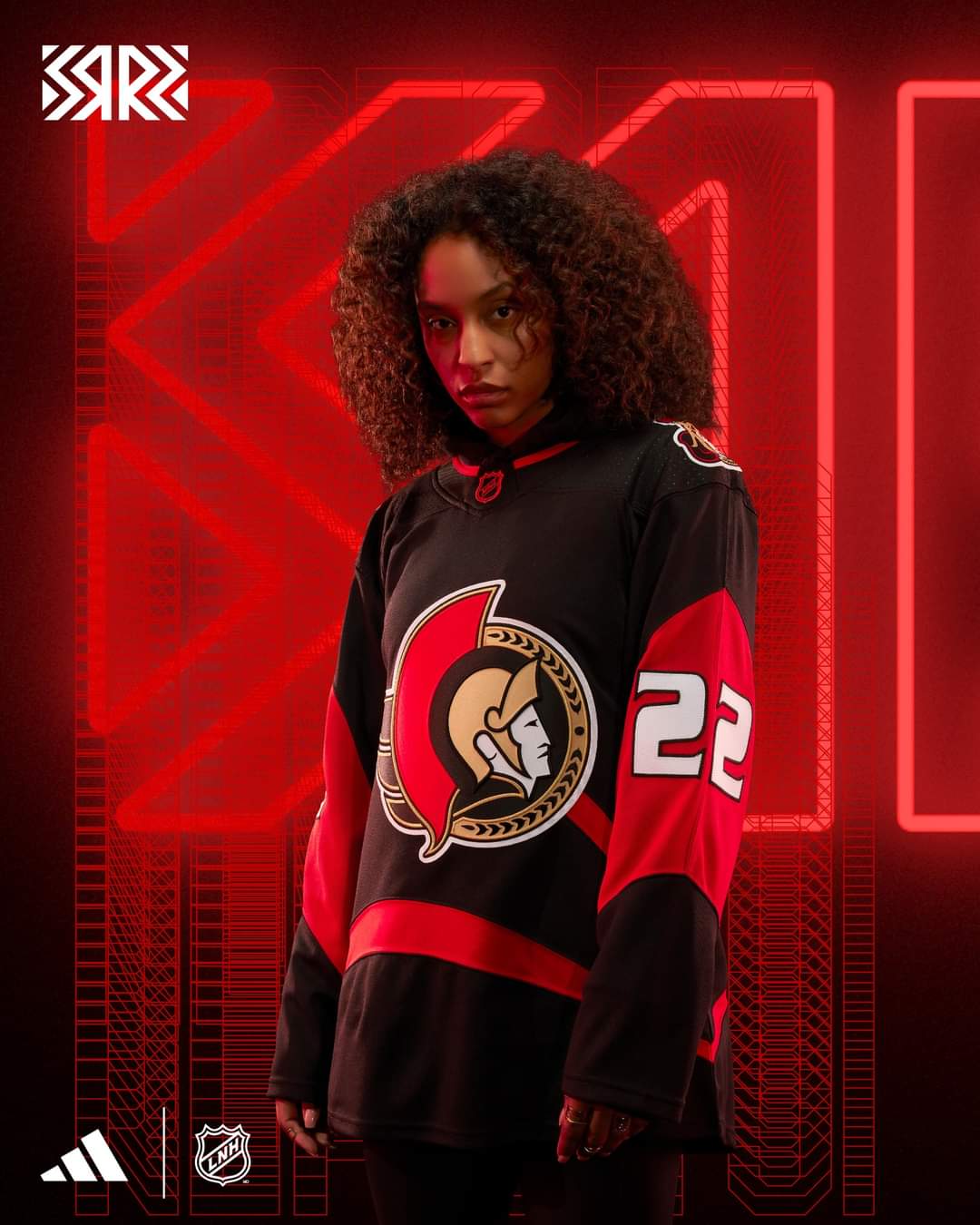
Better picture of the new RR Jersey
You May Also Like
Ottawa Senators: Formy has 1️⃣5️⃣ on the year!…
Formy has 1️⃣5️⃣ on the year!
Jakob Chychrun Projections 🤔
How many goals and assists will Jakob Chychrun end up with this season?

Throwback photos of the boys who were the last ones to take us to the playoffs
Throwback photos of the boys who were the last ones to take us to the playoffs
21 comments
lol
The fat numbers are sick
I don’t know why, but the back numbers remind me of the derp emoji:
https://cdn3.emoji.gg/emojis/6457_derp.png
These seem lazy to me. All they did is take our current home jerseys and add the 2000’s numbers and swoosh.
I’d much rather something red or revisit the cream barber poles with the O logo.
Feel like a fool for thinking we’d get laurels, gold, and a red jersey with the senagoth. Man, they just phoned it in with this.
i like. want to buy
It’s fine. At least we still have room to go gold/parliament/senagoth for future years.
I’m disappointed it’s not more distinct from our current jersey so I’ll probably only buy two of them
Like, look, it’s nice and it definitely should be ranked in the top half of the series of jerseys, but it’s so uninspired. At least get funky with it; make the swoosh white, give us some gold laurels, give us the goofy face. The fun ones are always the best ones.
I’ll probably still buy one because I’m weak as fuck though.
Edit: [Like this would have been great](https://twitter.com/n96network/status/1583122094682165250?s=46&t=1RPiC7AApyOjhu364BtNUg)
3.6 Roentgen
BOOOOOOOOO
Special shoutout to N96 Network for immediately making the jersey interesting instead of boring with very little tweaking:
https://twitter.com/N96Network/status/1583122094682165250?t=EQv923Cr51WLluLwe47EMg&s=19
Glad they released some pictures since she didn’t stop moving for a goddamn second in the video so we could see what they actually look like.
Dirty!!!!!!!
Really disappointing, zero creativity and they didn’t even use a different logo. I hope the next one has either Senagoth or the Peace Tower logo
Colour me disappointed. It’s just to plain and I was never a fan of that jersey even with the original colours.
So when does Adidas lose the jersey contract..?
So all they did was add a slanted stripe and change the font. That’s a lotta fail.
Numbers are alright. Rest is very very mid.
Officially 0-2 on the RR lol
A tad disappointing but I’m still gonna buy one with Zub on the back