
(https://i.imgur.com/kVVG3y3.jpg)
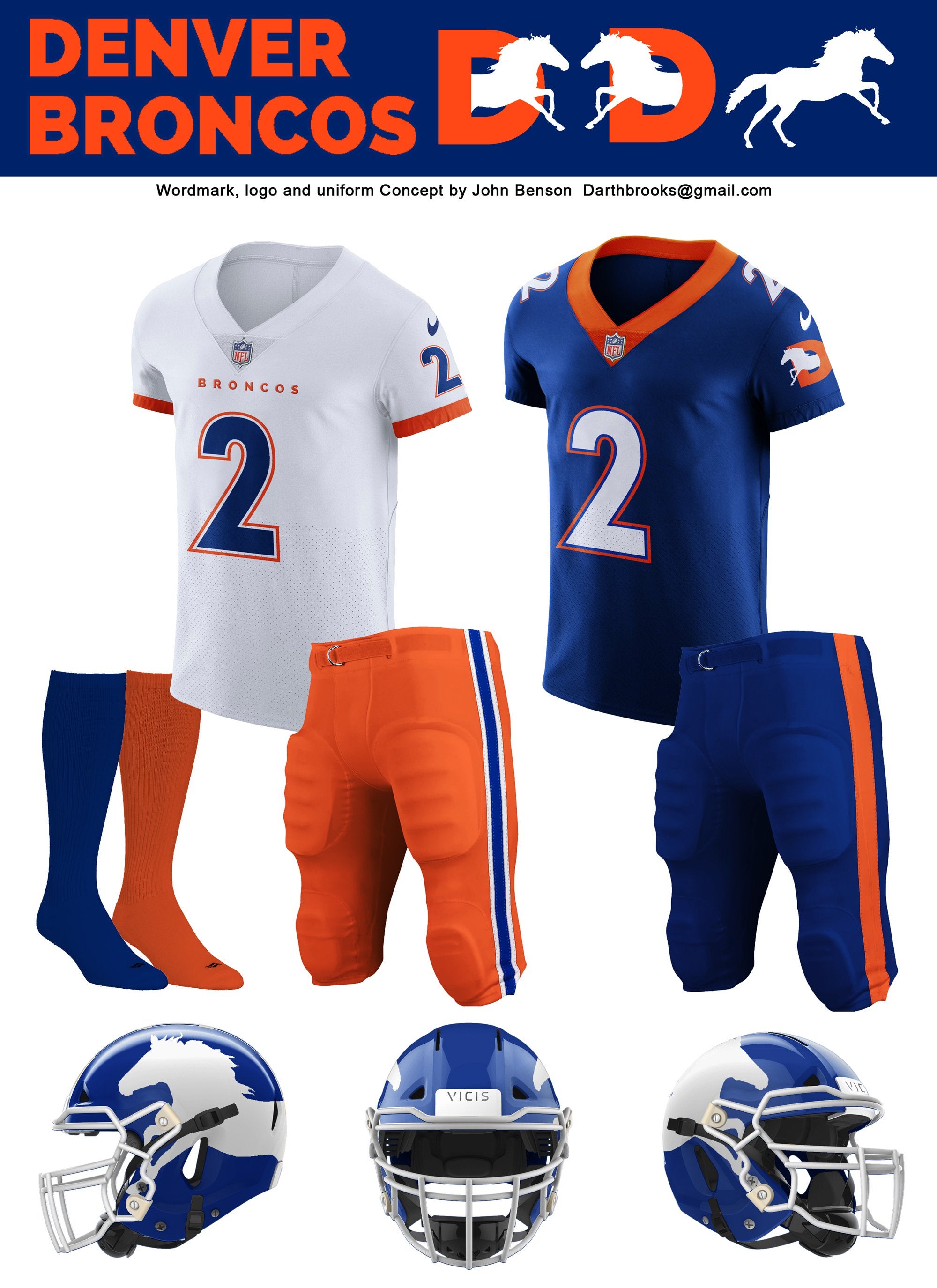
Uniwatch is doing a small contest asking people to redesign the Broncos uniform. (You don’t win anything as far as I know.) This is my version. The logo is new, and with both the logo and uniform I tried to riff off the old but not copy it. The socks are a little sparse because I didn’t realize until late in the process that Uniwatch wanted socks included.
What do you think? What (if anything) do you like about it, what (if anything) do you think could be better?
![[Polumbus] In honor of Raiders week, I present a 🧵 about my Favorite Hurricane Josh McDaniels Stories:](https://www.rawchili.com/wp-content/uploads/2022/09/hwJiBW5uip913DboDE-DhQC_giHEIkYjNGmtqmsl3Q8-560x336.jpg)
9 comments
I think we should figure out what color Russ can see and make them that color….
I like them, at least we would look good while we absolutely suck.
love it besides the logo on the helmet.
if the logo is a little more detailed they would be 10/10
Look like USFL jerseys.
But the color is nice
I like the colors, but the uni looks too much like UF. And the logo looks like something I’d see on a knockoff t-shirt being sold outside the stadium. Classic “D” logo or stick with the current one. I’ll pass.
Clean!
I would add some sort of stripe/color break to help separate the front and back. I think it would help make it standout from the tshirt jerseys.
I like these! Would love to see an orange variant of sorts
I’d rather not be the Denver gators. Good work but not diggin’ it