
What do you all think of the current uniforms and overall look of the Angels compared to those of the past? I’ve always loved the navy and red paired together, however the all red look they’ve used over the last 20 years isn’t terrible either. Would the fan base welcome a uniform change? Just curious.
44 comments
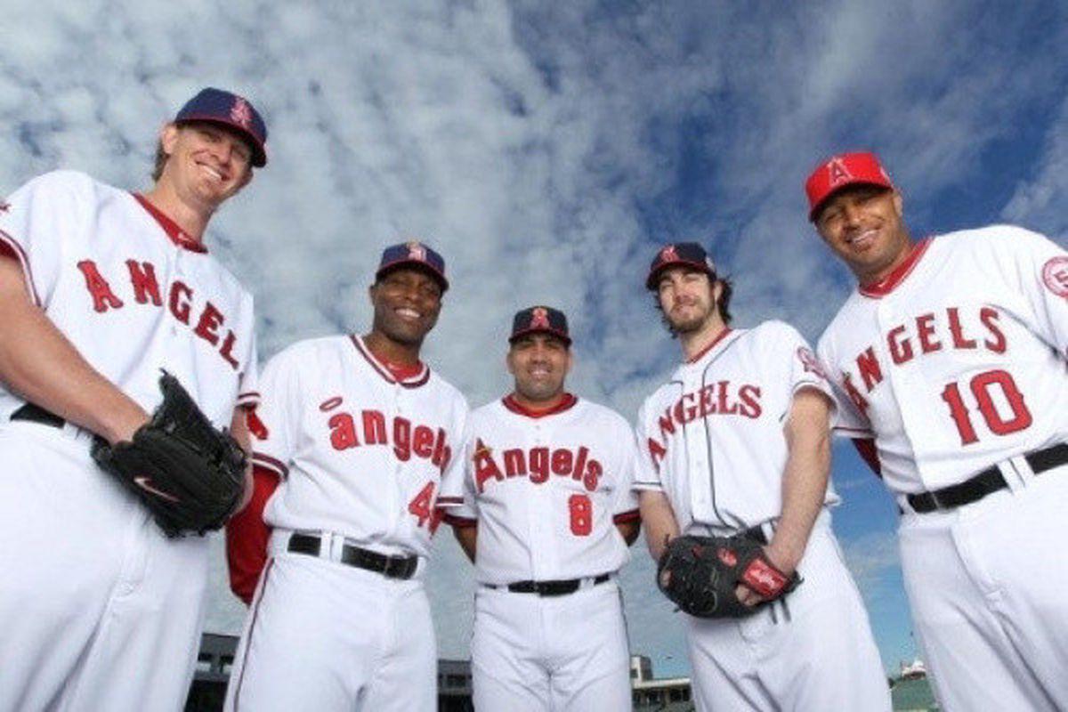
The Dan Haren uniform with the Torii hat but with the cap being red and the bill being navy
My fav
[Rodney Cline Carew California Angels ](http://www.backsportspage.com/wp-content/uploads/2020/12/Rod-Carew-Net-Worth-1024×681.jpg)
I personally like the current look. I love the red. I’d change the halo on the current logo to gold instead of the silver it is now and I wouldn’t be opposed to some navy accents like the bill of the hat, the under shirts, and the numbers on the front of the jerseys but I think the dominant color needs to be red. Many will disagree with me. We’re all different.
Out of all the uniforms there the current is the worst. Give us something clean and classy
We’ve had a really good uniform history. Our current unis are still fresh as heck and the alt reds are one of my all time favorites. The 80s California Angels set is definitely the best set we’ve ever had though.
The city connect should be made the new primary.
Bring back the “Anaheim” jerseys & the vest jerseys for one & the late 80’s early 90’s uniforms too
[1971-1972 ](https://news.sportslogos.net/wp-content/uploads/2012/05/Screen-Shot-2012-05-12-at-15h27.36-1.png)
I like the current uniforms, but I think it’s time to change it up. I would like to see them switch to the Uppercase A logo like in that middle uniform from the picture.
The lowercase “a” set is the best one and it was used the least
I like the current ones. Don’t change them.
Torii 😭
My Vernon Wells PTSD just got triggered
City connect are beautiful and should be a regular alternate.
I don’t notice the regular uniforms at all, and I think that’s bad.
I actually don’t like any of our throwbacks. I do agree a refresh would be nice. But I wouldn’t want to resemble the older styles
Holy moly I totally forgot that we had Dan Haren, let alone that he put up 6 FWAR in 2011!!!!!
Reagins was old-school, but there’s a reason he rose through the ranks (and it’s not because he was a nice guy, read Odd Man Out). He was an old-school superstar, but, well, nobody wins against Arte.
I don’t like calling the team the Los Angeles Angels. So I want to state that up front. But if we’re going to do that then I wish we’d go all in on our throwbacks and actually use the white “Los Angeles” jerseys from 61. I also wish we’d lean into the original LA logo that the Dodgers took from us just to remind them that one team is actually from Los Angeles while the other is just another east coast newcomer looking for better weather.
If you take those 5 jerseys, our current is without a doubt the worst, but it’s not like I don’t like em. We honestly have had a great history of uniforms, I really want to incorporate more navy in our color ways.
The more navy blue the better
These are all pretty good. I’d caution everyone not to conflate how good Torii Hunter looks wearing anything with how good that uniform is (even though it is still very good). I’m apparently in the minority in that my favorite is the 90’s era one that Haren is wearing in this pic. I think our current is probably my least favorite, but it’s still pretty good.
I know it’s just me but I never understood the button down jerseys, tradition I am guessing. Seems so impractical, I prefer the pullovers from the 80’s or whatever. But I also love the city connects. I say go with 80s, no buttons and city connects as alternates.
Best Angels contract legend Vernon Wells
So sick of the red. Red is fine as an accent color, but I don’t care for it as a primary.
The halo definitely needs to be gold.
Ahh those 4 jerseys to the left are prime, the one on the right is ugly and has contributed to our downfall as an organization
The red jersey is my favorite. I love their current look. I do love a good throw back to the CA Angels style uni when they wear them.
A lot of fans want the 70s California Angels units back. Dont get me wrong , they are fantastic but my opinion is they are way too dated. I mean they scream 70s. If they brought something like those back, they’d have to modernize them somehow without ruining the concept
Side note… I think the Ducks Angels collaboration caps can be way better.
We need to mix it up. They’re fine uniforms but they’re not cool. I would like something cool.
Couldn’t care less if they are winning. The importance of unis increases as the losses build.
I get fatigued by their existing red jerseys. There’s not enough variety for me.
I think back to that 50th anniversary season, and it was a disappointment whenever they wore their current jerseys instead of a throwback.
I don’t think we need to go full throwback mode, but incorporating more blues and golds from history would be nice.
The current look has had a good run. It has its place in our history and it looks right at home in this picture with our other looks. But it’s time. It’s not fresh anymore, it’s feeling stale. It’s time for another change.
As for that change, as much as I love a lot of our previous looks, I don’t think it should just be a simple switching back to one of those. They’re all awesome but they each feel dated and wouldn’t work as a primary today. But I do feel they should heavily inspire the new look. Specifically the 80s look. Navy cap, red bill, new version of that classic A, fresh version of that wordmark, etc. But no grey road uniforms. Periwinkle blue motherfuckers. The powder blue comeback is in full swing and it such a great alternative to how boring grey uniforms are and the periwinkle would be a slightly different twist.
As for the alternate, either Navy blue with red numbers or vice versa. And once the City Connest stuff is over, keep it around as another alternate.
As long as the Perwiwinkle pinstripes and wing never resurface, then all is fine with me.
Uniforms are starting to look dated. Would also like to see them bring back navy option. Also wish they would drop the Los Angeles and go back to California Angels.
They forgot the 90s angels unis smh 🤦♂️
I’d love a redesign that uses a navy jersey with sky blue sleeves, and an inverse of sky blue jersey with navy sleeves. Navy helmet/hat with a sky blue bill, gear would be red.
Lower case “a” for me.
I like our logo but don’t like our color scheme especially the red on red jersey
Middle design has always been my favorite.
I want the return of the California outline on the sleeve.
Need blue
I love the Anaheim jersey
90s era uniforms were great… California Angels, plus as a 49ers fan, the 1995 uniforms were great!
The current branding and jerseys are the best the team has ever had, from a design perspective. The Angels had a serious problem in the past of way too tracked out and really dull type.
I’d like the franchise to leave the jerseys mostly as is, perhaps with the addition of more navy and gold.
All my hats are the little a + halo – I’ve always loved that look.