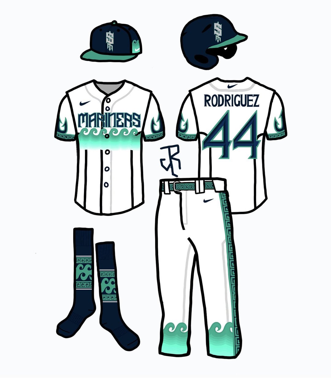
Way too busy with the waves, pant stripes and anchors on the sleeves. Could work as a City Connect kind of thing, though. I don’t think we’ll ever see the downward trident as the main logo graphic, either. Will always be around as a fun turn back the clock kind of thing, but I just don’t see it coming back. Also, looking at it closer up, the S on the hat looks like a dollar sign.
I love the aztec spirals on the pants
I like the color schemes. Especially the jersey with the black. I like the font and the logo. Not a huge fan of the waves, though. Overall great job.
I like the socks, but more as something for the fans, not as part of a uniform.
No thank you
Feels like it would be a jersey of a pacific island team
It’s a fun concept! I think I would only want this to be a one time home alt jersey. Pants are fire tho.
Looks like something you would see at a slowpitch softball tournament.
Pretty sure this player’s mock-up should have more of a bulge.
Double it and give it to the next person
Oof the waves and Greek feel at the hem is awful Edit: text is ugly too
Id buy a jersey.
Just to burn it.

It has “our flag means death” kinda vibe…. and for that I am out
Thanks. I don’t like it.
some cool ideas! just not very baseball i think
No offence but this is b a d
I like the Jp one. Idk why people are being assholes about it.

18 comments
They look like a kraken concept
Way too busy with the waves, pant stripes and anchors on the sleeves. Could work as a City Connect kind of thing, though. I don’t think we’ll ever see the downward trident as the main logo graphic, either. Will always be around as a fun turn back the clock kind of thing, but I just don’t see it coming back. Also, looking at it closer up, the S on the hat looks like a dollar sign.
I love the aztec spirals on the pants
I like the color schemes. Especially the jersey with the black. I like the font and the logo. Not a huge fan of the waves, though. Overall great job.
I like the socks, but more as something for the fans, not as part of a uniform.
No thank you
Feels like it would be a jersey of a pacific island team
It’s a fun concept! I think I would only want this to be a one time home alt jersey. Pants are fire tho.
Looks like something you would see at a slowpitch softball tournament.
Pretty sure this player’s mock-up should have more of a bulge.
Double it and give it to the next person
Oof the waves and Greek feel at the hem is awful
Edit: text is ugly too
Id buy a jersey.
Just to burn it.

It has “our flag means death” kinda vibe…. and for that I am out
Thanks. I don’t like it.
some cool ideas! just not very baseball i think
No offence but this is b a d
I like the Jp one. Idk why people are being assholes about it.