
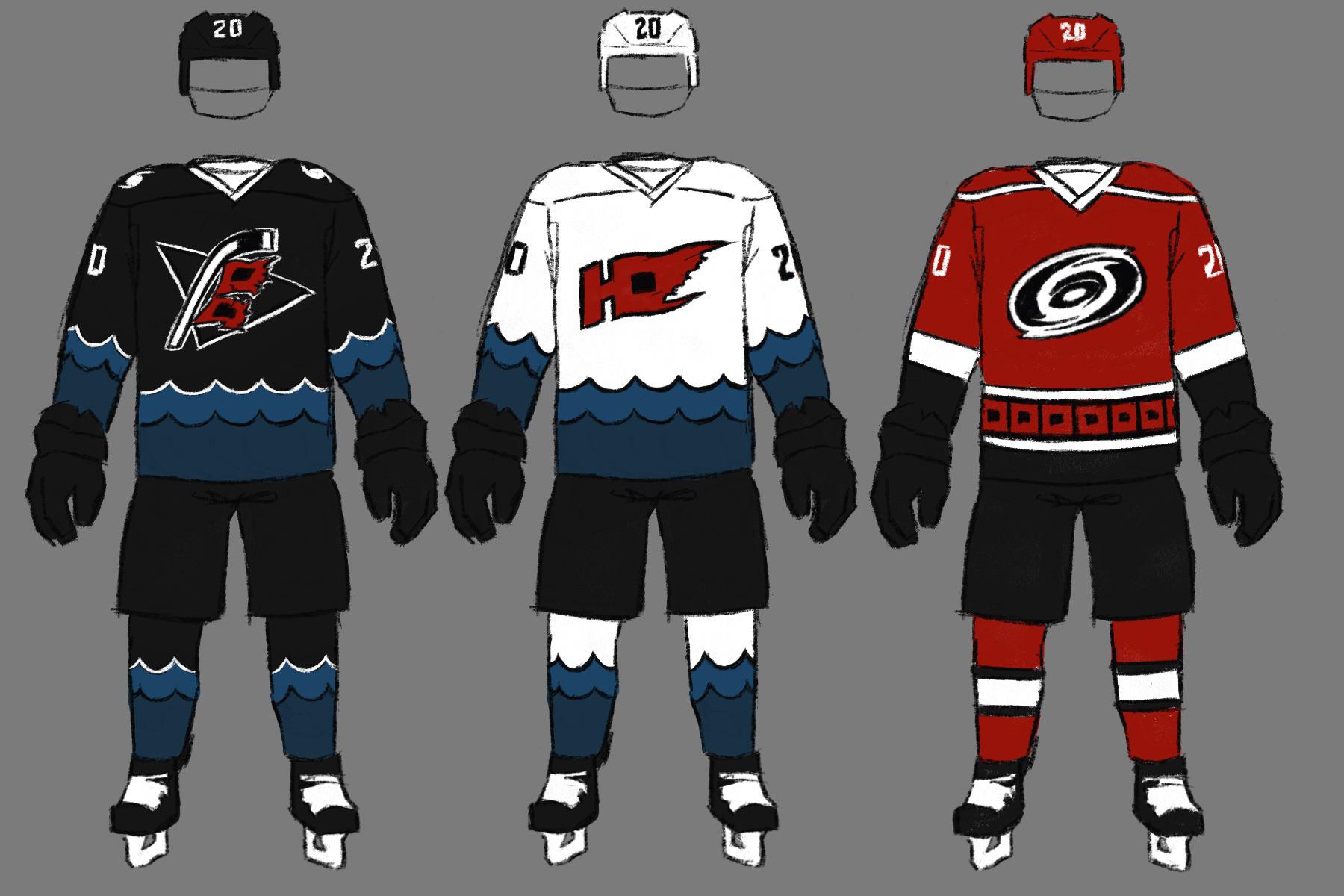
I personally believe we’ve gone overboard on the red and think we should mostly use it as accenting / highlighting. I became enamored with the idea of some gloomy sort of blue to evoke the oceanic aspects of hurricanes. For the away jersey, I borrowed and slightly modified another fan concept logo I found on google. The alt would be an updated Anniversary jersey, which are my personal favorites of our current lineup. Let me know your thoughts, this was just for fun!


3 comments
I absolutely love the first two. The wave design is fire
the waves are AWESOME
The triangle behind the new flag logo looks sick here. I wonder how it’d look on the home darks.