
— Previous article
[Cam Robinson] Arturs Silovs (VAN) leads Latvia to their first ever medal at an IIHF event. He finishes the World Championships with a 7-3-0 record and a .923 save percentage. What a tournament.
Next article —
Great seats today
You May Also Like
![[Rachel Hopmayer] Jack Quinn also had surgery on the lower body injury shown here, and good news — there is no sustained Achilles or knee damage (after he just returned from an Achilles injury last summer). Team anticipates 6-8 week timeline for recovery.](https://www.rawchili.com/wp-content/uploads/2024/02/ASz_1e_2lsx2z1vMWwR5y3yTytOWe_mJZ6VsTMmnVYw.jpg)
[Rachel Hopmayer] Jack Quinn also had surgery on the lower body injury shown here, and good news — there is no sustained Achilles or knee damage (after he just returned from an Achilles injury last summer). Team anticipates 6-8 week timeline for recovery.
[Rachel Hopmayer] Jack Quinn also had surgery on the lower body injury shown here, and good news —…
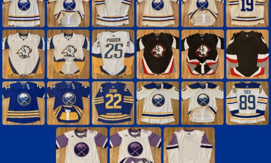
Let’s ring in the Sabres’ season with my current Sabres collection!
The blank HC is in the shop becoming a Cozens right now! * [Further breakdown of the Sabres-specific…
![[The Athletic] The NHL’s top breakout goalie candidates for 2023-24: Devon Levi, Dustin Wolf and 5 more](https://www.rawchili.com/wp-content/uploads/2023/09/Z89N-lyf2MxcOX0qOj07ELLIvTe14muyv5pXtYWRH0-560x336.jpg)
[The Athletic] The NHL’s top breakout goalie candidates for 2023-24: Devon Levi, Dustin Wolf and 5 more
[The Athletic] The NHL’s top breakout goalie candidates for 2023-24: Devon Levi, Dustin Wolf and 5 more
8 comments
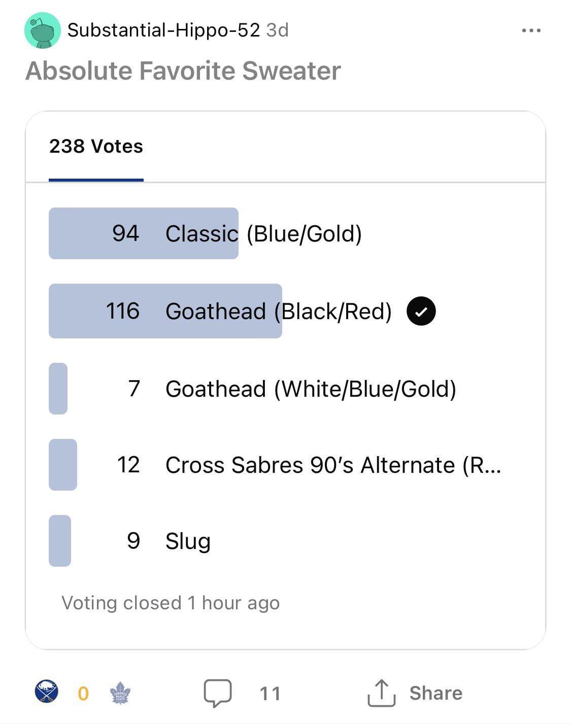
As it should! Goathead is one of the best designs in hockey history
I love the goat head but also it does get old after a bit and I’ve never gotten tired of the classic blue and gold that we have currently (that navy blue & yellow and outlined logo abomination can fuck right off)
I like the black and red as a regular alternate rotated in. Perfect balance of classic and aggressive once in a while.
Goathead is an amazing 3rd jersey the sabres home away and thirds are probably the best or second best in the league
I doubt you’d vote for the Goathead if you lived thru the Rigas ownership years
The classic logo is a graphic representation of both the city and the team name. I am not aware of any other team logo that can say that. It is a beautiful, elegant image that we should all be proud of.
Here’s a nice representation of age here on reddit..
Hard pass
If our primaries were black and red, the classic blue and gold would’ve blown this vote out because everybody always wants what they can’t have, and the classic blue and gold is the superior jersey.