Ranking every jersey in Wild history (worst to first, details in the comments)
June 9, 2023
Ranking every jersey in Wild history (worst to first, details in the comments)
14 comments
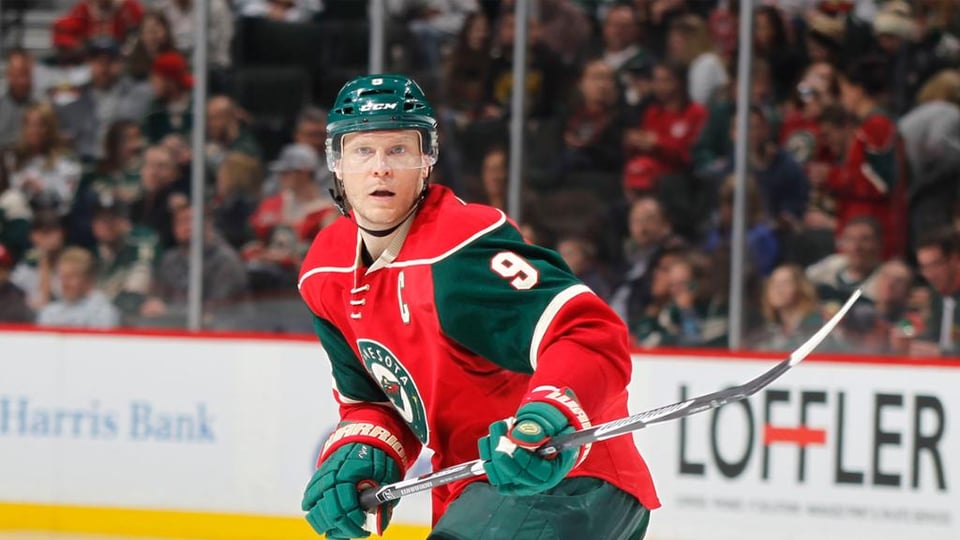
10) Red home: Very little use of forest green which is the team’s best color. Red is just not a good primary color for this team. Also the front logo is the worst, the bear logo on it’s own would’ve been much better.
9) Original forest green: The number font from this era is the best in team history and I wish we still used it. However the tan/wheat color is way too dark and there’s just too much green and not enough red and tan.
8) 2022 Reverse Retro: I’ll be honest, I’m not a fan of the North Stars colors so I just don’t like either reverse retro uniform. The stars on the pants look good and overall it’s a great homage to the North Stars, but the Wild are not and should never be a green and yellow team.
7) 2021 Reverse Retro: See above, but the white version is slightly better.
6) Winter Classic: A few too many stripes on the sleeves, but that’s nitpicking. The jerseys are very good. I understand the pants are dark to match the Target Field limestone, but as a hockey uniform the two shades of tan just doesn’t work.
5) Original white: Again, this era had the best number font. The bear logo pops really well on this jersey. I’m just not a fan of that particular sleeve and shoulder stripe style (going from the neck down to the wrist, like the Colorado Avalanche). That’s simply an opinion of personal taste, I happen to dislike that jersey template.
4) Stadium Series: Great use of forest green and both red and tan as accent colors. The bear logo looks great on the front, and the matching green helmet and pants complete a solid look.
3) Current white: This is my favorite jersey template, main color on top of the shoulders, some stripes on the sleeves and bottom of the jersey, and the main logo in the center. They’re simple but clean, and the red numbers with green outlines really pop.
2) Minnesota Wild script: These are perfection, and it’s a shame it’s no longer used as an alternate. The front logo is simple but clean, and while there is no red, the tan accents complement everything so well.
1) Current green: The Wild should never get rid of these, they hit a home run on their last rebrand. Forest green as the base is perfect, with matching pants and helmets. The use of tan and red on the sleeves is perfect. But most of all, the main logo really pops on the tan stripe in the middle of the jersey. These are simple, modern, unique and just plain beautiful. My favorite uniform in hockey history.
I disagree with about 90% of this.
I thought it was Best to Worst at first and I was like… “ok, except the Reds not bad…”
White RR are sick tbh
Yeah… Hard disagree on most of this.
Number one is actually number 5
Hard disagree. Having the current white that high and the entire bottom being outside the top 5 is a travesty. IMO from best to worst its 1) original whites, 2) last years RR, 3) original greens, 4) first RR, 5) Reds, 6) scripts, 7) first stadium series, 8) second stadium series, 9) current greens, 10) current whites.
Not trying to hate but I really really disagree with this opinion
You could drop the Retros both down to last place! Sorry but let the North Stars go FFS they look like the Subway colors
I really like the og green jerseys.
Original unis are great and so are the RR’s. I do agree with the red being the worst.
RR’s should be 1 and 2
Script jerseys (#9 as listed) are amazing and I want them back tomorrow
I like #1. I just don’t like the evergreen. I think the red and green make the wild

14 comments
10) Red home: Very little use of forest green which is the team’s best color. Red is just not a good primary color for this team. Also the front logo is the worst, the bear logo on it’s own would’ve been much better.
9) Original forest green: The number font from this era is the best in team history and I wish we still used it. However the tan/wheat color is way too dark and there’s just too much green and not enough red and tan.
8) 2022 Reverse Retro: I’ll be honest, I’m not a fan of the North Stars colors so I just don’t like either reverse retro uniform. The stars on the pants look good and overall it’s a great homage to the North Stars, but the Wild are not and should never be a green and yellow team.
7) 2021 Reverse Retro: See above, but the white version is slightly better.
6) Winter Classic: A few too many stripes on the sleeves, but that’s nitpicking. The jerseys are very good. I understand the pants are dark to match the Target Field limestone, but as a hockey uniform the two shades of tan just doesn’t work.
5) Original white: Again, this era had the best number font. The bear logo pops really well on this jersey. I’m just not a fan of that particular sleeve and shoulder stripe style (going from the neck down to the wrist, like the Colorado Avalanche). That’s simply an opinion of personal taste, I happen to dislike that jersey template.
4) Stadium Series: Great use of forest green and both red and tan as accent colors. The bear logo looks great on the front, and the matching green helmet and pants complete a solid look.
3) Current white: This is my favorite jersey template, main color on top of the shoulders, some stripes on the sleeves and bottom of the jersey, and the main logo in the center. They’re simple but clean, and the red numbers with green outlines really pop.
2) Minnesota Wild script: These are perfection, and it’s a shame it’s no longer used as an alternate. The front logo is simple but clean, and while there is no red, the tan accents complement everything so well.
1) Current green: The Wild should never get rid of these, they hit a home run on their last rebrand. Forest green as the base is perfect, with matching pants and helmets. The use of tan and red on the sleeves is perfect. But most of all, the main logo really pops on the tan stripe in the middle of the jersey. These are simple, modern, unique and just plain beautiful. My favorite uniform in hockey history.
I disagree with about 90% of this.
I thought it was Best to Worst at first and I was like… “ok, except the Reds not bad…”
White RR are sick tbh
Yeah… Hard disagree on most of this.
Number one is actually number 5
Hard disagree. Having the current white that high and the entire bottom being outside the top 5 is a travesty. IMO from best to worst its 1) original whites, 2) last years RR, 3) original greens, 4) first RR, 5) Reds, 6) scripts, 7) first stadium series, 8) second stadium series, 9) current greens, 10) current whites.
Not trying to hate but I really really disagree with this opinion
You could drop the Retros both down to last place! Sorry but let the North Stars go FFS they look like the Subway colors
I really like the og green jerseys.
Original unis are great and so are the RR’s. I do agree with the red being the worst.
RR’s should be 1 and 2
Script jerseys (#9 as listed) are amazing and I want them back tomorrow
I like #1. I just don’t like the evergreen. I think the red and green make the wild
you must be bored