Ranking every Timberwolves uniform set (worst to first, not including City Edition, details in the comments)
June 10, 2023
Ranking every Timberwolves uniform set (worst to first, not including City Edition, details in the comments)
6 comments
I was not very popular when I did this in the Wild sub, but here goes nothing.
5) 2008-2010: Just too much going on. The wordmark and number font is good, but they went way overboard with the side, neck, and arm lining. This was short-lived for a reason. 2/10
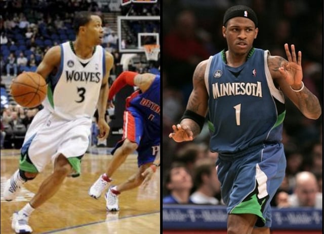
4) 2010-2017: Starting with the positive, this is my favorite number font in franchise history. It’s unique and sharp like the 2000s uniforms, but unlike the 2000s, it’s not so cartoony looking. That said, the rest is pretty bland (especially the colors), and the striping on the sides is a mess, with way too much going on. They not only have ugly elements to them, but there’s nothing exciting to them either. 3/10
3) 2017-present: These uniforms are fine. They’re not ugly, with the exception of the green alternate from 2017-2022, just bland. I will point out the green alternates are by far the single worst non-City Edition uniforms in franchise history. The team name font on this set is very generic and safe, and the number font doesn’t really match the team identity. I don’t mind the two shades of blue, but the neon green is a horrendous color. I will say I really like the new dark grey Statement uniform, especially the subtle way the M and the V look like sharp teeth. I also like the logo from this era more than any other. That said, the colors were better in the 90s and the fonts/designs were better in the 2000s, so this stays at #3. 6/10
2) 1989-1996: The OG Timberwolves colors are the best the franchise has ever had, and I hope we return to them very soon. The shades of blue and green are perfect. The jersey is quite simple, but very clean. I also love the original logo which, again, is simple but clean. 8/10
1) 1996-2008: This is a classic look. I like that the jersey says “TIMBERWOLVES” while most of our jerseys just say Wolves. I like how the wordmark looks like sharp teeth. The trees along the neck and arm are synonymous with this franchise, and need to be brought back. When you look at this uniform, you can tell it matches with *our* identity and no one else. The only thing I dislike is that the number font is a tad bit cartoony looking for my taste. I’d prefer they be dialed back, like the 2010-2016 number font which I felt was sharp and unique without being over the top. In my opinion, the white and black uniforms from this set are the best in franchise history. 9/10
Overall, I’d like the Timberwolves to create a new uniform set as new ownership takes over. Take the 2000s uniforms, slap the 2010s number font on them, and change the colors to the original blue and green (plus add silver as a secondary color). Keep the logo the same as it currently is, but with the 1990s colors. Take the best elements of each era and I think the Timberwolves uniforms can look spectacular.
Yeah hard pass, our current jerseys are so generic
I agree with this ranking
I agree with this ranking just bring back black and white with green trees please
Other than the Kg era we have awful jersey sets
Potentially unpopular opinion: the black sleeved jerseys were fire

6 comments
I was not very popular when I did this in the Wild sub, but here goes nothing.
5) 2008-2010: Just too much going on. The wordmark and number font is good, but they went way overboard with the side, neck, and arm lining. This was short-lived for a reason. 2/10
4) 2010-2017: Starting with the positive, this is my favorite number font in franchise history. It’s unique and sharp like the 2000s uniforms, but unlike the 2000s, it’s not so cartoony looking. That said, the rest is pretty bland (especially the colors), and the striping on the sides is a mess, with way too much going on. They not only have ugly elements to them, but there’s nothing exciting to them either. 3/10
3) 2017-present: These uniforms are fine. They’re not ugly, with the exception of the green alternate from 2017-2022, just bland. I will point out the green alternates are by far the single worst non-City Edition uniforms in franchise history. The team name font on this set is very generic and safe, and the number font doesn’t really match the team identity. I don’t mind the two shades of blue, but the neon green is a horrendous color. I will say I really like the new dark grey Statement uniform, especially the subtle way the M and the V look like sharp teeth. I also like the logo from this era more than any other. That said, the colors were better in the 90s and the fonts/designs were better in the 2000s, so this stays at #3. 6/10
2) 1989-1996: The OG Timberwolves colors are the best the franchise has ever had, and I hope we return to them very soon. The shades of blue and green are perfect. The jersey is quite simple, but very clean. I also love the original logo which, again, is simple but clean. 8/10
1) 1996-2008: This is a classic look. I like that the jersey says “TIMBERWOLVES” while most of our jerseys just say Wolves. I like how the wordmark looks like sharp teeth. The trees along the neck and arm are synonymous with this franchise, and need to be brought back. When you look at this uniform, you can tell it matches with *our* identity and no one else. The only thing I dislike is that the number font is a tad bit cartoony looking for my taste. I’d prefer they be dialed back, like the 2010-2016 number font which I felt was sharp and unique without being over the top. In my opinion, the white and black uniforms from this set are the best in franchise history. 9/10
Overall, I’d like the Timberwolves to create a new uniform set as new ownership takes over. Take the 2000s uniforms, slap the 2010s number font on them, and change the colors to the original blue and green (plus add silver as a secondary color). Keep the logo the same as it currently is, but with the 1990s colors. Take the best elements of each era and I think the Timberwolves uniforms can look spectacular.
Yeah hard pass, our current jerseys are so generic
I agree with this ranking
I agree with this ranking just bring back black and white with green trees please
Other than the Kg era we have awful jersey sets
Potentially unpopular opinion: the black sleeved jerseys were fire