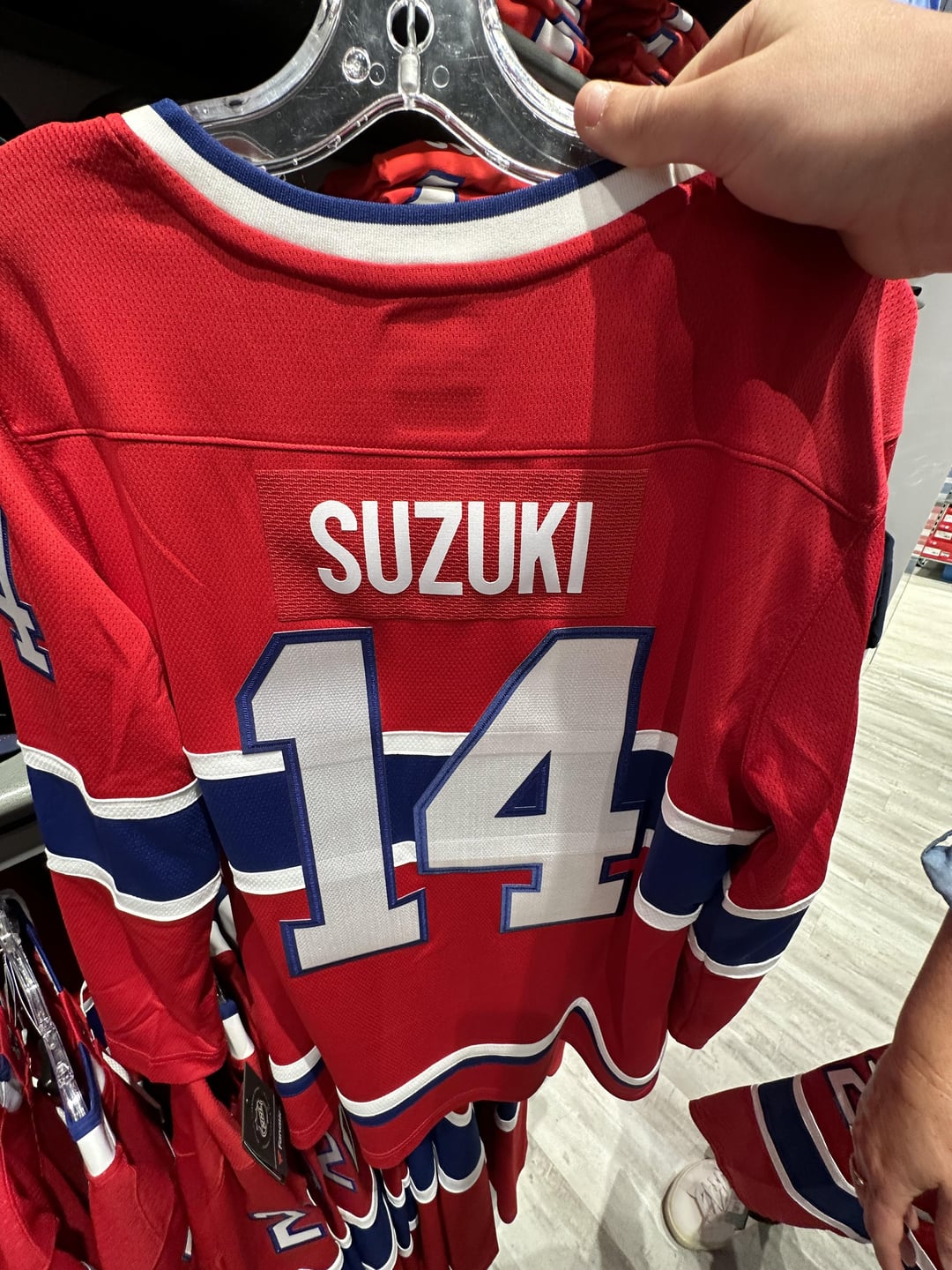
It looks like they put the name bar from a Youth Large onto the back of a Men’s Large 🤦🏻♂️
BLASPHEMY
Hey atleast the name is spelt right – Fanatics
That name plate is awful
That’s the new NHL official jersey brand for you!
Jeezzus…even the horizontal bars show through the back numbers because they’re so cheap. I wouldn’t spend a nickel on those.
mmm, love that look of the white bars through his number. that’s what i always look for in a jersey: transparent patches
That’s their version of the “budget” jersey. Think of a lesser quality Reebok Premier jersey. If you look at and feel the lettering it’s not even the proper letter kit. Due to this, I’m going to reserve judgement until we see the Fanatics player jerseys.
What did you expect? At least there’s no RBC patch
Nick ^^^Suzuki
Makes me appreciate buying an authentic pre-RBC jersey
So, when are we no longer going to be able to buy the Adidas jerseys? Need to buy some up before it’s too late.
They look like the jerseys you get off the Chinese knockout sites… Jesus NHL 🤦♂️
Fucking Kaka
I would buy it, at least I would have one in the most peripheral place for this type of jersey in the world  (i guess)
Might as well buy them from China for 30 bucks and you might even get better quality
Tinfoil hat: The name plate is smaller so they keep space for more ads in the future.
by making the names smaller they will be able to put ads on the back of the shoulders.
grow up you communist swine /s
Please tell me they won’t wearing those during the games…
Pretty sure that’s a women’s jersey. But, as a woman, yes they suck and they’re dumb

20 comments
It looks like they put the name bar from a Youth Large onto the back of a Men’s Large 🤦🏻♂️
BLASPHEMY
Hey atleast the name is spelt right – Fanatics
That name plate is awful
That’s the new NHL official jersey brand for you!
Jeezzus…even the horizontal bars show through the back numbers because they’re so cheap. I wouldn’t spend a nickel on those.
mmm, love that look of the white bars through his number. that’s what i always look for in a jersey: transparent patches
That’s their version of the “budget” jersey. Think of a lesser quality Reebok Premier jersey. If you look at and feel the lettering it’s not even the proper letter kit. Due to this, I’m going to reserve judgement until we see the Fanatics player jerseys.
What did you expect? At least there’s no RBC patch
Nick ^^^Suzuki
Makes me appreciate buying an authentic pre-RBC jersey
So, when are we no longer going to be able to buy the Adidas jerseys? Need to buy some up before it’s too late.
They look like the jerseys you get off the Chinese knockout sites… Jesus NHL 🤦♂️
Fucking Kaka
I would buy it, at least I would have one in the most peripheral place for this type of jersey in the world  (i guess)
Might as well buy them from China for 30 bucks and you might even get better quality
Tinfoil hat: The name plate is smaller so they keep space for more ads in the future.
by making the names smaller they will be able to put ads on the back of the shoulders.
grow up you communist swine /s
Please tell me they won’t wearing those during the games…
Pretty sure that’s a women’s jersey. But, as a woman, yes they suck and they’re dumb