Why does it look like there’s a white filled box covering an 8 to make a 3? Or it just me?
I don’t mind it. It’s a subtle southwest-y feel. It kinda gives ABA vibes
it’s so bad, someone on MS paint made this for sure
Yeehaw! I’m extremely on board for this.
Stupid
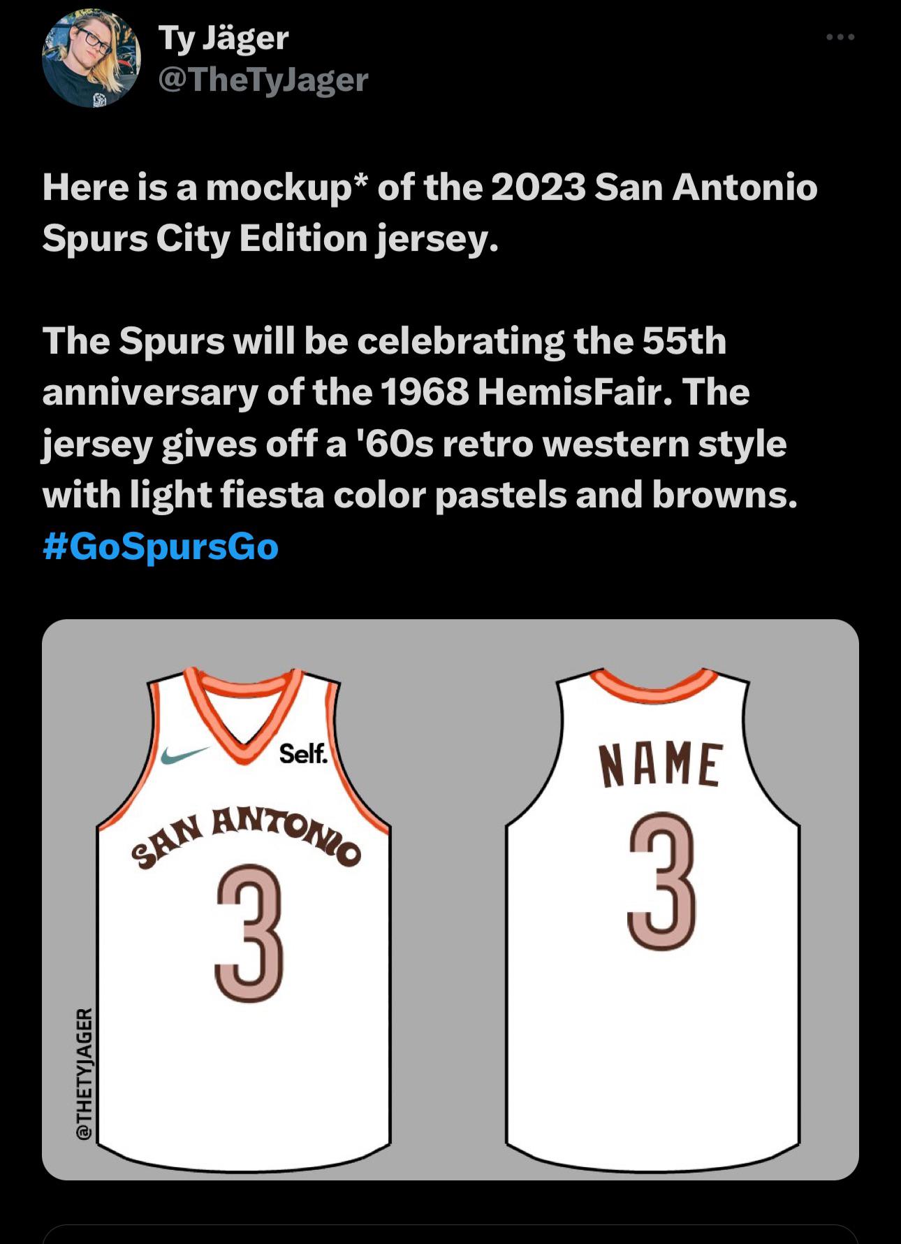
Ty said he’s seen the design himself but take his mockup very very lightly
woody’s roundup ass Jersey
For some reason, to me this looks like a Phoenix Suns jersey made in the style of the New Orleans Pelicans home jerseys
I guess were saving money to build the Wemby dome.
Love it
Terrible 🤢🤦🏻♂️

One of my favorite color palettes is brown, orange and red. Too sick
Trash
Best description on Twitter was “Bill Millers”
I’m just not a fan of any jerseys that stray from a team’s primary colors.
I’m out.
San Antonio Browns now? I thought we got rid of our Deshaun.
I like
This is so bad
The font is interesting, but those are dry. After the last few, feels drab. Needs some southwest imagery, like a coyote or the Alamo
Looks awful. I swear we have no talent when it comes to design. Guess it all went to coaching which is a positive.
Quit hatin, it’s good to try new styles otherwise we’d grow weary of the fiesta trend, plus this is sentimental of the 60s-70s, a good representation of the city’s roots and I like it
Change font to classic or 20-21 city jersey font. Add stripes or southwest design down the side.
Nah
I like it except the number. Looks a bit unfinished.
I like it. Nice to see there being so many things in SA to celebrate or pay homage to.
Orange and brown has gotta be the worst combination of colors to come out of that time period.

27 comments
Why does it look like there’s a white filled box covering an 8 to make a 3? Or it just me?
I don’t mind it. It’s a subtle southwest-y feel. It kinda gives ABA vibes
it’s so bad, someone on MS paint made this for sure
Yeehaw! I’m extremely on board for this.
Stupid
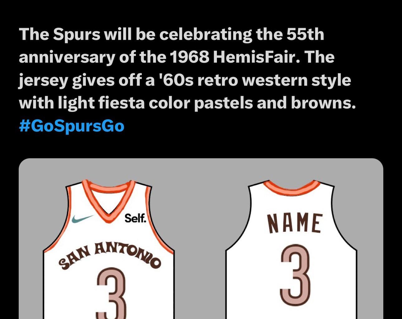
Ty said he’s seen the design himself but take his mockup very very lightly
woody’s roundup ass Jersey
For some reason, to me this looks like a Phoenix Suns jersey made in the style of the New Orleans Pelicans home jerseys
I guess were saving money to build the Wemby dome.
Love it
Terrible 🤢🤦🏻♂️

One of my favorite color palettes is brown, orange and red. Too sick
Trash
Best description on Twitter was “Bill Millers”
I’m just not a fan of any jerseys that stray from a team’s primary colors.
I’m out.
San Antonio Browns now? I thought we got rid of our Deshaun.
I like
This is so bad
The font is interesting, but those are dry. After the last few, feels drab. Needs some southwest imagery, like a coyote or the Alamo
Looks awful. I swear we have no talent when it comes to design. Guess it all went to coaching which is a positive.
Quit hatin, it’s good to try new styles otherwise we’d grow weary of the fiesta trend, plus this is sentimental of the 60s-70s, a good representation of the city’s roots and I like it
Change font to classic or 20-21 city jersey font. Add stripes or southwest design down the side.
Nah
I like it except the number. Looks a bit unfinished.
I like it. Nice to see there being so many things in SA to celebrate or pay homage to.
Orange and brown has gotta be the worst combination of colors to come out of that time period.