Actually terrible. If they’re going for a “back to basic, we can’t be flashy since we haven’t won anything “ vibe then I’m kinda feeling it. They have grit.
But on the other hand this is so far removed from regular Clippers jerseys and it’s actually got no appeal, I see no reason anyone would buy this. Nike’s given up
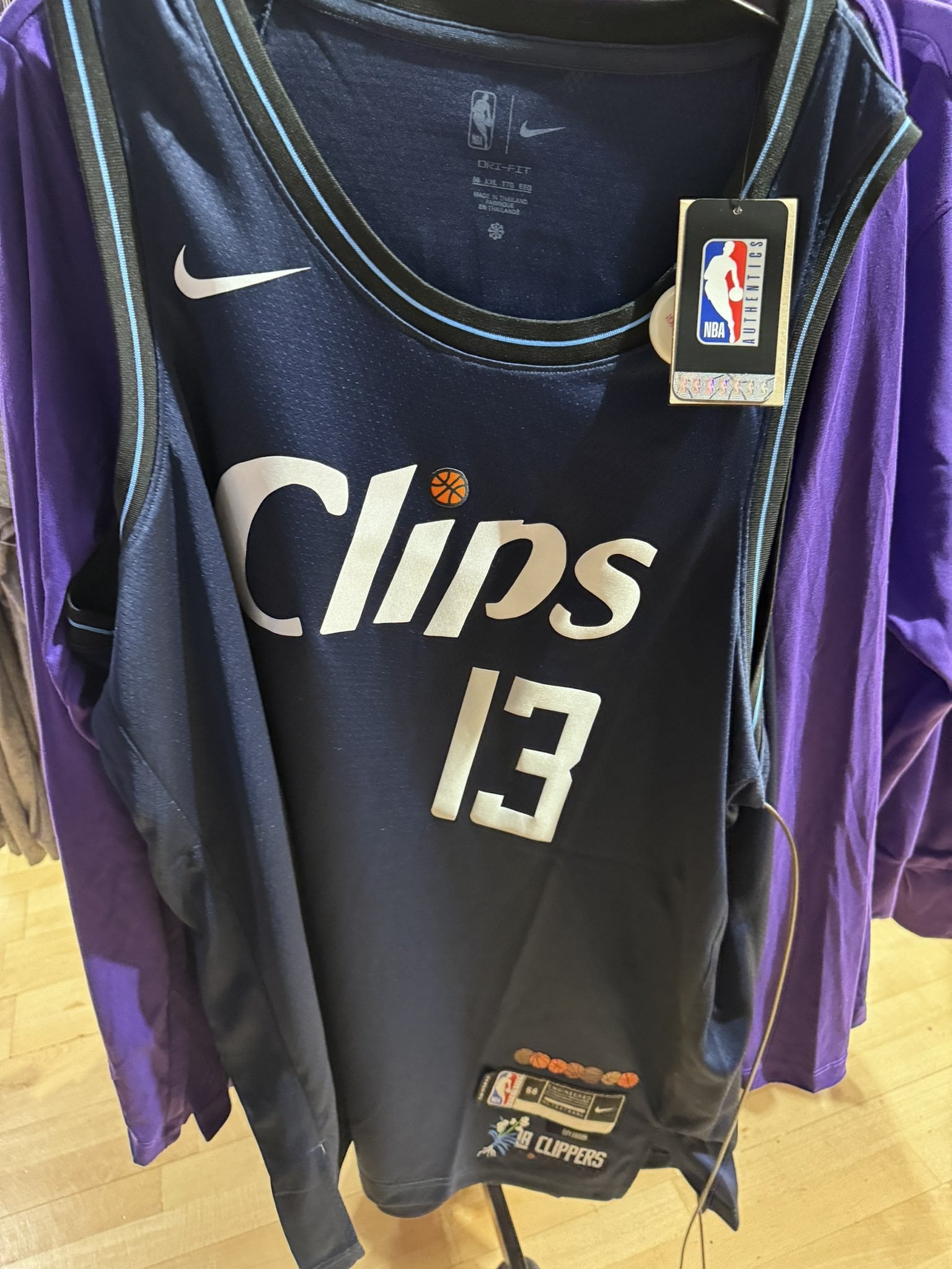
Is that a Washington Wizard jersey ?
We need to be honest our marketing team is very bad
These are awful but the post rebrand jerseys are still the worst I’ve ever seen.
I’m a certified Gillian Zucker hater exclusively because of how awful our branding tends to be.
Can we please get one jersey with the cursive font 🫠
Awful. I’m sure we’ll be able to find these for $5 in TJ Maxx before the season is even over, because no one is buying this at even 50% off.
Nike needs to stop having teams change jerseys every year. Most new City edition jerseys are either stale/recycled designs or absolute garbage tier.

Ballmer has everything going for him except any sense of style. This is embarrassing and yet still better than our logo and main unis.
Santee Alley specials.
The Statement jerseys are worse.
Clip those jerseys and sew in something better.
We went for the most underrated jerseys to something that looks like a G-League version of city editions. I’ll have to see it in action to get a proper opinion on these.

La Cliporis
I lost all hope today
Man, the potential with that color palette though….
If this helps us attract younger fans to become a stronger Clipper Nation in the future, I’m all for it. Not sure what other positive I can take away from this design.
Nike + ai, the future is now, unfortunately…
Is MJ coming back too
Basuda! lol. Why do we do this to ourselves lol
I want to eat chips
they put purple on our jerseys before we got a new red jersey
Weird. I’m interested in the story behind the design tho.
It looks like a soft drink label, or perhaps zero calorie flavored water (grape flavored.)
These are so shit that I’ve circled around to thinking it rocks. At least I’ll be able to get our whole roster’s jerseys for $20 total
eh. nothing special about these but nothing bad either. i just don’t get it, why come out with a jersey that looks like it took 5 seconds to make? if i was an nba designer i’d be putting my heart every year in designing these jerseys. just out of the love for my team and city. do these designers really just not care?

25 comments
Actually terrible. If they’re going for a “back to basic, we can’t be flashy since we haven’t won anything “ vibe then I’m kinda feeling it. They have grit.
But on the other hand this is so far removed from regular Clippers jerseys and it’s actually got no appeal, I see no reason anyone would buy this. Nike’s given up
Is that a Washington Wizard jersey ?
We need to be honest our marketing team is very bad
These are awful but the post rebrand jerseys are still the worst I’ve ever seen.
I’m a certified Gillian Zucker hater exclusively because of how awful our branding tends to be.
Can we please get one jersey with the cursive font 🫠
Awful. I’m sure we’ll be able to find these for $5 in TJ Maxx before the season is even over, because no one is buying this at even 50% off.
Nike needs to stop having teams change jerseys every year. Most new City edition jerseys are either stale/recycled designs or absolute garbage tier.

Ballmer has everything going for him except any sense of style. This is embarrassing and yet still better than our logo and main unis.
Santee Alley specials.
The Statement jerseys are worse.
Clip those jerseys and sew in something better.
We went for the most underrated jerseys to something that looks like a G-League version of city editions. I’ll have to see it in action to get a proper opinion on these.

La Cliporis
I lost all hope today
Man, the potential with that color palette though….
If this helps us attract younger fans to become a stronger Clipper Nation in the future, I’m all for it. Not sure what other positive I can take away from this design.
Nike + ai, the future is now, unfortunately…
Is MJ coming back too
Basuda! lol. Why do we do this to ourselves lol
I want to eat chips
they put purple on our jerseys before we got a new red jersey
Weird. I’m interested in the story behind the design tho.
It looks like a soft drink label, or perhaps zero calorie flavored water (grape flavored.)
These are so shit that I’ve circled around to thinking it rocks. At least I’ll be able to get our whole roster’s jerseys for $20 total
eh. nothing special about these but nothing bad either. i just don’t get it, why come out with a jersey that looks like it took 5 seconds to make? if i was an nba designer i’d be putting my heart every year in designing these jerseys. just out of the love for my team and city. do these designers really just not care?