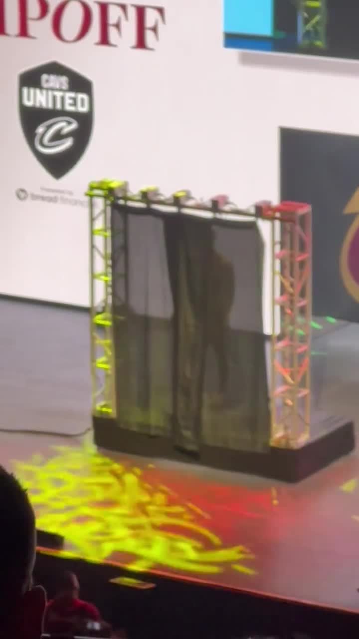
Cavs unveil their new City Edition jerseys to season ticket holders and get strong reactions: “That sucks. That’s garbage. Oh my god. What the hell was that?”
October 18, 2023
Cavs unveil their new City Edition jerseys to season ticket holders and get strong reactions: “That sucks. That’s garbage. Oh my god. What the hell was that?”
42 comments
What an awkward way to reveal a jersey
Nike jersey design has been so mid since they took over
Yeah that ain’t it, I wish they’d go back to the ones they had right before LeBron left the first time
This is a single person. A single Reddit comment visualized
Let’s be real, almost ALL of the city editions so far are pure trash.
Nike/NBA really dropping the ball this year.
I would’ve done something associated with both of their buildings or food prepared near the street
If there was any event in history I could have attended in person this would have been it
Fuck everything else
Dude sounds like Ricky from trailer Park boys
I think this is kinda crispy
Lol they didn’t even bothered to hire a model
It’s not the worst jersey I’ve seen but it’s incredibly **meh**
A strong reaction from a single individual but the uniform is ugly.
It made me laugh a lot envisioning the entire crowd heckling the jersey, for some reason, the actual video left me pretty disappointed.
Nike really mailing it in on some of these recent jerseys it would seem.
lol
I’m absolutely baffled how year in and year out the NBA manages to have the most mid 3rd jerseys/city edition jerseys.
NBA and Nike over complicate these things every year.
People love the old school 80s and 90s designs and simplicity and every year they get teased and then they they end up giving us the most goofy looking generic crap.
Nike jerseys stink
“Strong reactions” but it’s just the camera man talking to himself lol
i like it
Can we plz go back to white home jerseys, full color away jerseys, and the occasional alternate? We need to collectively stop buying new merch every time it drops. Holy hell it’s tiresome.
City Edition
more like Shitty Edition
The Land
Polar express lookin ahhhh jersey
The Jazz orange/yellow jersey was the best one of recent memory, but it never won them anything
What always baffles me is that they have every color imaginable to them, and so often they decide to have a city edition in the exact same color as one of their other jerseys.
Reactions: 1 Person yelling behind the video they are taking
Reddit hyperbole visualized.
CLEANNNNNNN😆
The reveal was weird, the font looks cool, colors are a cool mix, ‘the land’ is kind of corny.
Just have it read Cleveland.
deleted scene from the office
I don’t get why everyone does the less is more approach. If you all have garbage jerseys that say your version of “the land” then they all look the same. Maybe do something, anything, representing the city. Someone got paid to draw that and they basically stole money.
I actually kind of like this, but I’m a sucker for a serif font even if the numbers’ spacing looks weird. Still doesn’t change the dilution of brand identity with new, mostly shit jerseys every year tho.
“strong reactions”, by two people sitting there?
This is what happens when you ask ChatGPT to design you a basketball jersey with not enough details.
it would be a better jersey if it said “south beach”
Should have been a rook behind the curtain
The Magic finally have a good one but it’s just the McGrady era blue starts with a facelift.
Not much is cornier than putting the Land on your jersey. Probably just heat culture lmao

42 comments
What an awkward way to reveal a jersey
Nike jersey design has been so mid since they took over
Yeah that ain’t it, I wish they’d go back to the ones they had right before LeBron left the first time
This is a single person. A single Reddit comment visualized
Let’s be real, almost ALL of the city editions so far are pure trash.
Nike/NBA really dropping the ball this year.
I would’ve done something associated with both of their buildings or food prepared near the street
https://youtu.be/ysmLA5TqbIY?si=T5EOG8l8_aAB0xuS
pretty sure you could create this exact jersey in 2k
Still better than those garbage ass Culture Heat jerseys
Would “We’re Not Detroit” fit on the jersey?
​
if you dont get the joke: [https://www.youtube.com/watch?v=oZzgAjjuqZM](https://www.youtube.com/watch?v=ysmLA5TqbIY)
If there was any event in history I could have attended in person this would have been it
Fuck everything else
Dude sounds like Ricky from trailer Park boys
I think this is kinda crispy
Lol they didn’t even bothered to hire a model
It’s not the worst jersey I’ve seen but it’s incredibly **meh**
A strong reaction from a single individual but the uniform is ugly.
It made me laugh a lot envisioning the entire crowd heckling the jersey, for some reason, the actual video left me pretty disappointed.
Nike really mailing it in on some of these recent jerseys it would seem.
lol
I’m absolutely baffled how year in and year out the NBA manages to have the most mid 3rd jerseys/city edition jerseys.
NBA and Nike over complicate these things every year.
People love the old school 80s and 90s designs and simplicity and every year they get teased and then they they end up giving us the most goofy looking generic crap.
Nike jerseys stink
“Strong reactions” but it’s just the camera man talking to himself lol
i like it
Can we plz go back to white home jerseys, full color away jerseys, and the occasional alternate? We need to collectively stop buying new merch every time it drops. Holy hell it’s tiresome.
City Edition
more like Shitty Edition
The Land
Polar express lookin ahhhh jersey
The Jazz orange/yellow jersey was the best one of recent memory, but it never won them anything
What always baffles me is that they have every color imaginable to them, and so often they decide to have a city edition in the exact same color as one of their other jerseys.
Reactions:
1 Person yelling behind the video they are taking
Reddit hyperbole visualized.
CLEANNNNNNN😆
The reveal was weird, the font looks cool, colors are a cool mix, ‘the land’ is kind of corny.
Just have it read Cleveland.
deleted scene from the office
I don’t get why everyone does the less is more approach. If you all have garbage jerseys that say your version of “the land” then they all look the same. Maybe do something, anything, representing the city. Someone got paid to draw that and they basically stole money.
I actually kind of like this, but I’m a sucker for a serif font even if the numbers’ spacing looks weird. Still doesn’t change the dilution of brand identity with new, mostly shit jerseys every year tho.
“strong reactions”, by two people sitting there?
This is what happens when you ask ChatGPT to design you a basketball jersey with not enough details.
it would be a better jersey if it said “south beach”
Should have been a rook behind the curtain
The Magic finally have a good one but it’s just the McGrady era blue starts with a facelift.
Not much is cornier than putting the Land on your jersey. Probably just heat culture lmao
Minimalism is killing the nba
#So fucking bad.
I miss the 2016 Adidas jerseys so much.