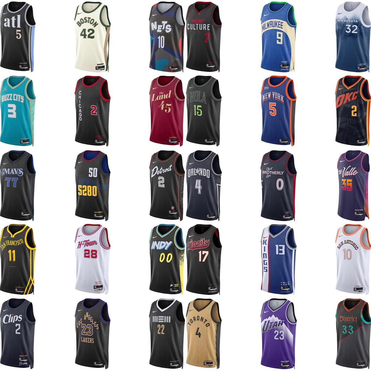
I might be biased, but I think we have the best city edition jerseys in the league this year by far.
October 23, 2023
I might be biased, but I think we have the best city edition jerseys in the league this year by far.
17 comments
The Denver jersey is so so bad
The way they aligned the lettering on the Lakers jersey is awful.
Ours is definitely one of the best, but I still don’t love the way they did the back. Could have been a lot worse though.
Top 5 for sure. There’s so many ugly jerseys. So many plain black jerseys too which is boring.
I love our city jersey, but I also love the Trailblazers one.
I actually like all of the city jerseys of teams in the northwest division (except for Denver’s: that kit is ugly this year). I also like Phoenix’s El Valle jerseys and I would love Milwaukee’s if the primary color was light green instead of blue. It’s stupid that Nike forces teams to move away from good jersey designs every year just for the sake of profit. That’s how we have ended up with all these shit designs because teams have exhausted their good ideas.
The Wolves look cool, as it looks like snow is falling. The Nets doesn’t look bad either. Not being biased, the Jazz have my 3rd favorite city jersey
It is one of the best but the bar is low. The only ones I think are really cool are San Antonio and Memphis.
Not a huge fan of most of these jerseys.
Boston and Golden State look simple and clean to me. The Jazz jersey is easily top 5.
We do, it’s basically consensus on NBA twitter too.
There’s not a single jersey in this assortment I’d buy.
I really like Minnesota’s. They definitely have my favorite. Utah‘s got one of the best for sure, though.
Boston and Chicago are pretty good
Why do most of these look like such garbage. The strategy of pumping out new jerseys every year is lame, teams don’t even play in them enough to build any sort of identity behind them
Yeah very unimpressed by most of the league. Brooklyn’s is fun and Minnesota’s is cool. Ours is probably the best though ngl
Idk, it’s kind of just our classic purple jersey but worse.
Rare jazz jersey W