I think people were a bit quick to judge. These are 🔥 I’m going Sharpe
I was a quick to judge. These are better than I initially gave them credit for. Seeing the full combo of jersey and shorts really brings it together
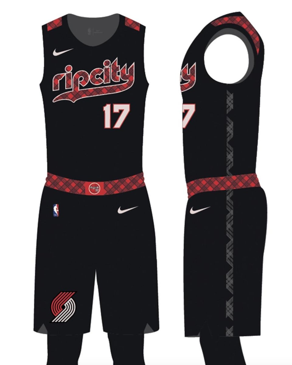
The rear shoulder wings bug me… the front isn’t bad
I have Scoot regular black and Shae PDX carpet. Might have to give Ant some love and get this one as a Simons
i’m hoping to get sharpe if it isn’t too expensive. they are clean af tho. sharpe been my guy since i saw his talent last season and without dame i want a different guy from the team to hopefully get autographed in memphis in march if i go
For me it’s kind of like every time Subaru releases a new model of WRX. My first reaction is always woo, that’s ugly. But then it grows on me and I wind up loving it by the time the next model is released and the cycle repeats.
Agreed. These are an instant classic for me
Larger red plaid side trim like the 40th Anniversary jerseys probably would put it over the edge for a lot of people instead of the weirdly thin black plaid side trim
Need a #17 one!!!!!
Gross.
glorious
I just wish they said Portland rather than ripcity, it may be heresy but I’m not super into the ripcity branding especially since the answer when someone asks “why is Portland called ripcity” is just that a guy randomly shouted it 50 years ago. It should be “rose city” if anything
They look like a private school uniform.
These would be S tier if not for the plaid
Edit: Elegant typeface, clean layout with each element having plenty of room to breathe, tasteful placement of the red (even the little wings are sweet), a little color to separate the pieces and balance things out a little—for all you pedantic fucks who think “without the plaid” means “all black everything,” solid colors would make these some of the cleanest jerseys in the league
They’re fine. I’ve liked a few of the city jerseys, but I’m honestly kinda tired of the concept of new jerseys every year.
A belt huh? Fuck it, not like we’re winning, might as well go formal.

16 comments
I think people were a bit quick to judge. These are 🔥 I’m going Sharpe
I was a quick to judge. These are better than I initially gave them credit for. Seeing the full combo of jersey and shorts really brings it together
The rear shoulder wings bug me… the front isn’t bad
I have Scoot regular black and Shae PDX carpet. Might have to give Ant some love and get this one as a Simons
i’m hoping to get sharpe if it isn’t too expensive. they are clean af tho. sharpe been my guy since i saw his talent last season and without dame i want a different guy from the team to hopefully get autographed in memphis in march if i go
For me it’s kind of like every time Subaru releases a new model of WRX. My first reaction is always woo, that’s ugly. But then it grows on me and I wind up loving it by the time the next model is released and the cycle repeats.
Agreed. These are an instant classic for me
Larger red plaid side trim like the 40th Anniversary jerseys probably would put it over the edge for a lot of people instead of the weirdly thin black plaid side trim
Need a #17 one!!!!!
Gross.
glorious
I just wish they said Portland rather than ripcity, it may be heresy but I’m not super into the ripcity branding especially since the answer when someone asks “why is Portland called ripcity” is just that a guy randomly shouted it 50 years ago. It should be “rose city” if anything
They look like a private school uniform.
These would be S tier if not for the plaid
Edit: Elegant typeface, clean layout with each element having plenty of room to breathe, tasteful placement of the red (even the little wings are sweet), a little color to separate the pieces and balance things out a little—for all you pedantic fucks who think “without the plaid” means “all black everything,” solid colors would make these some of the cleanest jerseys in the league
They’re fine. I’ve liked a few of the city jerseys, but I’m honestly kinda tired of the concept of new jerseys every year.
A belt huh? Fuck it, not like we’re winning, might as well go formal.