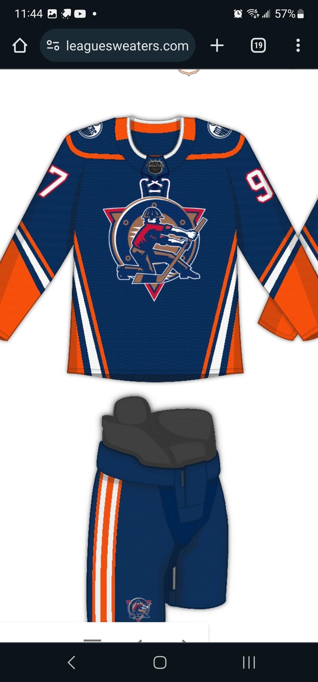
Remove if deemed duplicate. Can’t read any more doom and gloom about the start of the season. So here’s a jersey concept using Ducks template and the traditional Oilers stripping. Creative criticism welcome.
So, I kinda like the striping concepts. But I never liked that logo, and this is coming from a guy who’s currently looking at signed cujo jersey with that logo on it (also my first ever jersey). It works ok as a shoulder patch – light years ahead of using an Albertan flag, lol… but as a main logo, naw. The McFarlane meteor is a much cooler alternative logo.

2 comments
Messing around on Men’s League Sweaters site.
https://customize.mensleaguesweaters.com/
So, I kinda like the striping concepts. But I never liked that logo, and this is coming from a guy who’s currently looking at signed cujo jersey with that logo on it (also my first ever jersey). It works ok as a shoulder patch – light years ahead of using an Albertan flag, lol… but as a main logo, naw. The McFarlane meteor is a much cooler alternative logo.