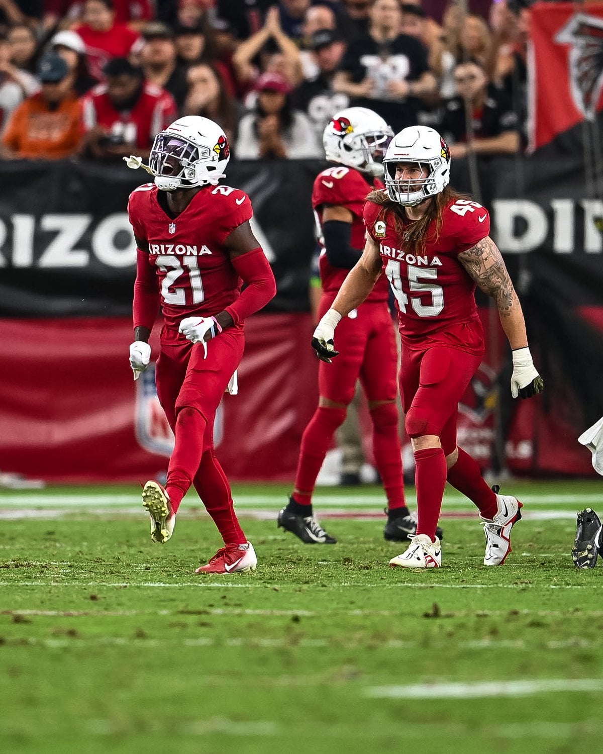
Are the new Cardinals jerseys growing on anyone else or is it just me?
November 15, 2023
Are the new Cardinals jerseys growing on anyone else or is it just me?
12 comments
I like em. I wish the “Arizona” was a little smaller but I do like them. I really like the white but to afraid to get one
Lol they got so much hate when they released but like with anything people will get used to them. I remember thinking at the time that people were shitting on them because they were still riled up from the horrifying events that happened in the offseason
I think they are boring if you just look at them in a store or whatever but they look really good in action. I do wish they’d go away from black for either 3rds or color rush.
I like them. I just can’t get over how they’re too similar to the Commanders’ jerseys. Lazy.
I just want them to start swapping the pants between uniforms. I want to see red on white, not just solid red for the home unis.
Nope, nor the suns. Just look generic, or cheap
Arizona Sooners
The reds would look so much better with white pants. Never been a fan of the pajama look.
Not really they’re just aren’t that noticeable during games so I forget how basic and plain they are.
The white jerseys are okay though because they work well with the red.
I seen a design somewhere on twitter where those same jerseys had the ARIZONA font removed in the front and they arguably look better. Besides that yeah they’re starting to grow on me more or less.
They’re ok, i just feel like they could be better. There’s so much room on the shoulder of the red jersey to put the state flag or striping like the other sets.
Whites are okay but the Red are dog shit