
— Previous article
Lakers Minutes Per game so far..
Next article —
Digging through some old boxes and forgot I had these. Pick a number between 1-100 and I’ll send one to the closest guess.
You May Also Like
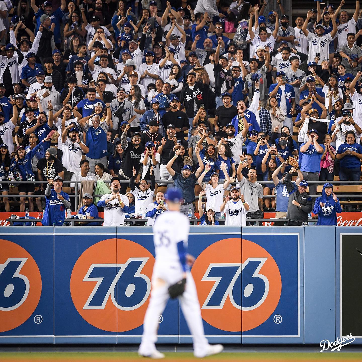
Los Angeles Dodgers: “Cody” chants from the best fans in baseball….
“Cody” chants from the best fans in baseball.
Los Angeles Dodgers: Opening Day, let’s get it….
Opening Day, let’s get it.

I’m so ready for the regular season again. XD
I’m so ready for the regular season again. XD
7 comments
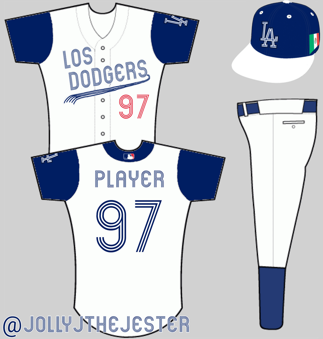
Looks a lot better than the city conduct jerseys! I like the color.
I don’t like em. I hate the Los dodgers on the city connect jerseys and I hate it here. I know it’s the wbc but the numbers feel too much like the blue jays.
I’d say remove the Mexican flag cause the Dodgers represent more latinos/Latinas than just Mexican fans but other than that good idea
You had me at high socks!
The only thing that saved the city connects for me was when a player choose to wear short pants and tall socks.
I do like the look of this…and I don’t thing the swoosh-y thing under the name works in this this style though. Maybe just two lines? Overall I think it looks clean with a nice touch of blue everywhere. Well done : )
I prefer the current city connect jerseys, but I think these fit the spirt of the city connect concept a bit more. But yeah, does look a little Blue Jaysish. Incorporating some colors of the flag of Los Angeles may make it look more original, but it’d be sacrilegious to not use Dodger Blue.
Not a fan of the Mexican flag. Why not just use a map of the North/South American continent?
👎🏼