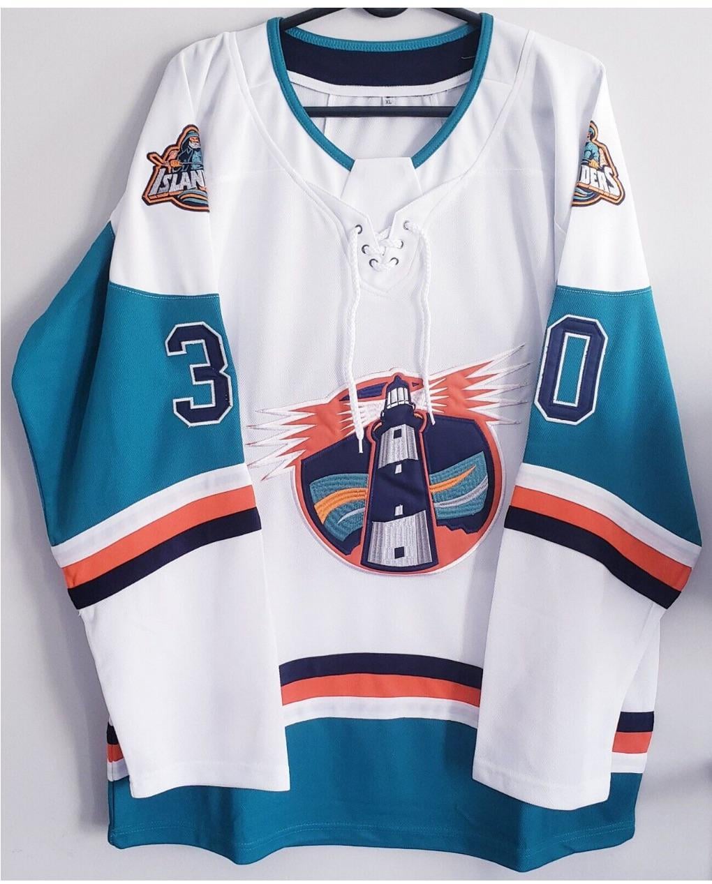
imo would look better if the teal and the dark blue is swapped. But any lighthouse logo jersey is >>>> than a non lighthouse logo jersey
Where can I buy
I have the teal version of this and it’s sick. I will say, if it’s the sportology guy on mercari you’re looking at this from and it’s $125, you can get the jersey much cheaper on dhgate(which is where I’m assuming he gets his and resells). only downside is long wait for shipping.
It’s decent for a Chinese knockoff
The crest is gonna be on your belly.
Yes! This 💯
No
Nope.
Needs better shoulder patches, but it’s decent
No thanks I’m good
update the shoulder patches to the 3rd jersey islanders crest (smaller I and s, different fisherman/colors). The lighthouse logo should be aligned to have the lights horizontal and the lighthouse italic. not bad update. Maybe swap the silver and navy for the teal.
No thank you. I don’t like any of their jerseys that don’t have what I would consider the classic logo on them.
Love the lighthouse logo
I really like it personally, aside from the Fisherman shoulder patches. The lighthouse logo is fantastic and it’d be cool to see something like this (maybe with less teal) instead of our current alts
I like the lighthouse but the teal needs to go
Sharp
The lighthouse logo should be our 3rds.
There are so many concept jerseys on dhgate!
I like the lighthouse logo but the “fishsticks” guys gotta go…I’ll never warm up to that. Maybe have the original logo on one side and the 4 stripes on the other. I’d also swap the teal with the dark blue but definitely a cool concept.
Hoping we get a lighthouse primary logo on the stadium series jersey

21 comments
This is awesome
imo would look better if the teal and the dark blue is swapped. But any lighthouse logo jersey is >>>> than a non lighthouse logo jersey
Where can I buy
I have the teal version of this and it’s sick. I will say, if it’s the sportology guy on mercari you’re looking at this from and it’s $125, you can get the jersey much cheaper on dhgate(which is where I’m assuming he gets his and resells). only downside is long wait for shipping.
It’s decent for a Chinese knockoff
The crest is gonna be on your belly.
Yes! This 💯
No
Nope.
Needs better shoulder patches, but it’s decent
No thanks I’m good
update the shoulder patches to the 3rd jersey islanders crest (smaller I and s, different fisherman/colors). The lighthouse logo should be aligned to have the lights horizontal and the lighthouse italic. not bad update. Maybe swap the silver and navy for the teal.
No thank you. I don’t like any of their jerseys that don’t have what I would consider the classic logo on them.
Love the lighthouse logo
I really like it personally, aside from the Fisherman shoulder patches. The lighthouse logo is fantastic and it’d be cool to see something like this (maybe with less teal) instead of our current alts
I like the lighthouse but the teal needs to go
Sharp
The lighthouse logo should be our 3rds.
There are so many concept jerseys on dhgate!
I like the lighthouse logo but the “fishsticks” guys gotta go…I’ll never warm up to that. Maybe have the original logo on one side and the 4 stripes on the other. I’d also swap the teal with the dark blue but definitely a cool concept.
Hoping we get a lighthouse primary logo on the stadium series jersey