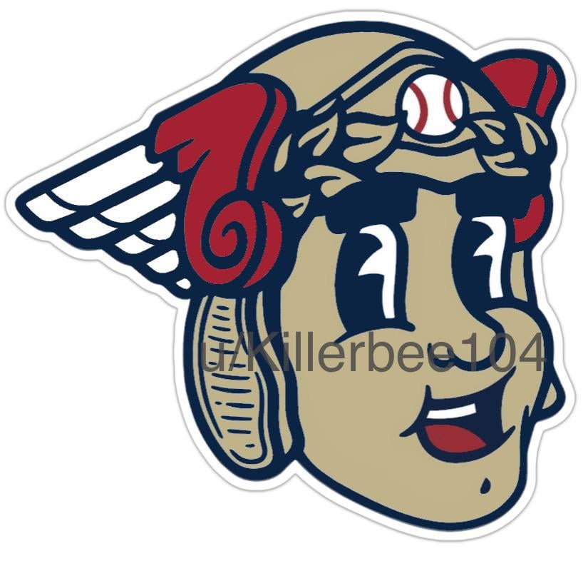
I worked with bruno.pirani to create this mock up. The color palette is the same as the 1935 allstar game. The rubber hose art style works well given that it was the style that was prevalent when the guardian statues were built.
11 comments
Personally, I’m not a fan of cartoonish logos for major league sports teams, but what I like about it is that it’s happy rather than angry. I prefer the smiling old-fashioned logos to the constantly gritted teeth. I don’t mean this condescendingly, so please don’t take it that way, but I think this could be a great mascot and a great logo for kids’ shirts and apparel. It’s a nice piece of work!
Please no
Good work but no
No. Looks like a Peter Pan cartoon.
Funny thing is it make me realize how little the “baseball with wings” logo bothers me now. And, it really bothered me when it was revealed.
It is nice work! But what’s with Cleveland baseball fans wanting a face/character mascot so bad?
It looks like a potato kinda
No.
I like this! Nice job
Pass, makes us look like a burger chain.
Looks Big Boy inspired