
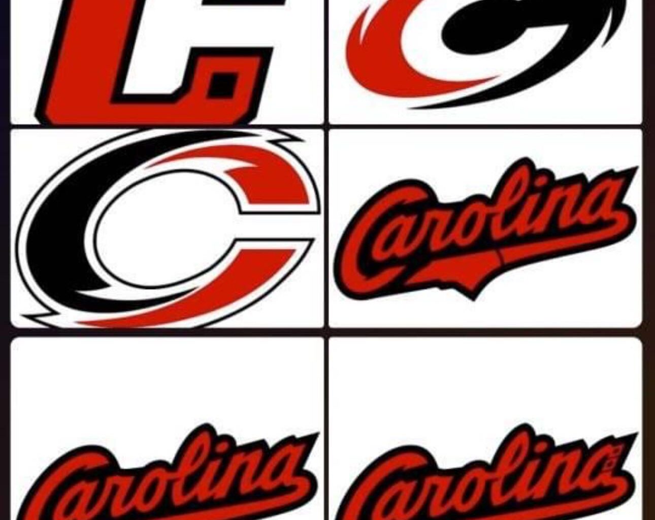
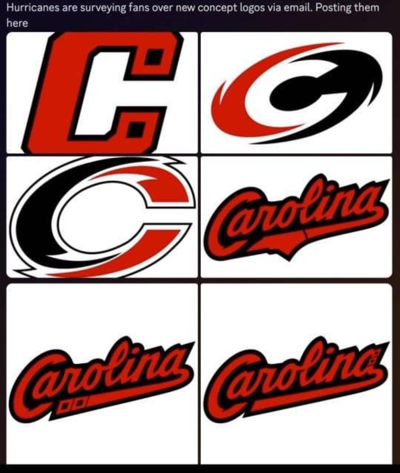
What do we think? Personally the C would be cool if it replaced captains C and the A patches in the same style. The two C x Current logo mashups would look better closed off (not a C more of an O) I think would look good as a shoulder patch. They give the “minimalist” vibe. And the baseball styles can go.
25 comments
They’re all pretty terrible imo
I dont mind refreshing our logo/ design. But these aren’t good.
The negative space H on the first one is probably the best? But it’s not even a full H.
If it ain’t broke, don’t fix it.
🤮
Honestly, the two hurricanes logos are just bad. The “C” is interesting, but not enough to be a full logo. The three Carolina ones are all awful, the one with the NC shape is a interesting touch, but there’s nothing unique about those logos.
Those bottom two and middle right look more like they’re for a baseball team. Top left is all right.
Yeesh no thank you to all of these.
I think I hate them all.
I hate them all.
Okay *as a shoulder patch*
Barf
Barf
good for baseball
good for baseball
good for baseball
This was done as a middle school art project right?
We got this survey and my general sense (based on questions leading up to these) is they’re kind of in the “concept testing” phase, putting the questions like “do you like a stylized letter with team colors/concepts like Calgary’s ‘C’ or script words like…” and so on.
At least, I *hope* none of these are more than just generic concepts lol.
IIRC an article about Fanatics taking over production, teams really won’t be able to make changes for 2 seasons?
They’re all awful
Whoever made these spent maximum 3 hours on it
These are genuinely some of the worst things I’ve ever seen
Those all suck
I said this on Twitter, it I think these almost look like a baseball style logo or perhaps for a farm team
These are just awful. Stick to what we have!
Absolutely not, do not change the logo
Thanks, I hate it
Top left would look good as a captain patch
I hate them all
I feel the logos we have are some of the best in the league. Please don’t change them🙏
Nobody in Raleigh wants to wear “Carolina” even if it’s the right colors
no no no no no no no no no no no no
nononononononononononononononononono
Seriously, I will be devastated if they change the main logo. Its perfect just like it is. Make all the toilet swirl references you want, but that’s been the logo for 26 years now. It’s simple, it’s easily identifiable and it gets it’s point across.